
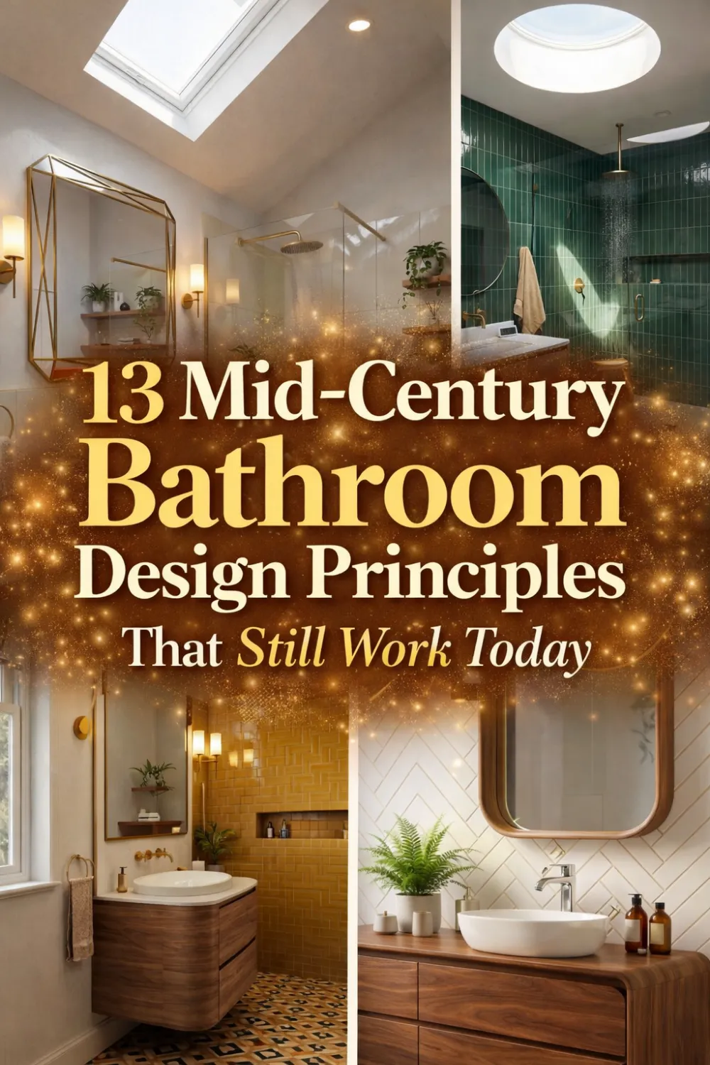
How to Get the Mid Century Modern Bathroom Look Without Going Full Retro
The first mid century modern bathroom I ever walked into belonged to a house built in 1958. The owner had done almost nothing to update it — original walnut vanity, original terrazzo floor, original globe sconces flanking a round mirror. My first thought was that it should have felt dated. My second thought, which arrived about thirty seconds later, was that it felt more considered than almost any bathroom I had seen in a newly renovated home.
That experience started a long fascination with why this particular design era holds up so well in spaces that should theoretically feel old. What I kept coming back to was this: mid century modern bathrooms were not designed around trends. They were designed around principles. Clean geometry. Warm materials. Restrained color. Purposeful lighting. A single focal point instead of ten competing ones.
Those principles do not expire. This guide is about how to apply them without turning your bathroom into a time capsule — getting the warmth, the geometry, the material quality, and the visual calm without the costume-party feeling that full retro reproduction sometimes creates.
— Written from years of studying what makes certain bathrooms feel genuinely timeless rather than just stylistically correct 🏠
1 • The Real Philosophy Behind Mid Century Bathrooms — It Was Never About Nostalgia
There is a common misreading of mid century modern design that treats it as essentially nostalgic — a way of recreating a specific decade’s aesthetic for the pleasure of the reference. That reading produces bathrooms that feel like sets. A more accurate reading understands mid century as a philosophy that happened to be expressed during a particular era, and that philosophy is as valid today as it was in 1955.
At its core, mid century design is about intention. Every element should earn its place. The vanity is not just storage — it is a sculptural object. The tile is not just a waterproof surface — it defines the visual character of the space. The lighting is not just illumination — it shapes how the materials are perceived. When every decision is made at this level of deliberateness, the result has a quality that transcends period styling.
This is also why mid century bathrooms tend to have a single strong focal point rather than multiple competing ones. A statement vanity. A bold tile wall. A distinctive mirror. These anchor elements do the expressive work, and everything else in the room serves them. That restraint is exactly what prevents the space from feeling themed. A bathroom designed around one strong idea feels architectural. A bathroom trying to reference as many mid century elements as possible feels like a mood board.
The Core Principles — Keep These in Mind Before Anything Else
- Every element should earn its place — no decorative clutter
- Choose one focal point and let everything else support it
- Warm materials balance cool tile and hard geometry
- Restrained color is more powerful than abundant color
- The goal is timeless, not period-accurate
2 • The Balance Between Geometry and Organic Shapes — Why Both Are Essential
Bathrooms are inherently geometric spaces. Tile grids, rectangular mirrors, cabinet doors, fixture profiles — the room is full of straight lines and right angles. In most bathrooms, this geometry accumulates until the space feels rigid and slightly institutional. Mid century design understood this problem and solved it with a specific strategy: introduce curves deliberately and sparingly to interrupt the geometry without abandoning it.
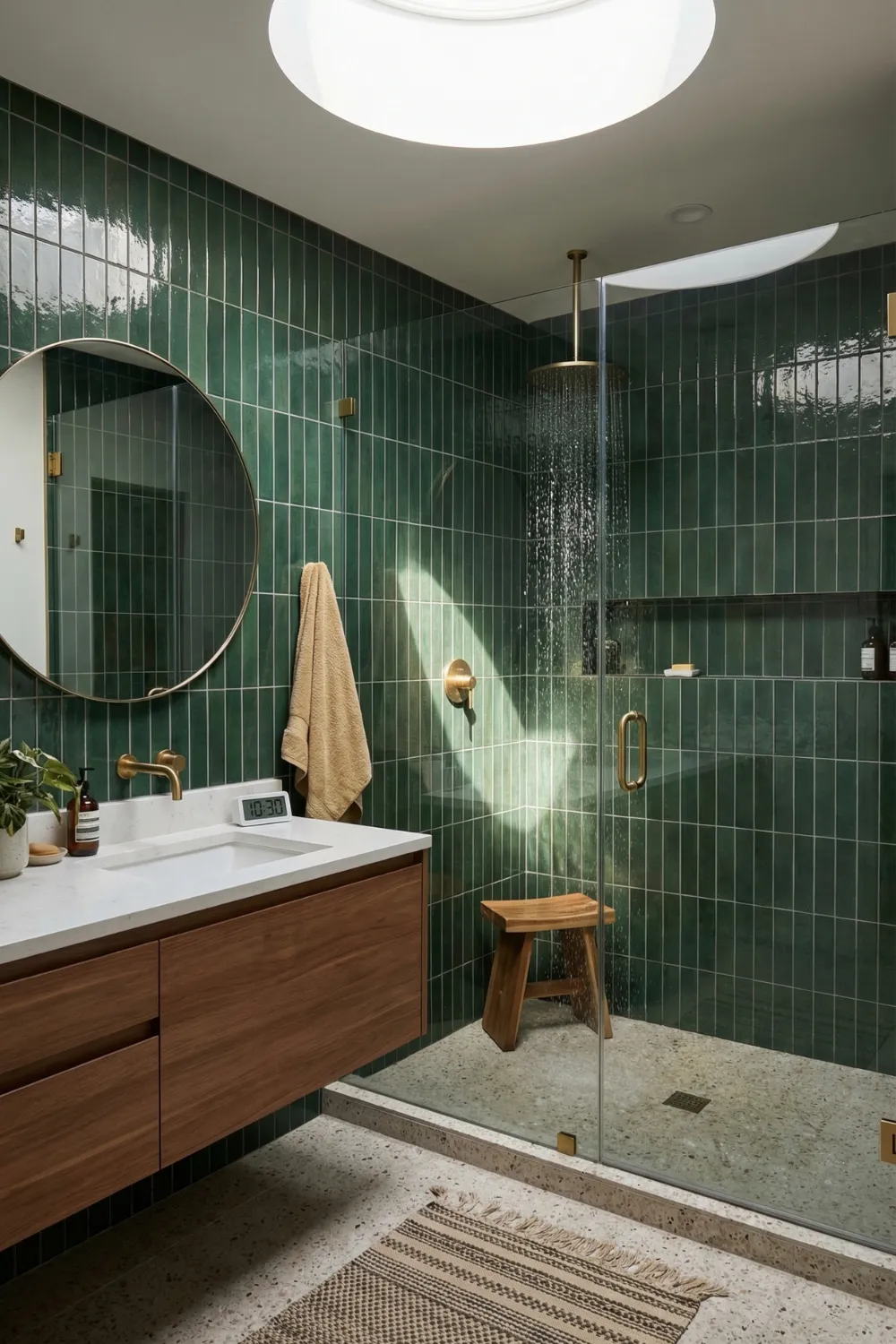
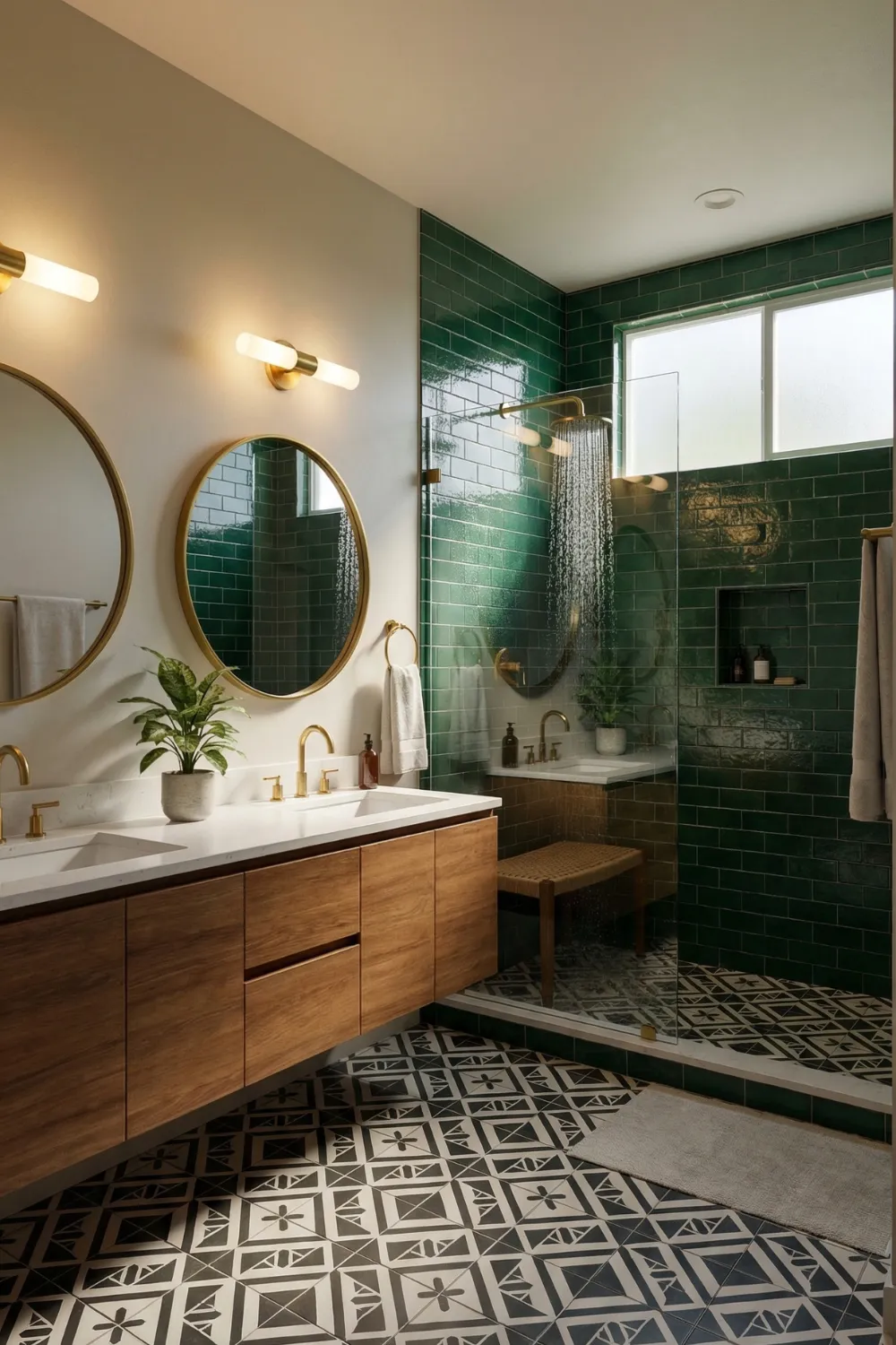
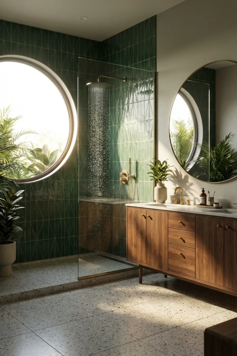
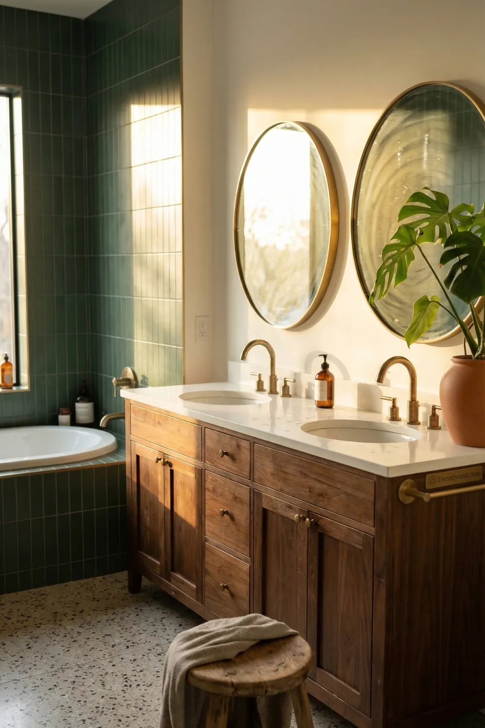
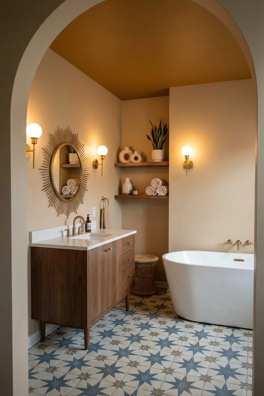
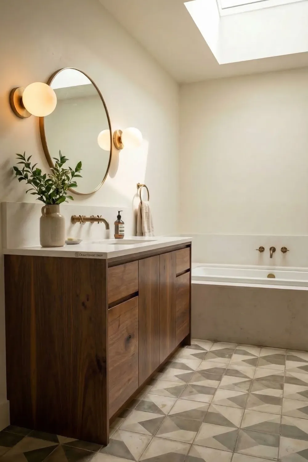
A round mirror in a bathroom full of rectangular surfaces does not just add shape variety — it creates a visual rest point. The eye, tired of following angles, lands on the circle with something like relief. The same effect applies to a curved sink, a circular window, or a sculptural light fixture with a round globe. These organic shapes do not fight the geometry. They complete it.
The ratio matters enormously. One round mirror in a rectangular bathroom creates contrast. Three round elements competing for attention create noise. The mid century approach is to be precise: identify where the curve is most needed — usually near the vanity, where the eye spends the most time — and place it there with confidence.
“Mid century bathrooms were not designed around trends. They were designed around principles. Those principles do not expire.”
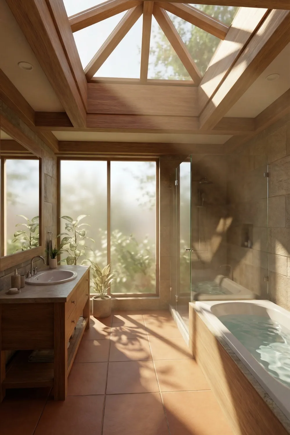
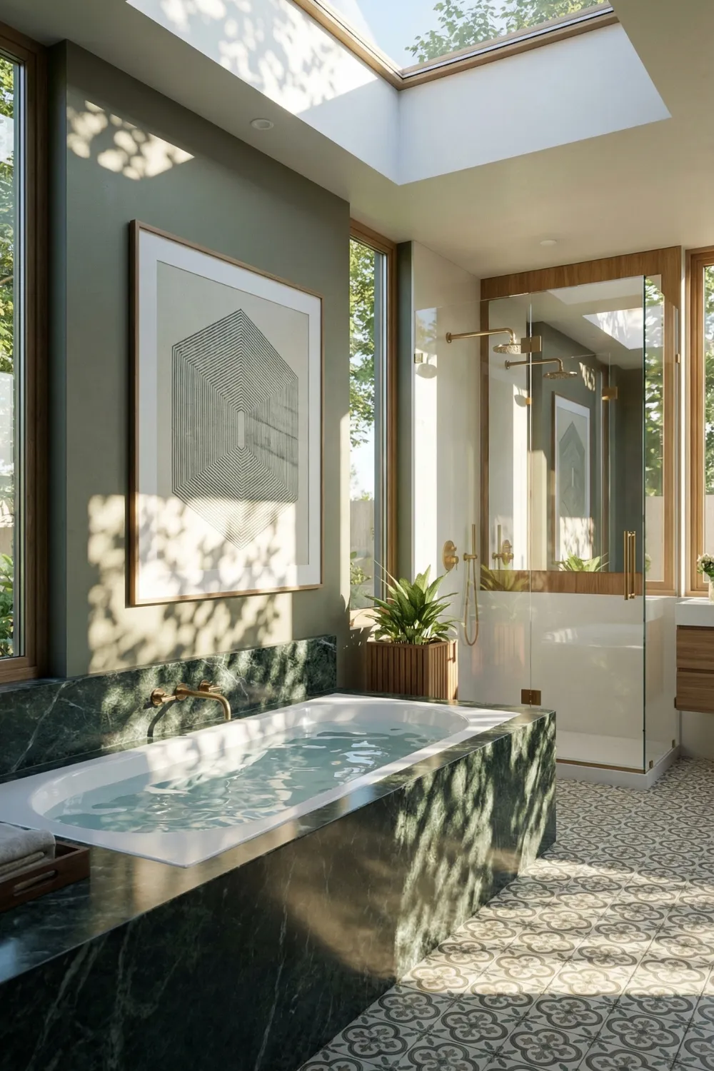
3 • Skylights and Wood Frames — How Natural Light Changes Everything
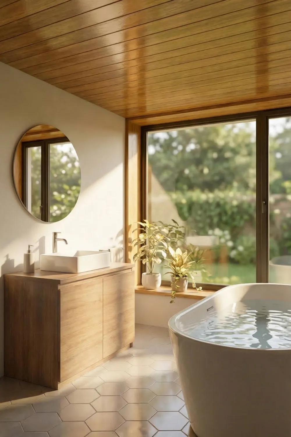
Natural light is one of the most underused tools in bathroom design, and mid century architects were unusually good at deploying it. Skylights appear so frequently in mid century bathrooms because they solve a specific problem: bathrooms need light but also need privacy. A skylight provides bright, even, natural light from above with complete privacy by default.
The wood framing that mid century architects placed around skylights and windows was doing double duty. Structurally, it provided the frame. Aesthetically, it introduced warmth into a space that might otherwise feel cold. Walnut, cedar, and teak were the materials of choice because their natural grain adds visual movement that painted surfaces cannot replicate. When morning light catches the grain of a wood-framed skylight, the ceiling becomes an architectural element.
Even without a full skylight installation, the principle applies in smaller ways. A wood-framed mirror. A wood ceiling panel above the vanity. Teak bath accessories. Each brings the warmth and material character of mid century architecture into a modern bathroom without requiring structural renovation. Plants near windows compound the effect — greenery softens architectural lines and creates that connection between interior and exterior that mid century designers consistently sought.
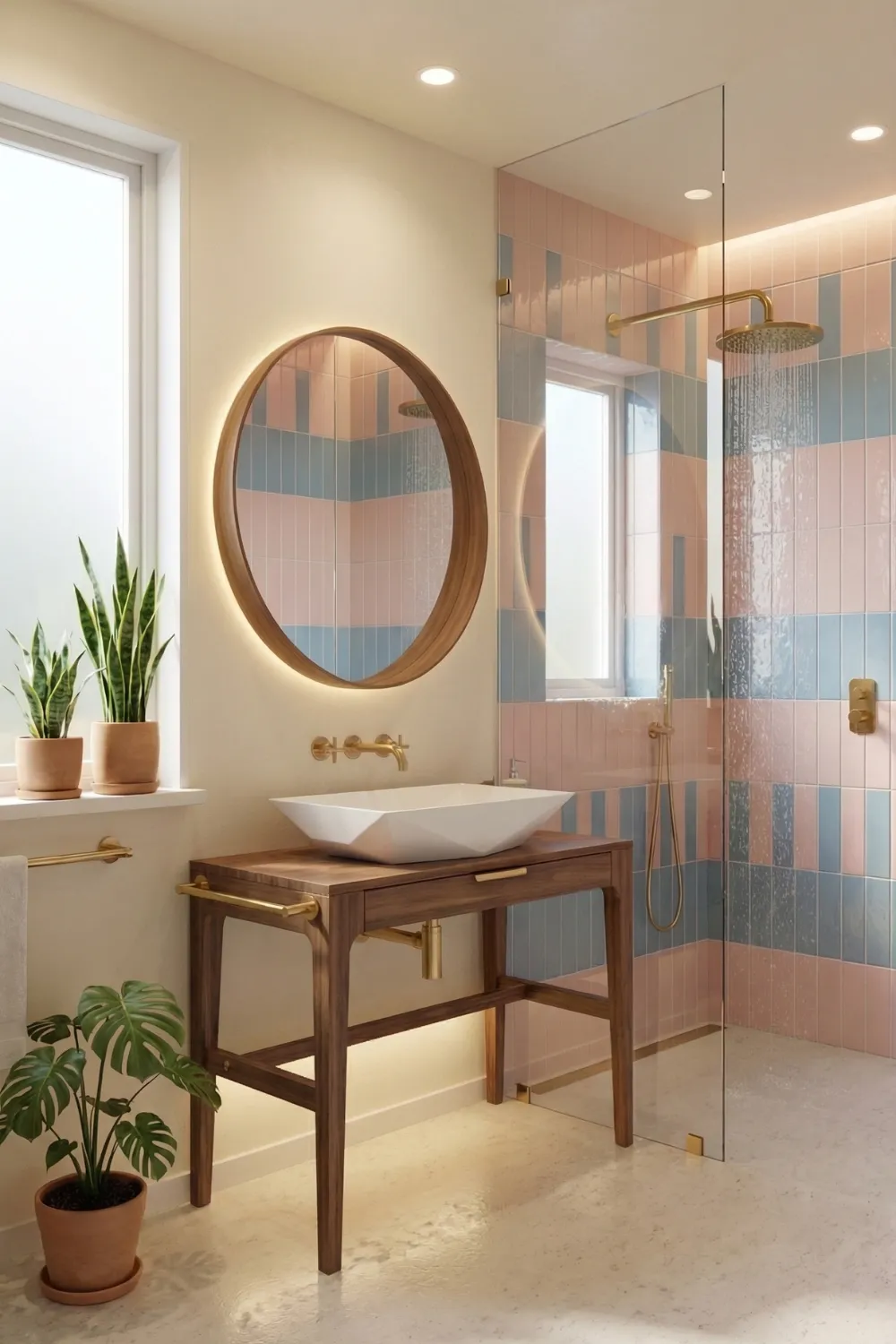
4 • Color Blocking That Defines Zones Without Overwhelming the Room
Color in mid century bathrooms operates on a principle that most modern renovations get backwards: instead of spreading color evenly throughout a space, mid century designers concentrated it deliberately in specific zones and left the surrounding surfaces neutral. The result is color that has impact precisely because it has defined boundaries.
A horizontal band of muted teal tile running at counter height across one wall does more visual work than the same tile covering all four walls. The band defines a zone — it says this is the wet area, this is where the design lives — and the neutral surfaces around it give the color room to breathe. Vertical tile bands work differently, pulling the eye upward and making low-ceilinged bathrooms feel taller.
Mid century designers favored colors that were present without being aggressive: muted sage, dusty rose, avocado green, mustard yellow, soft teal. These tones have personality without dominating. Paired with walnut or teak vanities, they create the warm-cool balance that characterizes the style. The wood grounds the color and prevents it from reading as kitsch. The color prevents the wood from feeling heavy.
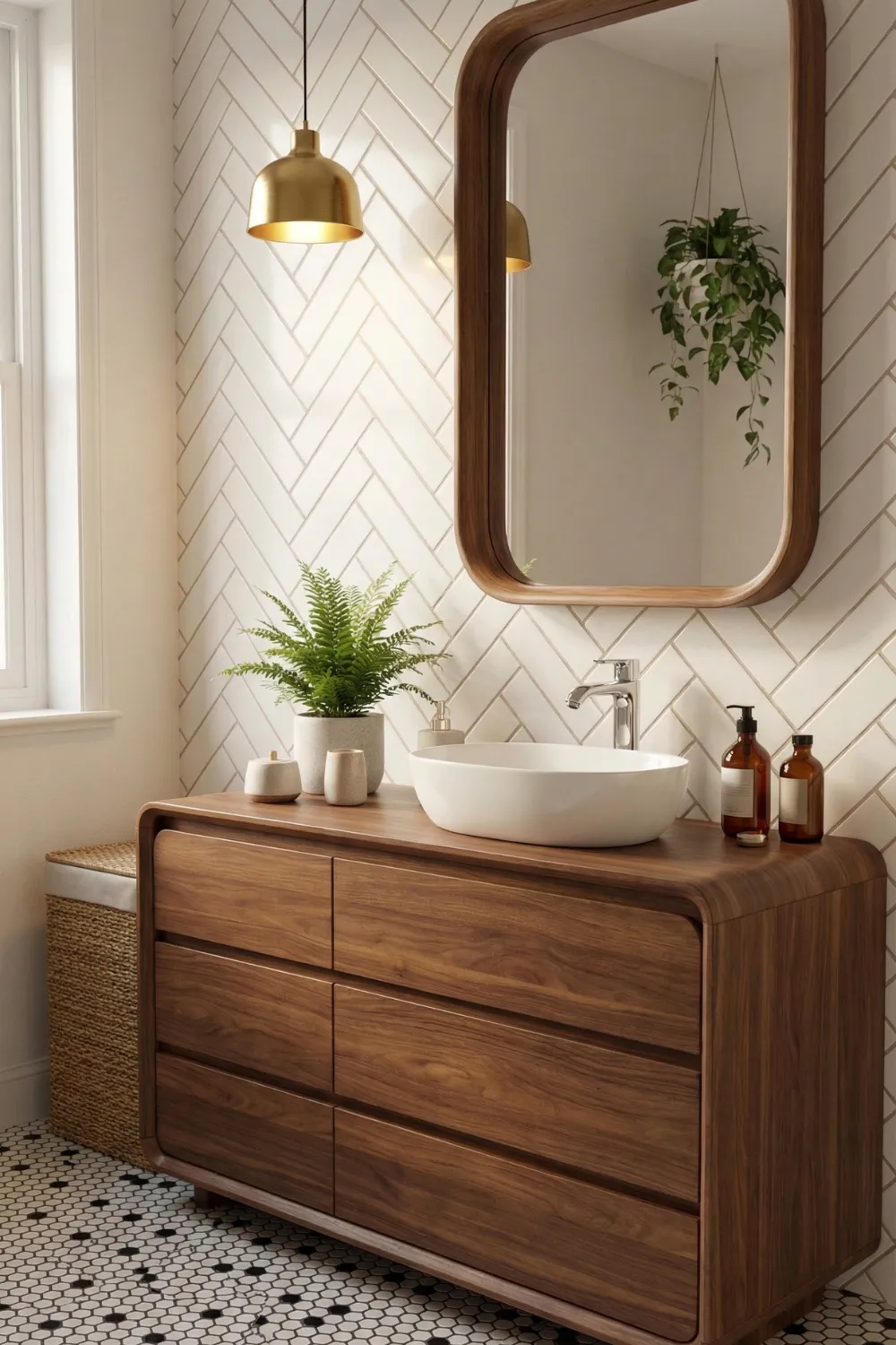
5 • Vertical Tile Installations That Make Small Bathrooms Feel Taller
The direction that tiles run is one of those details that most homeowners do not consciously think about, but that everyone subconsciously responds to. Horizontal tile lines push the eye sideways and make a space feel broader but lower. Vertical tile lines pull the eye upward and make a ceiling feel higher than it actually is.
In small bathrooms or narrow showers, vertical tile installation is one of the most effective visual tricks available — and it costs exactly the same as horizontal installation because the tile is identical. The only difference is the direction of the lines, and that direction changes how tall the room feels to anyone standing in it.
Single-color vertical tile amplifies the effect. Fine, consistent grout lines are essential here. Wide grout lines emphasize the individual tiles. Thin grout lines emphasize the surface as a whole, which is what you want when the surface is doing spatial work.
6 • Warm Wood Ceilings That Add Architectural Character
Wood ceilings in bathrooms make people nervous, and the concern is understandable. But the mid century architects who specified cedar and teak for bathroom ceilings were using species selected specifically for their moisture resistance, and the results, six decades later, are often the most beautiful feature in houses of that era.
What a wood ceiling does to a bathroom is difficult to achieve any other way. It lowers the perceived height slightly, which actually makes the space feel more intimate and sheltered. The grain pattern adds movement — the eye travels along the wood planks in a way it never travels along a painted surface. And the warmth of the material changes the quality of light in the room in a way that is felt before it is noticed.
For a modern application, a wood panel above the vanity — essentially a wood-clad soffit — achieves much of the same effect in a contained area. Cedar, teak, and thermally modified wood are all appropriate species for wet environments when properly finished. The floating vanity below should be restrained — clean lines, no visible hardware, simple proportions. The ceiling is doing the expressive work.
7 • Bold Tile Moments — How to Use Strong Color Without Losing Control
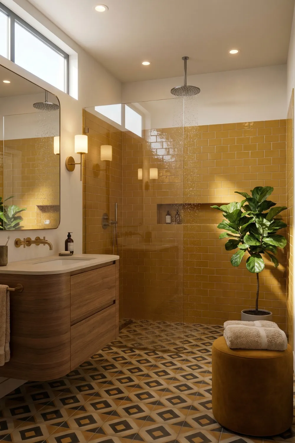
The difference between a mid century bathroom that uses bold color successfully and one that feels garish is almost always about containment. Deep emerald, saturated mustard, rich terracotta — these colors work in mid century bathrooms not because they are inherently compatible with the style, but because the style provides a framework for using them without letting them take over.
The shower wall or bathtub surround is the conventional location for the bold tile moment. These are the areas you look at most actively, and they are naturally framed by their function. A mustard tile shower wall surrounded by pale plaster and a walnut vanity reads as a deliberate design decision. The same mustard tile running across all four walls reads as a commitment that most people will regret within a year.
The floor can carry bold pattern even when the walls stay quiet. Geometric black-and-white tile — hexagons, diamonds, starbursts — grounds the room and gives it rhythm without competing with the wall focal point. Together, a bold wall zone and a patterned floor create a bathroom that feels genuinely composed rather than merely decorated.
8 • Graphic Floors That Do the Heavy Lifting
In a well-designed mid century bathroom, the floor is rarely an afterthought. It is often the most visually complex surface in the room — the place where pattern lives, where geometry is expressed most freely, where the design gets to be interesting without requiring the walls or fixtures to do anything beyond supporting it.
Terrazzo is the quintessential mid century floor material. Terrazzo floors installed in the 1950s are routinely in better condition than tile floors installed a decade ago. The material’s visual character — those irregular chips of stone suspended in a cement matrix — creates a pattern that is simultaneously random and cohesive, organic and geometric. It ages perfectly.
The scale of the pattern relative to the room is the critical decision. A small bathroom with large-scale geometric tile will feel overwhelmed. A good rule of thumb: the largest pattern element should be no larger than about one-third the width of the shortest wall. This keeps the pattern from dominating the space while still giving it the visual weight it needs to anchor the room.
Choosing the Right Floor Pattern Scale
- Small bathroom under 50 sq ft: small to medium geometric pattern or terrazzo
- Medium bathroom 50–100 sq ft: medium geometric pattern works well
- Large bathroom over 100 sq ft: large-scale pattern or bold terrazzo
- Keep walls simple when the floor is busy — they should support, not compete
- Thin grout lines on patterned floors preserve the pattern’s continuity
9 • Statement Vanities That Function as Sculpture
The vanity is where mid century bathroom design is most immediately recognizable. The characteristic detail — tapered legs that lift the cabinet off the floor — looks like a stylistic choice but is actually a spatial one. A floating or legged vanity creates visual space beneath it. The floor continues visibly under the cabinet, and the room reads as larger than it would with a floor-to-ceiling cabinet blocking that sightline.
Walnut is the material most closely associated with mid century vanities, and the association is earned. The deep, warm tone of walnut sits against white tile and pale walls with a richness that lighter woods cannot quite match. It has enough presence to read as a focal point without needing decorative hardware or elaborate detailing.
Brass hardware is the conventional pairing — the warm metal tone connects the vanity to the lighting fixtures and creates the kind of material repetition that makes a room feel cohesive. What does not work is chrome, which introduces a cool, clinical quality that runs counter to the warmth that mid century bathrooms are fundamentally trying to achieve.
10 • Architectural Openings — Arches and Alcoves That Add Depth
Mid century architects were not minimalists in the way that term is often used today. They were trying to make every element of visual interest count. Arched openings, framed alcoves, and circular windows appear in mid century bathrooms because they solve a specific design problem: how do you add architectural depth to a small room without cluttering it?
An arched vanity niche is one of the most elegant answers. The arch frames the vanity the way a picture frame frames a painting — it defines the object, gives it importance, and makes the space behind it feel considered. The curved opening stands apart from the surrounding flat walls, and the eye naturally stops there before moving on.
Shape repetition amplifies this effect. A round mirror placed within or above an arched niche echoes the curve and creates visual coherence. A circular globe light fixture extends the repetition further. The room begins to feel like it has a design logic — a conversation between shapes that was intentional rather than accidental.
11 • Lighting That Creates Warmth Rather Than Clinical Brightness
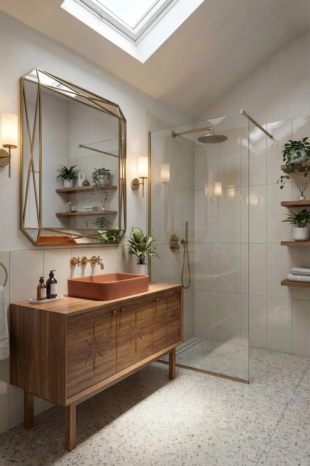
The lighting in most modern bathrooms is designed for function and nothing else: a bright overhead fixture that eliminates shadows. This approach works for practical tasks but produces an environment that feels more like a changing room than a place you want to spend time in. Mid century designers approached bathroom lighting differently — they layered it, warmed it, and made it part of the architecture.
Globe sconces flanking a mirror are the most recognizable mid century lighting fixture. A single overhead light casts shadows downward on a face — unflattering and unhelpful for grooming. Side-mounted sconces at face height provide even, shadow-free illumination. The round globe form connects to the other organic shapes in the room. The warm light temperature complements wood and brass tones.
Skylights handle the daytime equation. When the evening lighting is warm and layered and the daytime lighting is natural and even, the bathroom has the quality of atmosphere that most renovations spend a great deal of money trying to achieve through finishes and fixtures — and miss entirely because they got the lighting wrong.
12 • Repetition and Material Harmony — The Detail That Ties Everything Together
Repetition is probably the most underappreciated principle in interior design. When the same material, color, or shape appears in multiple places throughout a room, the room reads as unified. When every element is different from every other element, the room reads as incoherent, regardless of how beautiful the individual pieces might be.
In practical terms, choose a metal finish and use it everywhere: faucet, towel bar, light fixture, cabinet pulls, mirror frame. Brass is the most historically appropriate choice for mid century design and the most forgiving in terms of aging. It develops a patina that most people find appealing rather than shabby.
The same principle applies to wood. If the vanity is walnut, the shelving should be walnut. If there is a wood ceiling panel, it should match the vanity. Round shapes repeated in mirror, light fixture, and sink basin. Geometric tile patterns on floor echoed in textured tile on walls. These repetitions are what give mid century bathrooms their sense of visual resolution.
Material Repetition Checklist
- Choose one metal finish — brass, matte black, or brushed nickel — and use it on every fixture
- Match wood tones across vanity, shelving, and any ceiling or wall panels
- Repeat round shapes in mirror, light fixture, and accessories
- Echo floor pattern geometry in wall tile texture or pattern
- Keep grout color consistent throughout — mixing grout tones fragments the space
13 • Creating a Bathroom That Feels Timeless Rather Than Trendy
The question most people ask about mid century modern bathrooms is: will this look dated in ten years? It is a reasonable concern, especially given how much renovation costs and how long a bathroom is expected to last. The answer, when the design is done correctly, is no.
A bathroom that follows trends will look dated when the trend moves on. A bathroom designed around principles — geometry balanced by organic shapes, warm materials balancing cool tile, restrained color in defined zones, lighting layered for atmosphere, repetition creating coherence — will continue to look considered as long as those principles remain valid. And those principles have been valid for the entire history of Western architecture.
What makes mid century modern feel fresh is not that it is fashionable. It is that it is clear. In an era of bathrooms that are either aggressively minimal or aggressively decorated, a bathroom with a walnut vanity, a graphic floor, a bold tile moment, globe sconces flanking a round mirror, and a skylight overhead feels like it was designed by someone who knew what they were doing and trusted it.
That trust is what produces spaces that feel timeless rather than trendy
Home Decor Ideas & Inspiration


Pingback: 11 Modern Farmhouse Bathroom Ideas That Look Straight Off Pinterest - Decorly Nest | Modern Home Decor Ideas