
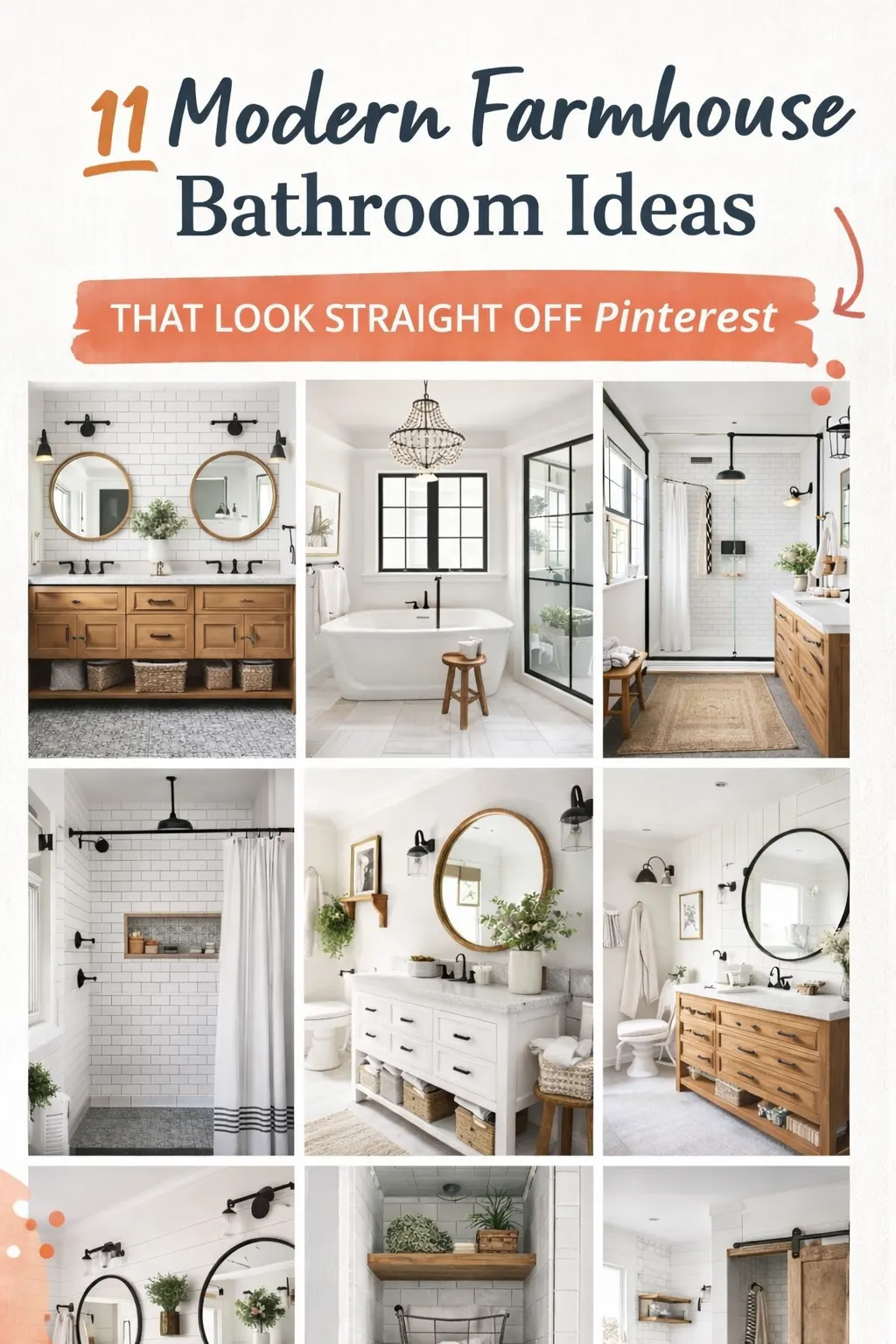
Looking to transform your bathroom into a modern farmhouse retreat? These Pinterest-inspired ideas combine rustic charm with clean, modern design to create a space that feels both cozy and luxurious.
I have spent a lot of time pinning bathroom ideas — probably more than I should admit. And somewhere between my hundredth saved post and actually helping a friend redesign her guest bathroom,
I noticed something. The farmhouse bathrooms that stopped me mid-scroll all shared the same quiet logic. It was never about having expensive fixtures or a massive renovation budget. It was always about contrast, texture, and knowing which details actually matter.
This post breaks down those details. Not in a vague “add shiplap and call it a day” way, but the specific decisions — material pairings, layout choices, color approaches — that make a farmhouse bathroom feel genuinely warm instead of just decorated.
Whether you’re starting from scratch or trying to refresh what you already have, these ideas translate to real homes and real budgets.
1 • Contrast Is What Makes Farmhouse Bathrooms Work — Not Just Aesthetics
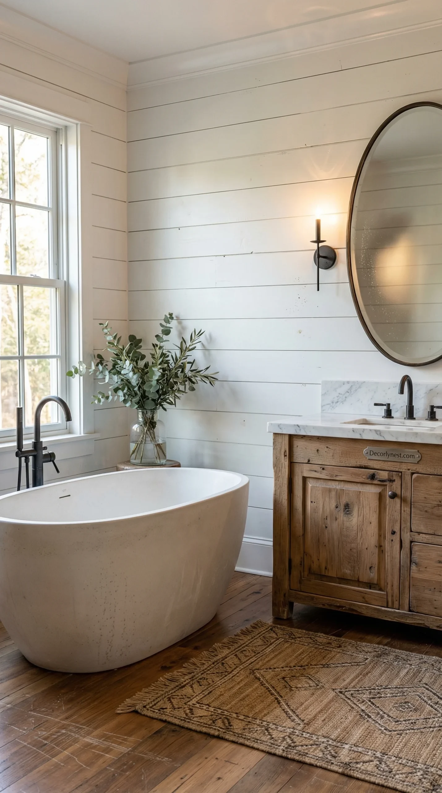
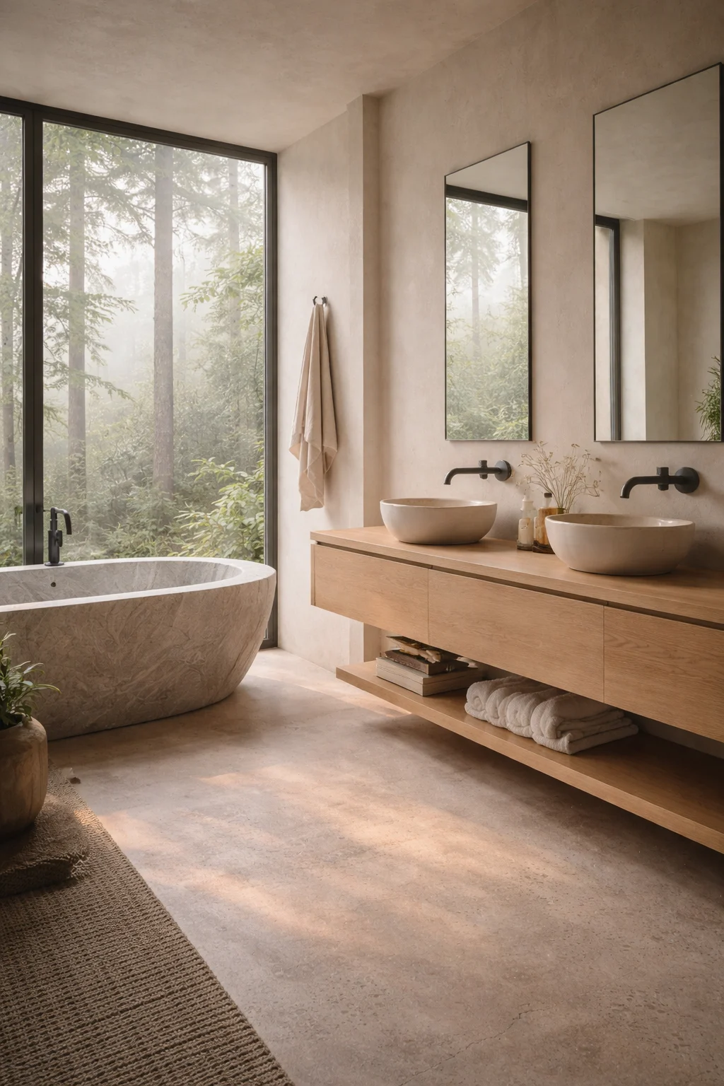
If I had to name the single biggest reason farmhouse bathrooms look so good in photos, it would be intentional contrast. Not the kind that feels random or busy, but the kind where each material has a reason for being there.
Think about what actually happens in a room when you place warm wood next to cool white tile. The white reads cleaner because the wood is next to it. The wood feels richer because the white is pulling it forward. Neither would look as good alone.
This is the engine behind almost every Pinterest-worthy farmhouse bathroom. Cool surfaces — tile, glass, painted walls — create clarity. Warm surfaces — wood vanities, wicker baskets, linen towels — stop the room from feeling clinical. When those two things are in balance, the space feels both polished and livable at the same time.
Black hardware plays a specific role here. Matte black faucets, shower frames, towel bars, and lighting fixtures act like punctuation marks. They create visual rhythm by repeating the same dark tone across different parts of the room.
How to Build This Contrast Layer by Layer
- Start with a neutral base — white, cream, or greige on walls and tile
- Introduce one warm wood element — a vanity, a stool, or open shelving
- Choose one metal finish for all hardware and commit to it throughout
- Add soft texture last — towels, baskets, or a small plant
📌 Pinterest Save: Modern farmhouse bathroom with wood vanity + matte black fixtures + white tile — the contrast formula that works every time. Save this!
2 • Shiplap Done Right: One Wall, Not Four
Shiplap is one of those farmhouse elements that people either use beautifully or overdo entirely. The difference usually comes down to how much of it is in the room.
When you cover all four walls with shiplap, the bathroom starts to feel like a theme park cabin rather than a home. But one wall of shiplap? That becomes an architectural moment. It gives the room texture and personality without turning into a statement about itself.
Vertical panels work particularly well in smaller bathrooms. They pull the eye upward, which tricks the brain into reading the ceiling as higher than it actually is. Horizontal panels tend to create a sense of calm and spaciousness — they read as settled rather than reaching.
White-painted shiplap is the most versatile choice because it keeps the room bright while still adding texture. Against that pale backdrop, black shower frames and dark fixtures stand out clearly. Then you layer in natural materials — a woven basket on the floor, a wooden stool beside the tub, folded linen towels — and suddenly the room has warmth without feeling heavy.
One thing I always tell people: paint the shiplap the same color as the surrounding walls. A lot of beginner mistakes come from treating shiplap as an accent, when the real magic happens when it blends in and the texture does the work quietly.
Shiplap Placement Tips.
- One accent wall behind the vanity is the sweet spot for most bathrooms
- Vertical orientation visually raises low ceilings — ideal for smaller spaces
- Paint it the same shade as surrounding walls for a seamless, elevated look
- Pair with matte black fixtures and at least one natural fiber accessory
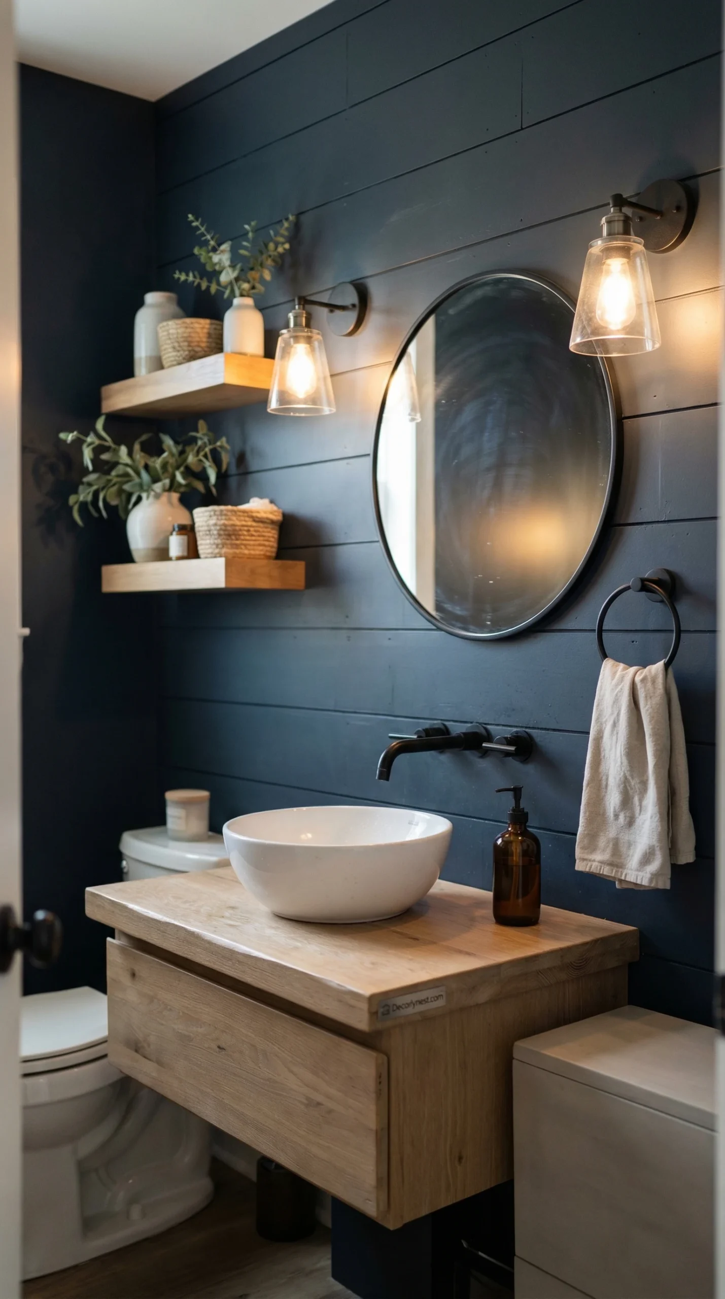
3 • Dark Paint in Small Bathrooms : Less Scary Than You Think
Most people’s instinct when dealing with a small bathroom is to keep everything light — pale walls, white fixtures, bright lighting. And that works fine. But dark paint in a powder room or small bath can do something unexpected: it makes the room feel intentional instead of just small.
Explore these backyard pool design ideas to instantly upgrade your outdoor space.
There’s a psychological shift that happens when you commit fully to a deep color. The room stops feeling like it’s apologizing for its size and starts feeling like a deliberate design choice. Deep forest greens, charcoal grays, moody navy blues — any of these can give a tiny bathroom a sense of luxury that white simply cannot achieve.
The key to making it work is contrast and light management. White wainscoting or shiplap running along the lower third of the wall stops the dark paint from feeling oppressive. A wood vanity in a warm honey or walnut tone pulls the eye away from the walls. And warm lighting — not cool white LEDs, but soft warm bulbs — prevents the room from reading like a cave.
Matte black fixtures are a natural pairing here. They echo the drama of the dark walls while keeping the farmhouse character intact. A round mirror with a simple black frame reflects light and opens up the wall without fighting the mood you’ve created.
Design Steps for a Moody Bathroom
- Use dark paint on upper walls — deep green, charcoal, or navy
- Add white trim or wainscoting on the lower third for balance
- Include one warm wood element to soften the palette
- Use warm-toned lighting bulbs — never cool white in dark rooms
📌 Pinterest Save: Dark moody powder room with deep green walls, white shiplap trim, wood vanity + matte black fixtures. Small bathroom, BIG personality. Pin this idea!
“The farmhouse bathrooms that stop you mid-scroll aren’t expensive. They’re considered. Every element earns its place.”
4 • Patterned Floors Add Character While Walls Stay Calm
Here is a design move that completely changed how I think about small bathrooms: put your personality on the floor, and let the walls breathe.
Patterned floor tile — black-and-white hex, cement-look geometric, classic encaustic patterns — adds visual movement to a room without crowding it. Because the pattern is underfoot, not at eye level, it creates interest without demanding attention every time you walk in.
This approach works especially well in farmhouse interiors because the classic patterns already feel rooted in history. They read as authentic rather than trendy. And when the walls above them are simple — white subway tile, painted plaster, bare plank — the floor gets to be the quiet showstopper.
Wood vanities are a reliable companion for patterned floors. The warmth of the grain softens the graphic energy of the tile below. Open shelving in the same wood tone keeps everything connected visually.
Floor Tile Pairings That Work
- Black-and-white hex tile + white subway walls + wood vanity = timeless
- Geometric cement tile + limewash walls + brass fixtures = warm and eclectic
- Classic penny tile + shiplap wall + matte black hardware = clean farmhouse
- Always use a simple grout color on patterned floors — let the tile do the talking.
5 • All-White Bathrooms Only Work When Texture Does the Heavy Lifting
An all-white bathroom can look stunning or completely sterile depending on one thing: how many different textures are in the room. When everything is the same smooth white — painted walls, ceramic tile, glossy fixtures — there’s nothing for the eye to land on. The room feels blank rather than peaceful.
But when you stack different whites and off-whites in different materials, something interesting happens. Shiplap reflects light differently than marble. Linen towels absorb it differently than ceramic tile. A wooden mirror frame sits differently against a painted wall than a chrome one does. All of those micro-differences create visual depth without adding color.
This is why texture is the most underrated tool in a neutral bathroom. You don’t need contrast in color if you have enough contrast in surface quality. Matte versus glossy. Rough versus smooth. Natural versus manufactured.
Wood accents are especially effective in white bathrooms. Even a single wooden element — a stool, a shelf, a small mirror frame — brings a warmth that no amount of white-on-white layering can replicate.
Creating a Calm White Bathroom
- Combine several white materials with different textures
- Add one warm wood accent — even a small shelf or stool counts
- Limit metallic finishes to one primary tone throughout the room
- Resist the urge to add color — let texture do the visual work
📌 Pinterest Save: All-white farmhouse bathroom that doesn’t feel cold — shiplap + marble + linen towels + one wood accent = texture magic. Save this idea!
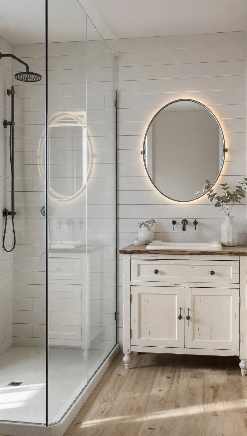
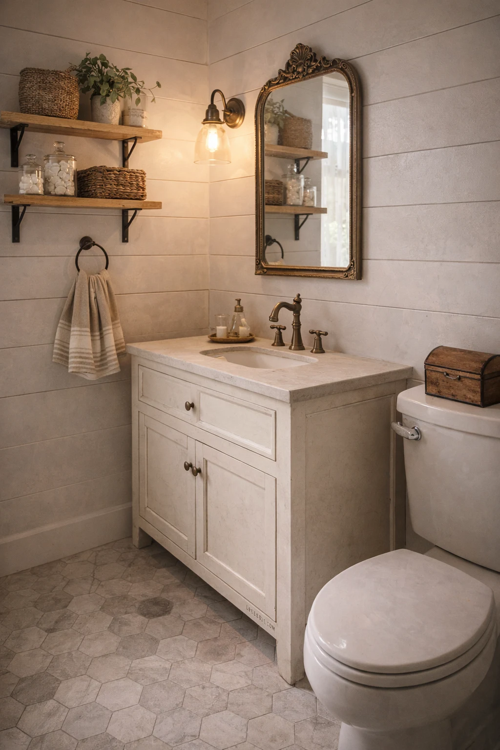
6 • Statement Vanity Can Do Most of the Design Work Itself
If you’re only going to invest in one thing in a farmhouse bathroom, make it the vanity. A strong vanity can carry an entire room — it sets the tone, anchors the palette, and tells you exactly what kind of bathroom you’re in before you even look at the walls.
Reclaimed wood vanities are especially powerful in this role. The visible grain, the natural imperfections, the sense that this piece has a history before it arrived in your bathroom — all of that adds character that no flat-pack cabinet can replicate. You don’t need to pair it with anything elaborate. White subway tile, simple wall sconces, and a round black-framed mirror are genuinely all you need when the vanity is doing its job.
Open shelving under the vanity is worth considering too, both for practical reasons and visual ones. Stacked towels, a small basket, even a few glass jars of soap and cotton balls — these items add a layer of lived-in warmth that styled bathrooms often lack.
Keep countertops clear or nearly clear when the vanity is a statement piece. Clutter above a beautiful vanity undermines everything the piece is trying to do. One soap dispenser, one small plant, maybe a candle — that’s the ceiling.
7 • Black and White Palettes That Feel Timeless, Not Trendy
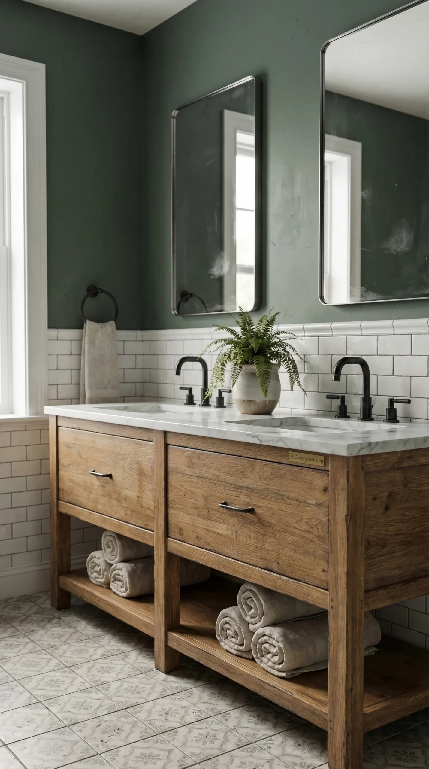
Black and white bathrooms have been around long enough to prove that they’re not a trend — they’re a classic. But there’s a difference between a black-and-white bathroom that feels sharp and intentional and one that feels like it hasn’t been updated since 2015.
The farmhouse version of this palette leans into contrast without going cold. A matte black vanity grounds the room. White walls and marble floors bounce light around and prevent the dark furniture from weighing the space down. Geometric floor tile adds movement without noise.
Round mirrors are one of those details that matter more than they seem to. In a bathroom full of straight lines — tile grids, cabinet edges, rectangular windows — a round mirror introduces a soft shape that gives the eye somewhere to rest.
Small brass or warm gold accents can finish off this palette beautifully. A soap dish, a hook, a towel ring — these tiny metallic details introduce warmth to what would otherwise be a monochrome space.
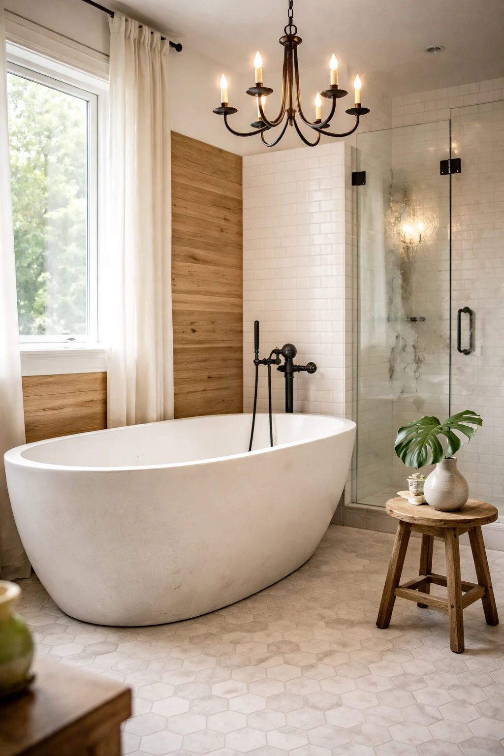
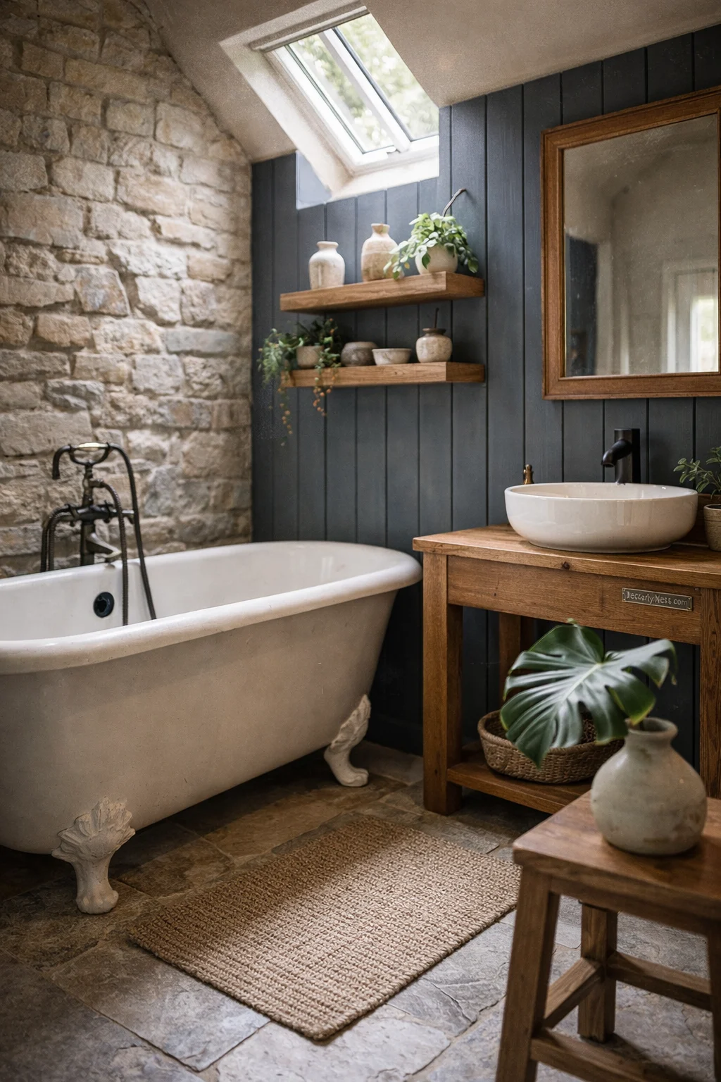
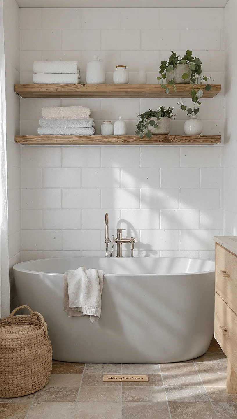
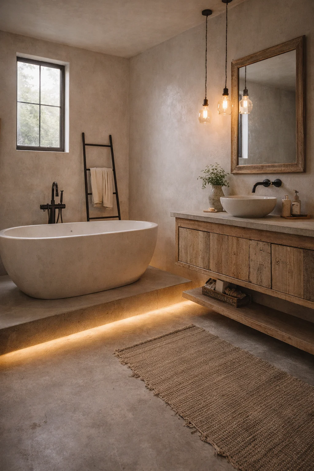
8 • Clawfoot Tub Doesn’t Need Company — It Needs Space
Few bathroom features photograph as beautifully as a clawfoot tub. There’s something about the sculptural shape — the curved lip, the exposed feet, the way the tub sits free from every wall — that reads as both historic and luxurious. It’s almost impossible to take a bad photo of one.
But here’s what most people get wrong when they install a clawfoot tub: they surround it with too much. Other statement pieces. Busy tile. Elaborate lighting. The tub doesn’t need any of that. What it needs is room to breathe.
Simple shiplap walls let the tub’s shape stay the visual anchor. Wood-look flooring or plain hex tile provides ground without competing. Black fixtures — a floor-mounted faucet, simple wall sconces — nod to the hardware without overshadowing the tub itself.
The restraint is the design. Everything in the room should essentially be saying: look at the tub. When that principle is followed, clawfoot tub bathrooms become the kind of spaces people save to Pinterest without quite knowing why.
📌 Pinterest Save: Farmhouse bathroom with clawfoot tub, shiplap walls, black fixtures + wood floors. The restraint IS the design. Save this for your dream bathroom board!
9 • Double Vanities: Symmetry Makes Shared Bathrooms Feel Calm
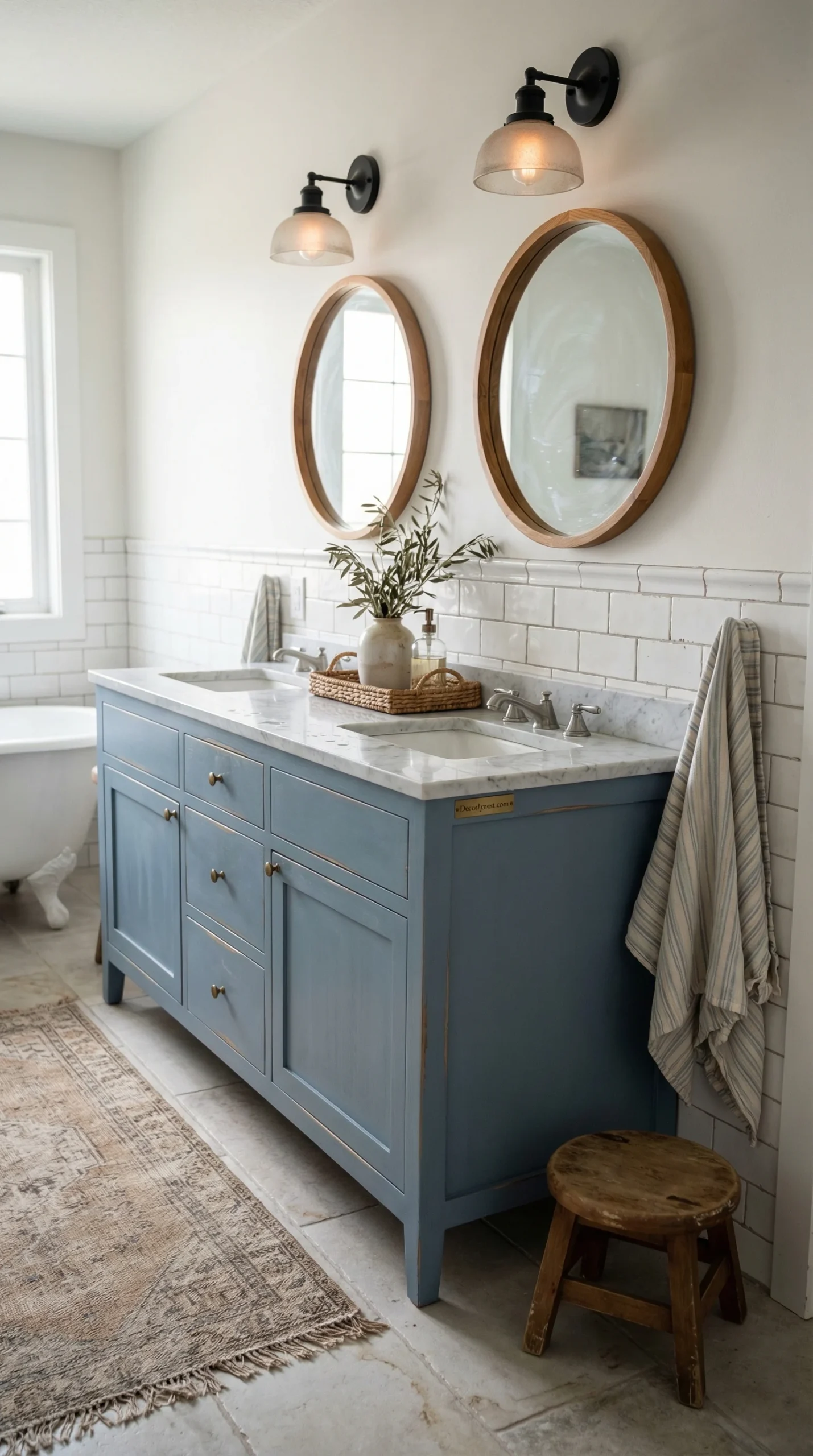
Shared bathrooms have a tendency to feel chaotic — two people, limited counter space, mismatched things accumulating on every surface. A double vanity helps on the practical side, but the way it’s designed determines whether it helps visually too.
Symmetry is the key principle. Identical mirrors above each sink. Matching sconces at the same height on both sides. The same hardware finish on every drawer and cabinet. When the two halves of the vanity mirror each other, the room’s eye naturally finds a center point, and the space settles into a feeling of order rather than competition.
Wood cabinetry in a double vanity works well because the warmth of the grain is generous enough to span a wider piece without looking flat. Marble or stone countertops stay bright and reflective, which keeps the room from feeling weighed down by the larger furniture footprint.
Keep the counter surface itself as clear as possible. Two sinks plus toiletries plus decor quickly becomes overwhelming. The vanity itself, when it’s beautiful and well-balanced, doesn’t need decoration on top of it.
Designing a Balanced Double Vanity
- Use identical mirrors and lighting on both sides — symmetry is everything
- Keep countertops relatively clear — one item per side maximum
- Choose cabinetry that visually connects both sinks into one unit
- Open shelving under each side gives personal storage while maintaining balance
10 • Dark Grout Transforms Subway Tile Without Changing a Single Tile
If you already have subway tile — or you’re planning to install it — this is one of those details that costs almost nothing but changes everything about how the room looks. Dark grout turns standard subway tile into something graphic and deliberate.
The grid becomes visible. Each tile reads as its own distinct element rather than blending into a flat white surface. The overall effect is more structured, more intentional, and — honestly — more interesting.
There’s also a practical benefit that nobody talks about enough: dark grout hides staining. In a bathroom that gets used every day, white grout requires constant attention to keep looking fresh. Dark grout simply doesn’t show the gradual discoloration that comes with moisture and daily use. It ages gracefully.
This combination — wood vanity, dark grout subway tile, matte black fixtures — is one of the most cohesive farmhouse looks you can build, and it works in bathrooms of any size.
11 • The Best Farmhouse Bathrooms Feel Like They Were Put Together Over Time
I keep coming back to this idea because I think it’s what separates farmhouse bathrooms that feel real from ones that feel like a showroom. The spaces that stop people mid-scroll aren’t perfect in an obvious way. They feel lived-in and specific in a way that a perfectly staged room never can.
That quality usually comes from restraint and patience. Instead of trying to complete the whole design in one pass, the best farmhouse bathrooms are built from a single anchor — the right vanity, a tile pattern you love, a tub that commands the room — and then gradually layered from there.
Wood introduces warmth. Tile and glass provide durability. Metal gives contrast and structure. When those three categories are represented in a room and kept in balance, the space takes care of itself. You stop noticing the individual elements and start just feeling comfortable in the room — which is the point.
The goal was never a bathroom that looks impressive in a photo. It was a space that feels good to be in every single morning. When those two things align, you get something genuinely worth saving to a Pinterest board.
Final Checklist Before You Start
- Choose one anchor element — vanity, tile, or tub — and build around it
- Pick one metal finish and use it on every fixture in the room
- Include at least one warm wood element, no matter how small
- Let texture do the work in neutral palettes — vary materials, not just colors
- Resist the urge to fill every surface — empty space is part of the design
You Might Also Like
Explore more bathroom styles with mid-century bathroom design and how to decorate a bathroom without overwhelming the space. Also love farmhouse style? See our farmhouse entryway ideas.