
Eight seconds. That is about how long it takes for a guest to get a full picture of your home when they walk in.
It is the quickest design brief in the house, and most people do not put enough thought, money, or style into it. A well-done farmhouse entryway does not call attention to itself. It just makes people slow down a bit, look around, and feel something they can not put into words right away. Warmth. Comfort. The feeling that someone lives here and cares.
This guide talks about nine different ways to set up an entryway, from full mudrooms to narrow console arrangements. It also gives styling tips and explains the design logic behind each one. It is much easier to make something work in your own space when you know why it works. Your space will never look exactly like a picture.
1. Cozy Mudroom Bench With Smart Storage — Function as the Starting Point
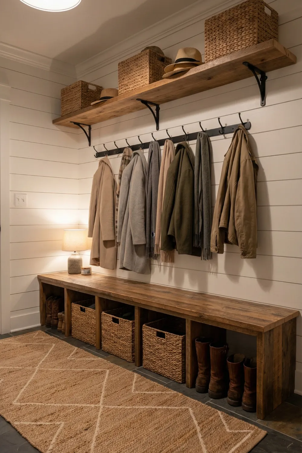
The mudroom bench entryway is the farmhouse design solution that takes into account a fact that most entryway styles don’t: real families are messy at the door. Shoes pile up. Coats move from hooks to chairs. Bags find their own flat surfaces. A mudroom that actually gets used is different from one that looks great in pictures but falls apart in a week because it was designed around this fact instead of ignoring it.
Closed storage at floor level is the most important structural choice in this format. Wicker baskets tucked under the bench hide the everyday mess—shoes, dog leads, reusable bags—while keeping the bench’s surface clear and calm. This is the same idea that makes built-in cabinets feel more relaxed than open shelving in a kitchen: the eye sees the organized outside, not the useful inside.
Material choices that create cohesion:
- Warm wood tones throughout (bench, shelf, hooks) create the material continuity that prevents the entryway from reading as assembled from separate purchases — even if it was
- Neutral textiles (a linen cushion on the bench, a textured runner rug underfoot) add softness without colour complexity
- A plaid or subtle pattern on one textile element — a cushion cover, a small throw — introduces the visual warmth that prevents an all-neutral palette from reading as cold
- Hooks positioned at a genuinely practical height (lower than most people’s instinct, roughly shoulder height rather than above-head) get used; hooks positioned for aesthetics alone get ignored and coats end up on chairs anyway
The rug is the grounding element that defines the entryway as a zone rather than just a corridor. Get the size right — it should extend beyond the bench on both sides and feel like it belongs to the space rather than floating in it.
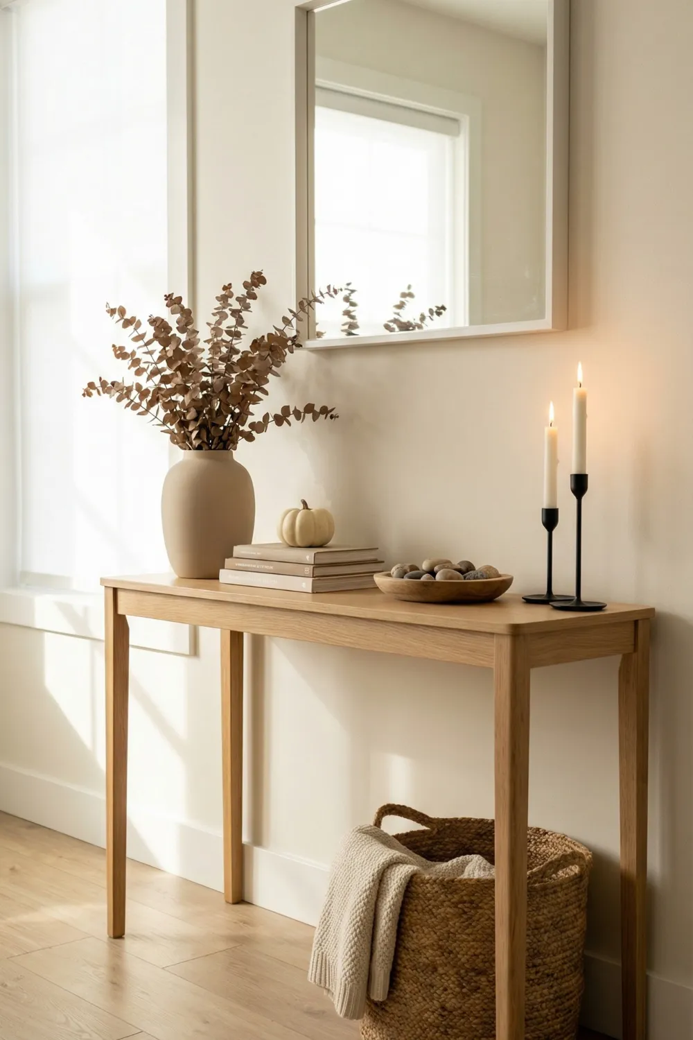
2. Welcome Console With Layered Lighting — Mood as the First Impression
Interior designers often use a console table with two lamps as an entryway. This is because two light sources at the same height on either side of a surface create bilateral visual balance, warm the space right away, and create a symmetrical focal point that looks planned as soon as someone opens the door.
It may not seem like it, but the lighting is doing a lot of design work. It is not just about brightness when you use two lamps instead of one. It is also about creating the layered, multi-source lighting that makes rooms feel designed instead of just lit up. An entryway with just one overhead light is institutional. Having two table lamps on either side of a console is cozy and homey. The change in mood is immediate and big.
Styling the console surface:
- Work in the rule of three: group objects in odd numbers and vary their heights — one tall element (a vase with branches or stems), one medium (a sculptural object, a small lantern), one low (a tray, a small book stack, a decorative bowl)
- The triangular composition created by varying heights — tallest at the back, descending toward the front — creates depth that flat, same-height arrangements cannot
- A meaningful object on the wall above (a framed print, a simple sign, a mirror) gives the eye a landing point and turns the console into a complete vignette rather than just a surface with objects on it
- A basket or woven tray below the console provides hidden storage and visual grounding — without something at the base, console tables can feel like they’re floating
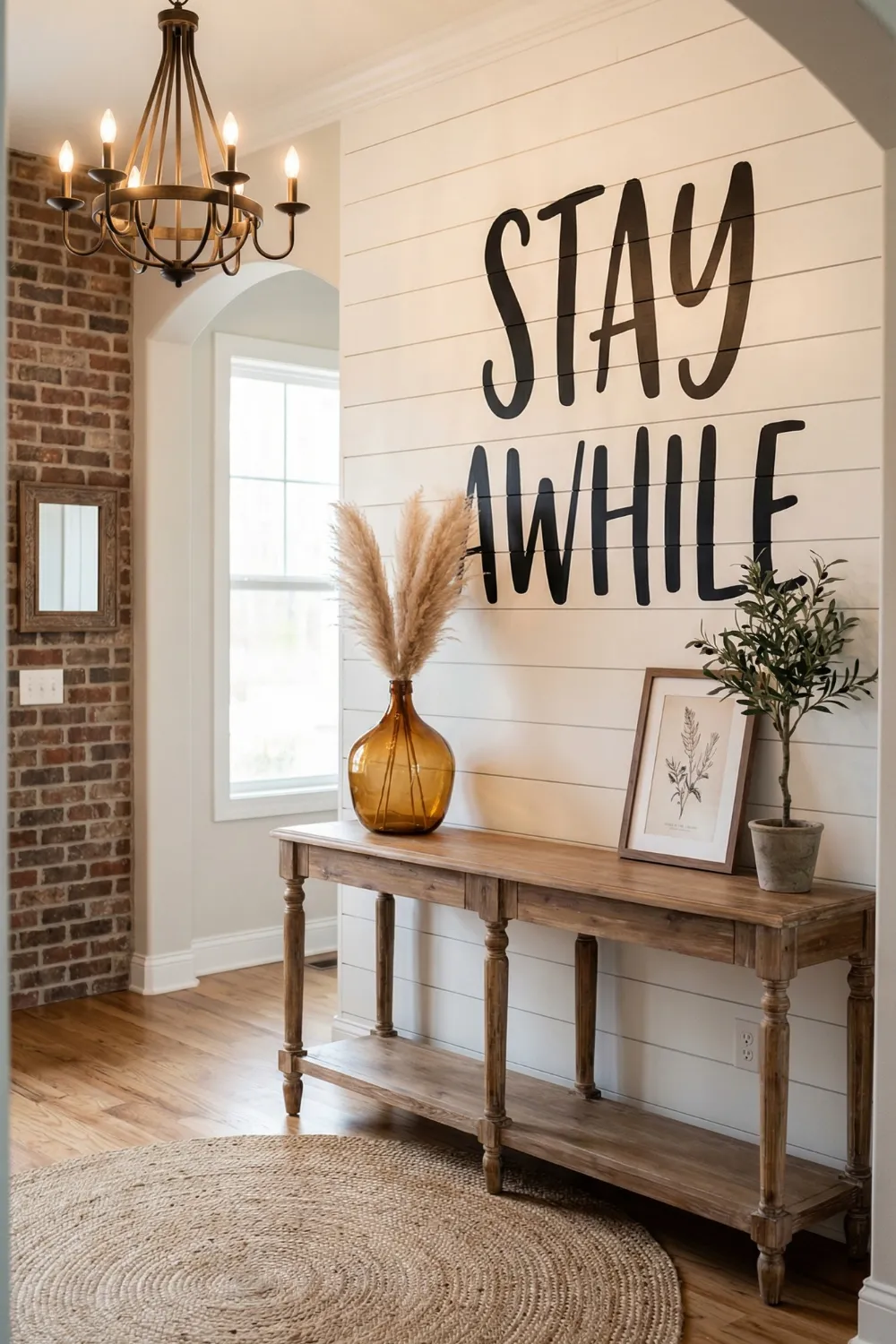
3. Personalized Bench Nook — Character as a Design Element
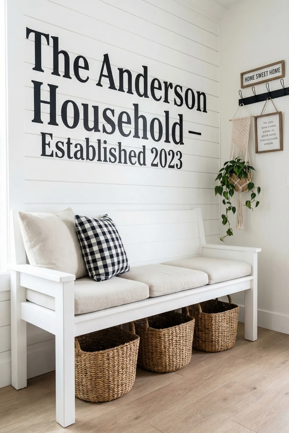
The personalized entryway bench nook is based on a principle that more formal design approaches sometimes miss: personality is a design element that has real aesthetic value, not just sentimental value. When a space shows something specific about the people who live there, like a name, a phrase that means something to them, or the way the letters are arranged, it creates an emotional connection that perfectly coordinated anonymous styling can not match.
You do not need a frame, a gallery wall installation, or a lot of money to make a big wall decal or painted typographic element like this work as statement art. The scale is what makes it work. At this size, the large text looks more like architecture than decoration, which is a whole different effect from small framed lettering.
The contrast and repetition logic:
- Black lettering, black hooks, and a plaid pattern with black — this is the same tone appearing in three different forms and scales, and the repetition is precisely what makes the arrangement read as designed rather than coincidental
- A white bench keeps the lower half of the composition light and open so the visual weight of the wall text doesn’t make the space feel heavy
- Woven baskets below the bench introduce a warm natural material that softens the graphic contrast of the typography and adds tactile richness
- One trailing plant — even a very small one — introduces organic life that breaks the geometry of straight lines and hard surfaces; its value to the composition is disproportionate to its size
4. Minimal Farmhouse Console With Clean Lines — Restraint as Sophistication
The minimal farmhouse console approach makes an argument that maximalist entryway styling often obscures: that a small number of genuinely beautiful objects given adequate space is more effective than a surface filled with many objects competing for attention. This is the “museum effect” — curate less, display better.
The console form matters here. Tapered legs in a light natural wood give the piece visual lightness — the eye can see under and through it, which prevents the furniture from visually dividing the entryway floor space in half. This matters more in narrow entries than anywhere else, where visual heaviness at floor level creates the impression of a corridor rather than a welcoming space.
The negative space principle applied:
- Limit the surface to three to five objects maximum — this is the number at which a grouping reads as curated rather than sparse or cluttered
- Vary the heights deliberately: one tall element (branches in a vessel, a tall lamp), one medium (a sculptural bowl, a small potted plant), one grounding low piece (a candle, a small stack of books)
- A basket or tray below the console is the one storage addition that doesn’t compromise the minimal aesthetic — it reads as intentional containment rather than overflow
- A mirror above the console is non-negotiable in a narrow entryway: it doubles perceived depth, bounces natural light toward the space, and creates the illusion of a window where none exists
5. Vintage Wall Plate Display With Console — The Collected-Over-Time Effect
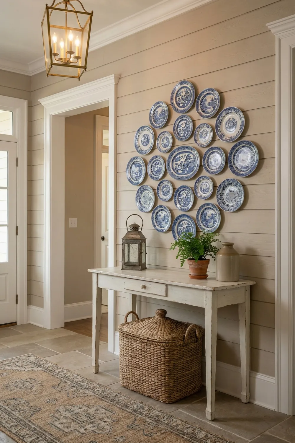
The plate gallery wall entryway works because it gives the impression of a home whose character grew slowly through real accumulation rather than a single shopping trip. This is something that modern styling rarely does. Plates that have been collected over time, whether from traveling, shopping, or inheriting them, tell a story that mass-produced wall art can not match.
Color palette unity is the design principle that keeps a plate arrangement from looking messy instead of organized. In a classic arrangement, blue and white are the main colors that all the plates share, even if the patterns on each plate are very different. The consistent color is what makes different things look like a collection instead of a random group.
Arranging a plate gallery:
- Plan the arrangement on the floor before any hardware goes into the wall — spacing, scale relationships, and compositional balance are all much easier to assess horizontally than they are when you’re holding a plate up to a wall and squinting
- Aim for a silhouette shape that has a clear visual logic — oval, rectangular, circular, symmetrical flanking — rather than arranging plates wherever they fit
- The console below should be visually lighter and simpler than the wall arrangement above it — this is not the surface for competing styling; a few simple objects at varying heights and one woven basket below is sufficient
- Two to three tones across the entire arrangement (plates, console, surface accessories) is the limit; beyond this, the vintage charm tips toward visual noise
6. Arched Mirror and Wood Console Pairing — The Classic Combination
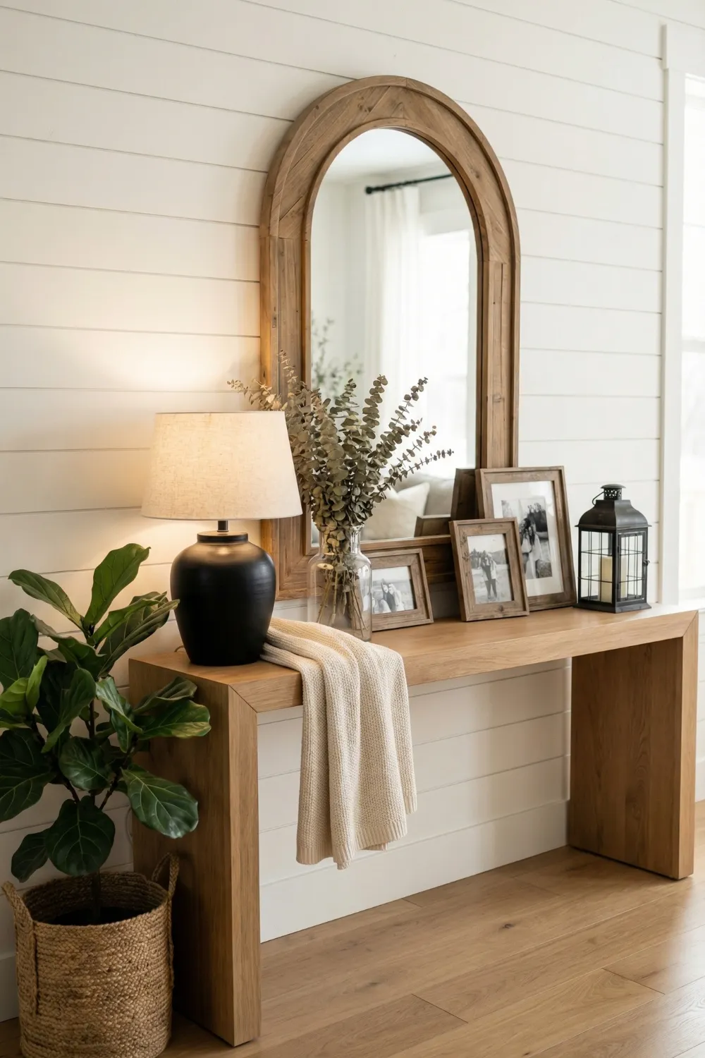
This is the main feature of the farmhouse entrance: a warm wood console table with an arched mirror above it. The combination has become popular because it works well in small and large spaces, narrow hallways and wide foyers, and takes good pictures from every angle.
The logic behind the design is simple and worth knowing. The arch of the mirror makes the eyes go up, which makes the ceiling look taller and gives the room a sense of vertical expansion that flat rectangular mirrors can not do. The console’s warm wood grounds the piece at the bottom. The tall-to-grounded visual rhythm they make together makes any vignette feel balanced.
Styling the console surface in this format:
- A tall lamp on one side (warm bulb, warm shade) introduces light and asymmetrical height
- A plant or botanical arrangement on the opposite side creates a natural counterweight to the lamp without being identical — organic asymmetry is more interesting than perfect mirroring
- A few low objects in the centre (a tray, a stack of books, a small decorative object) fill the middle zone without interrupting the sightline to the mirror above
- One contrasting finish — a matte black lamp base, a dark metal object, a darker wood tray — prevents the warm wood tones from reading as uniformly beige and adds the visual definition that makes the arrangement readable from across the room
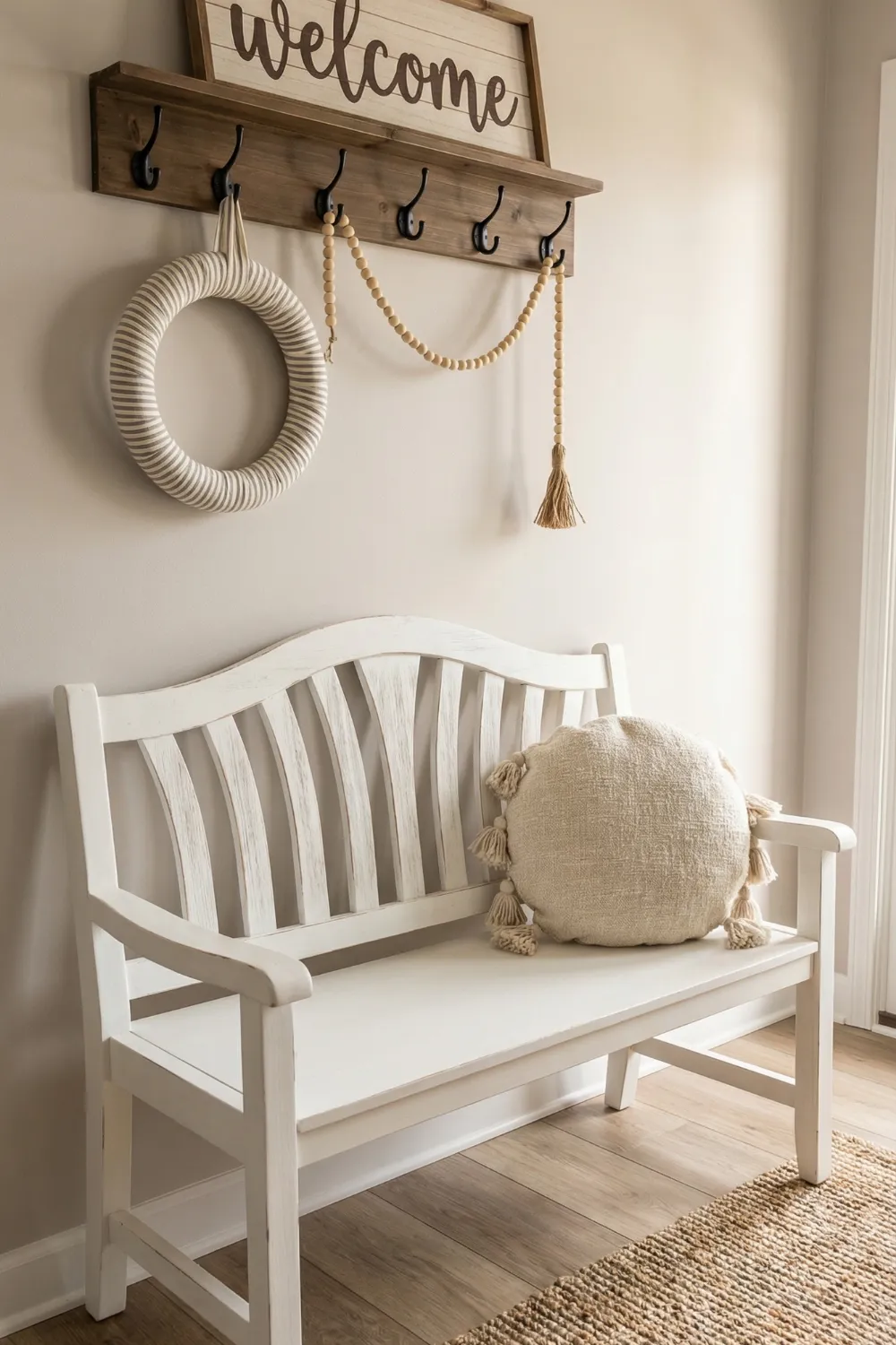
7. Wall Hooks and Welcome Sign Setup — Vertical Rhythm as Organisation

The wall hooks and welcome sign arrangement is the best way to use this collection: it organizes the entrance vertically, makes it easy to get to functional items like coats, bags, and keys, and creates a neat visual display all at the same time. This format makes the most of the design space when there is more wall space than floor space, which is the case in many small and urban homes.
The design principle used here is vertical rhythm. There is a sign or piece of art at the top, a shelf in the middle, and hooks at the bottom. These three things make a visual ladder that leads the eye down through the composition. This top-to-bottom movement feels natural and organized because it follows the order in which people really use the space: first, they see the welcome message, then they put things on the shelf, and finally, they hang their coat and bag below.
Layering materials for warmth:
- Wood brings warmth; metal adds structure and definition; woven baskets or a textile element soften both — this three-material combination is the reliable farmhouse formula that prevents any single material from dominating
- A striped or textured textile (a folded throw on a hook, a small linen hand towel, a plaid accent piece) introduces horizontal visual movement that contrasts with the vertical lines of the hooks and sign
- A small round rug at the base of the wall arrangement creates a defined landing zone and introduces a curved element that softens the geometry of the rectangular wall composition
- One plant — floor-level beside the rug, or hanging from the top hook position — anchors or crowns the arrangement with organic life that no decorative object can replicate
8. White Console With Gold Mirror Accent — Refined Farmhouse
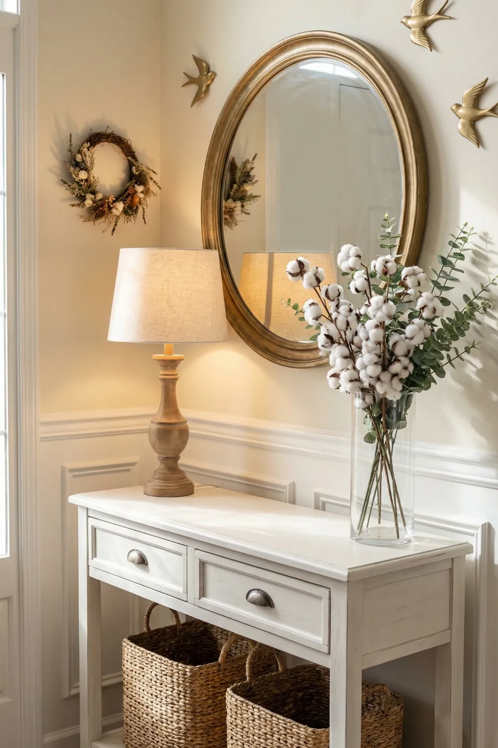
The combination of the white console and gold mirror fits into a certain part of the farmhouse style: the part that leans toward the refined, almost formal, “farmhouse chic” end of the spectrum. It is the right choice for homes where the inside is more polished and a purely rustic entryway would seem out of place.
Tone repetition across different scales is the design principle that makes it work. In the frame of the mirror, then in the base of the lamp, and maybe even in a small accessory, warm gold shows up. The repetition of three different sizes and shapes brings the whole composition together without making it look the same, which is what makes considered interior design different from a catalog page.
Shape contrast as a design tool:
- The round mirror above a rectangular console creates shape contrast that generates visual interest — without it, the pairing reads as uniform and slightly flat
- Curved decorative objects on the console surface (a round vase, a spherical decorative object, a rounded tray) reinforce the circular theme of the mirror and create compositional unity across vertical levels
- Soft neutrals throughout — cream, greige, warm white — allow the gold accents to read clearly; busier or darker surrounding tones compete with metallic finishes and diminish their impact
- Warm-toned bulbs are essential with gold mirror frames; cool-white bulbs shift gold toward brass-toned grey and eliminate the warmth that makes this combination work
9. Oversized Quote Wall With Narrow Console — Hierarchy and Soul
The large typographic wall treatment is the best way to get guests to feel something when they walk into the house. After all, that is the point of an entryway. The entryway has about ten seconds to set the emotional tone of the house before the living room, the kitchen, or any other room that “matters.” Almost any other design choice will not do this as directly or as memorably as large-scale text.
The clear hierarchy of elements in this format makes it work: the wall text is the most important part, and everything else is there to support it. The narrow console does not compete; it holds things in place. The things on its surface do not fight for attention; they sit quietly. The rug at the bottom marks the area. Every part knows what it needs to do and does it without going too far.
Executing this format well:
- The text content matters as much as the typographic execution — choose a phrase that feels genuinely true to the home rather than generically aspirational; authenticity reads in a way that appropriate sentiment doesn’t
- A single warm-toned accent on the console surface (an amber glass vessel, a terracotta pot, a honey-toned wood object) introduces colour warmth that prevents the arrangement from reading as monochromatic
- Relaxed asymmetry on the console surface — a framed piece leaned rather than hung, an object placed slightly off-centre — communicates ease rather than effort, which is the emotional quality the oversized quote is already establishing
- A round jute or natural fibre rug defines the entryway zone and provides the circular grounding element that softens the dominant rectangular geometry of the wall text
Design Principles Behind Every Farmhouse Entryway That Works
Nine different entryways, nine different aesthetic approaches, and the same underlying logic appearing consistently across all of them.
Every entryway needs one focal point.
A mirror, a typographic wall treatment, a plate gallery, a bold console — one element that the eye lands on immediately and returns to. Without a clear focal point, the eye wanders without resolution and the space reads as uncertain rather than composed.
Vertical thinking matters more in small spaces.
Entryways are typically narrow. The horizontal dimension is limited. Designing vertically — using the wall height, varying the levels at which objects appear, drawing the eye upward with mirrors and artwork — creates perceived spaciousness that no amount of horizontal reorganisation can achieve.
Natural materials are the warmth delivery mechanism.
Woven baskets, warm wood, linen textiles, terracotta, jute rugs — these materials communicate comfort before conscious thought. Their warmth is tactile and immediate in a way that paint colour and furniture form are not. In any farmhouse entryway, natural materials do the emotional heavy lifting.
Storage should be invisible from the primary sightline.
Baskets beneath consoles, hooks for coats at a comfortable reach, closed storage for shoes — all of these manage the practical reality of household life without it appearing in the designed view of the space. The entryway looks calm because the chaos has somewhere to go.
Lighting determines the emotional register.
Warm-toned artificial light in an entryway shifts the entire experience of arriving home. A single warm table lamp does more for the feeling of an entryway than any decorative addition. This is consistently the highest-return, lowest-effort change available in any entry.
Final Thought — The entryway is the house’s promise.
The story slowly unfolds in every other room of the house. The entryway has to set the tone right away, in the time it takes to close the door, take off a coat, and take two steps forward.
The farmhouse style is perfect for this challenge because its main ideas—warmth, honesty, natural materials, and comfort over perfection—are easy to understand. A warm lamp, a woven basket, an arched mirror, and a sign with meaning are all examples of decorative choices that do not need to be explained. They make you feel something before you even have time to think about what you are looking at.
The point is to feel that way. Make the entryway around it, and everything else in the house will feel more like it belongs.
Which idea for the entrance to your farmhouse works best? Leave a comment or save this guide for your next weekend of cleaning.