

There’s a specific feeling that a well-decorated summer room creates — and it has almost nothing to do with seashells or starfish.
When you walk into a room, you feel like you have to slow down right away. Shoulders go down. The light looks softer. It seems easier to breathe in the air. That answer is not random; it is the result of careful choices about natural light, the texture of the materials, the colors used, and how much space there is to breathe. When done right, summer room decor can even affect how your body works. It changes how your nervous system feels in a space.
Most summer decor advice is about things, like what to buy, what to add, and what seasonal accessory to switch out. This is the problem. This guide is more useful because it talks about the design principles that make a room feel like summer, no matter what specific pieces you use.
Table of Contents
- 1. Tropical Glow Bedroom Escape
- 2. Coastal Dresser Styling
- 3. Breezy Window Seat Nook
- 4. Sunlit Indoor-Outdoor Dining
- 5. Relaxed Coastal Bedroom Balance
- 6. Sunroom Lounge With Natural Rhythm
- 7. Botanical Cottage Living Room
- 8. Cheerful Summer Entryway
- 9. Playful Beach-Inspired Bedroom
- 10. Bright Eclectic Summer Living Space
- 11. The Design Principles Behind Every Summer Room That Works
- 12. FAQs
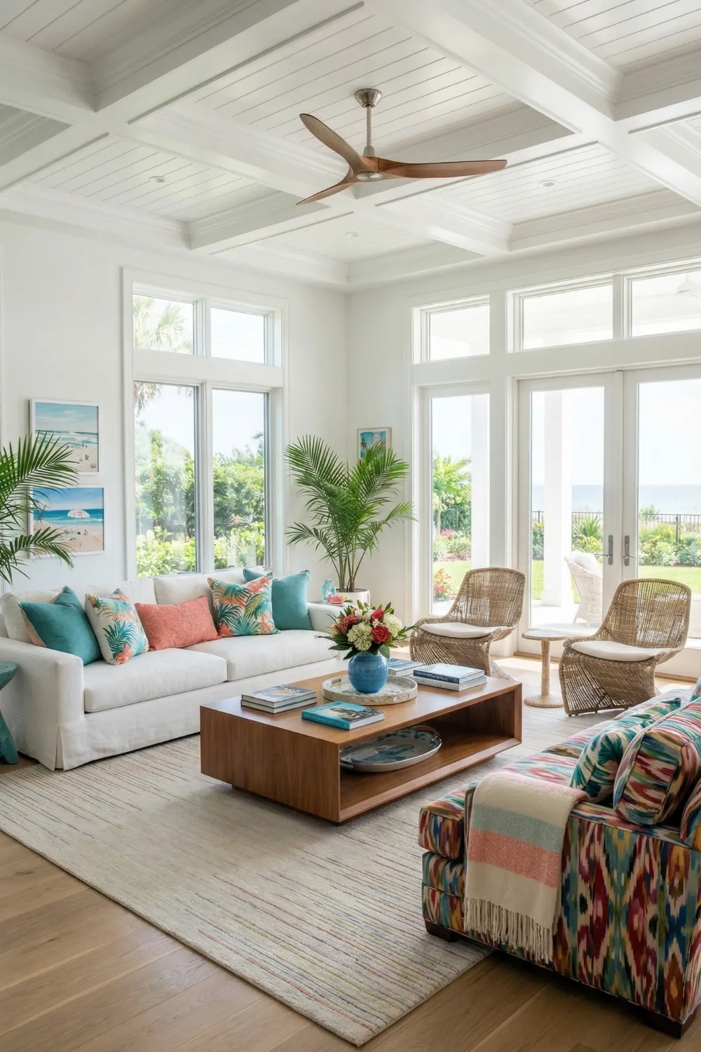
1. Tropical Glow Bedroom Escape — Layered Lighting as the Main Event
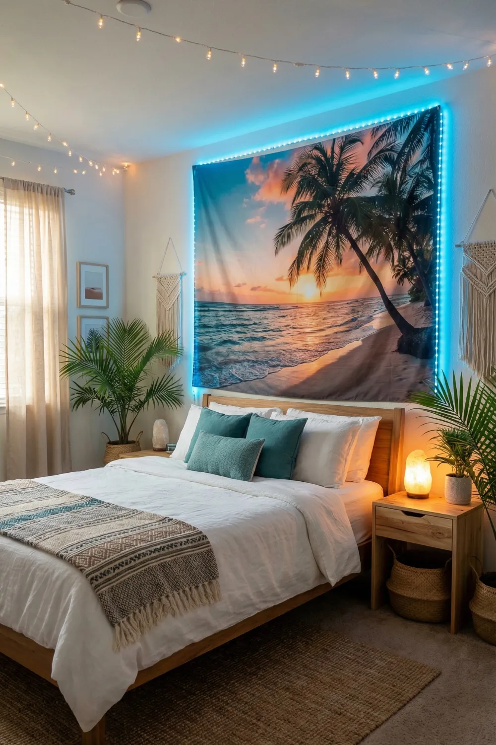
People often think that bedroom summer decor is all about what you put on the walls or the bed. It is really about how you light the room.
This tropical-themed bedroom works because it uses lighting in layers instead of just one overhead light. String lights on the ceiling make the room feel warm and cozy, like “golden hour” instead of “overhead fluorescent.” Fairy lights framing a large tapestry make a second light source that draws the eye and adds depth to the picture. Two lights at different heights make any room feel more real and planned.
The beach tapestry works as big anchor art, giving the room a seasonal look right away without having to completely change it. The palette discipline is what keeps it from going crazy: sand, aqua, palm green, and warm wood. That is four tones at the most. A limited color palette lets bold decor choices like tropical prints, fairy lights, and woven textures live together in harmony.
Recreating this without overdoing it:
- Keep bedding almost entirely neutral — white or natural linen — and let throw pillows carry the color
- Warm-toned bulbs only; cool white light kills tropical atmosphere instantly
- Woven baskets and jute textures counterbalance the visual intensity of the lights, keeping the room breathable despite its layers
The goal is a room that feels like a warm evening, not a hotel lobby with seasonal decorations.
2. Coastal Dresser Styling — When One Surface Does All the Work
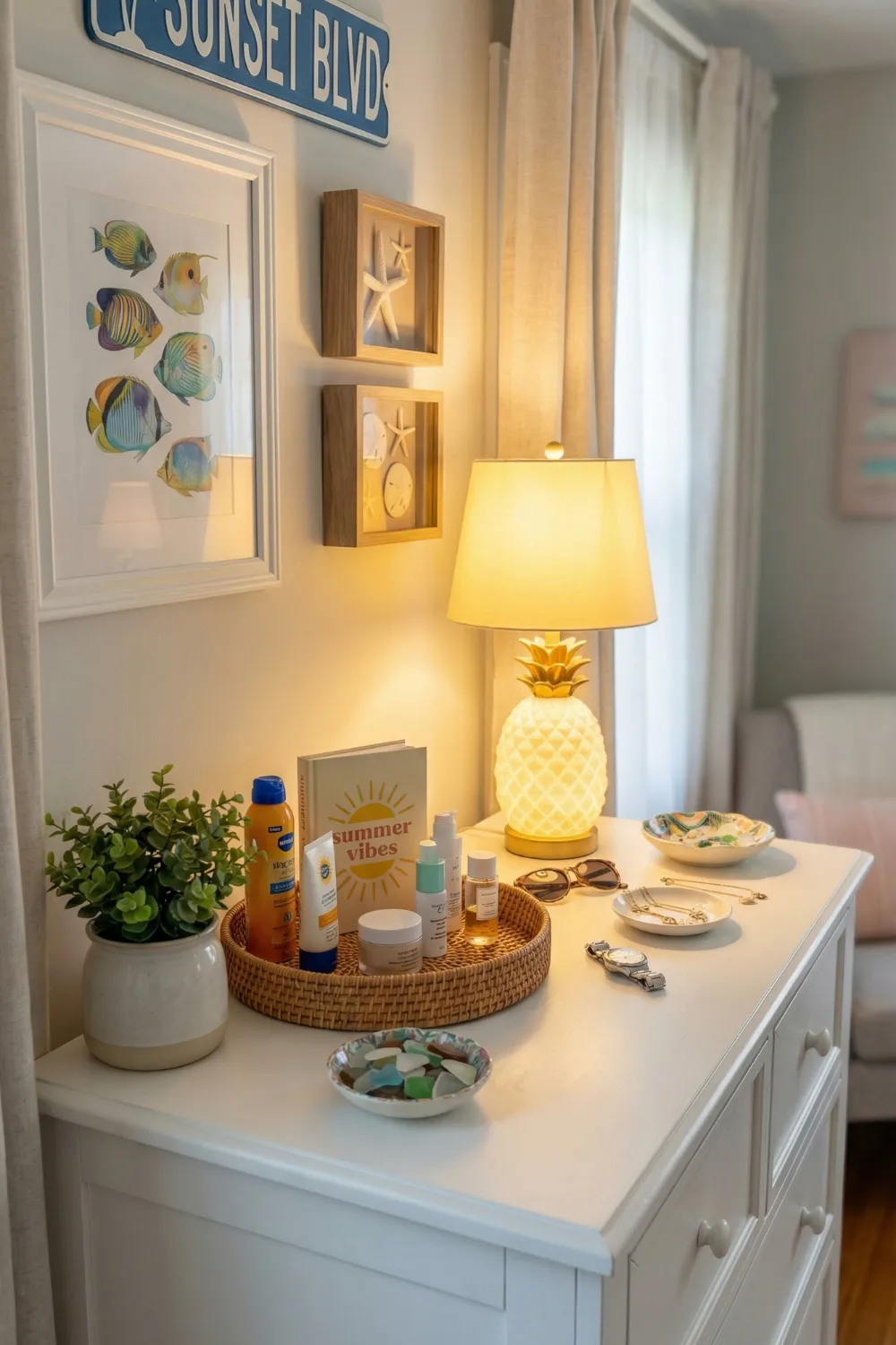
Not every summer refresh requires rethinking an entire room. Sometimes a single well-styled surface changes how the whole space reads — and a bedroom dresser is one of the highest-leverage surfaces in any room.
The idea behind this is intentional clustering. Instead of putting things all over the dresser, they are grouped by how they look and how heavy they are. A wicker tray keeps smaller pieces together so they look like one piece. One corner has a ceramic dish that holds it in place. A novelty lamp, like one shaped like a pineapple, gets its place because the other pieces are sturdy enough to hold it.
The color story is calm and coastal: soft white, ocean blue, sandy beige, and a touch of warm yellow. When the base palette is this simple, shapes that are fun or silly become cute instead of childish. There is space for the things to breathe.
The vertical dimension matters:
- Framed art or a small sign leaned against the wall lifts the eye upward and prevents the surface from feeling horizontal and flat
- Vary object heights deliberately: one tall piece, two medium, one low — this creates visual rhythm even in a small arrangement
- Keep functional items (keys, sunglasses, daily essentials) inside a single container so they count as one visual element rather than many
This kind of surface styling is also completely reversible — which matters for people who want summer energy without a permanent commitment.
3. Breezy Window Seat Nook — Designing Around Natural Light
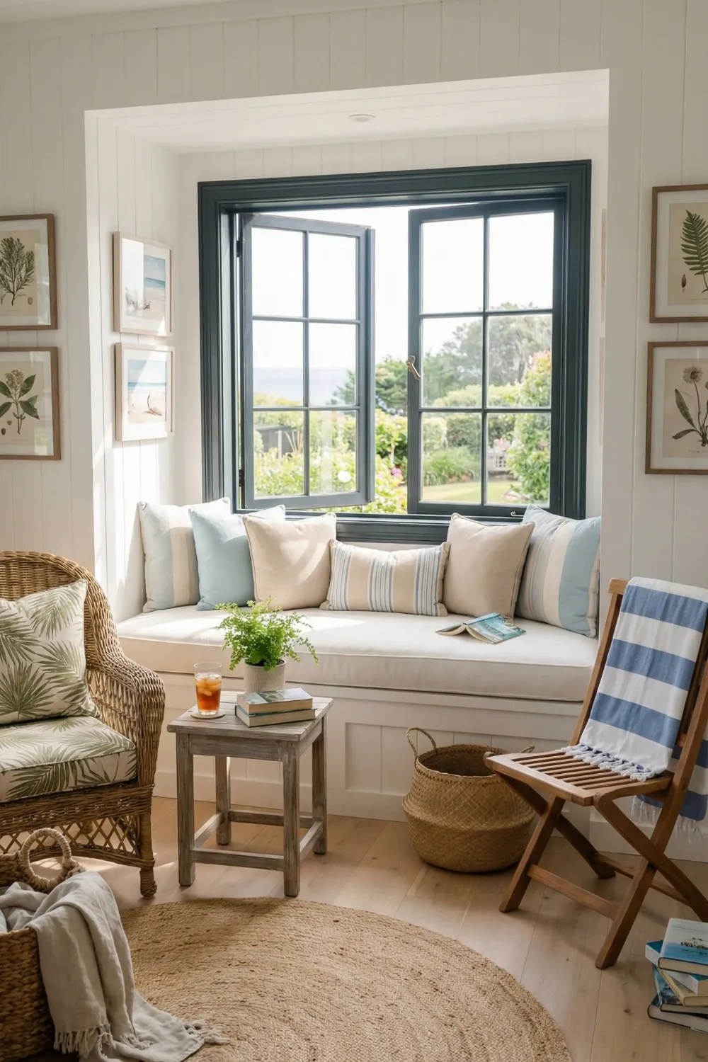
The most important rule for summer interior design is to let in as much natural light as possible and then decorate around how it changes your space.
When you turn a window seat into a destination instead of a storage bench, it goes from being useful furniture to the best thing in the room. The white-paneled walls around it make the light that comes in brighter by bouncing it around the room. This makes the whole room feel bright instead of just the area near the glass. This works better and costs a lot less than putting in more lights.
The way the chairs are arranged here makes sense for a conversation: they are angled slightly inward instead of being pushed flat against the walls. This makes the space feel like it was made for sitting and staying. People should be able to act in summer rooms, not just look at them. They should be able to have slow mornings, long conversations, and lazy afternoons.
Materials and palette choices:
- Natural fiber materials (rattan, jute, woven cotton) add warmth and texture without the visual weight of heavier upholstery — essential for rooms where airiness is the priority
- Repeat one muted accent tone (soft blue, sage, warm sand) across pillows, artwork, and small accessories — repetition is what makes a relaxed room feel designed rather than assembled randomly
- Skip heavy curtains entirely or replace them with lightweight linen panels that filter light rather than blocking it
The room should feel like a gentle breeze moved through it and arranged things pleasantly on the way out.
4. Sunlit Indoor-Outdoor Dining — Blurring the Line Intentionally
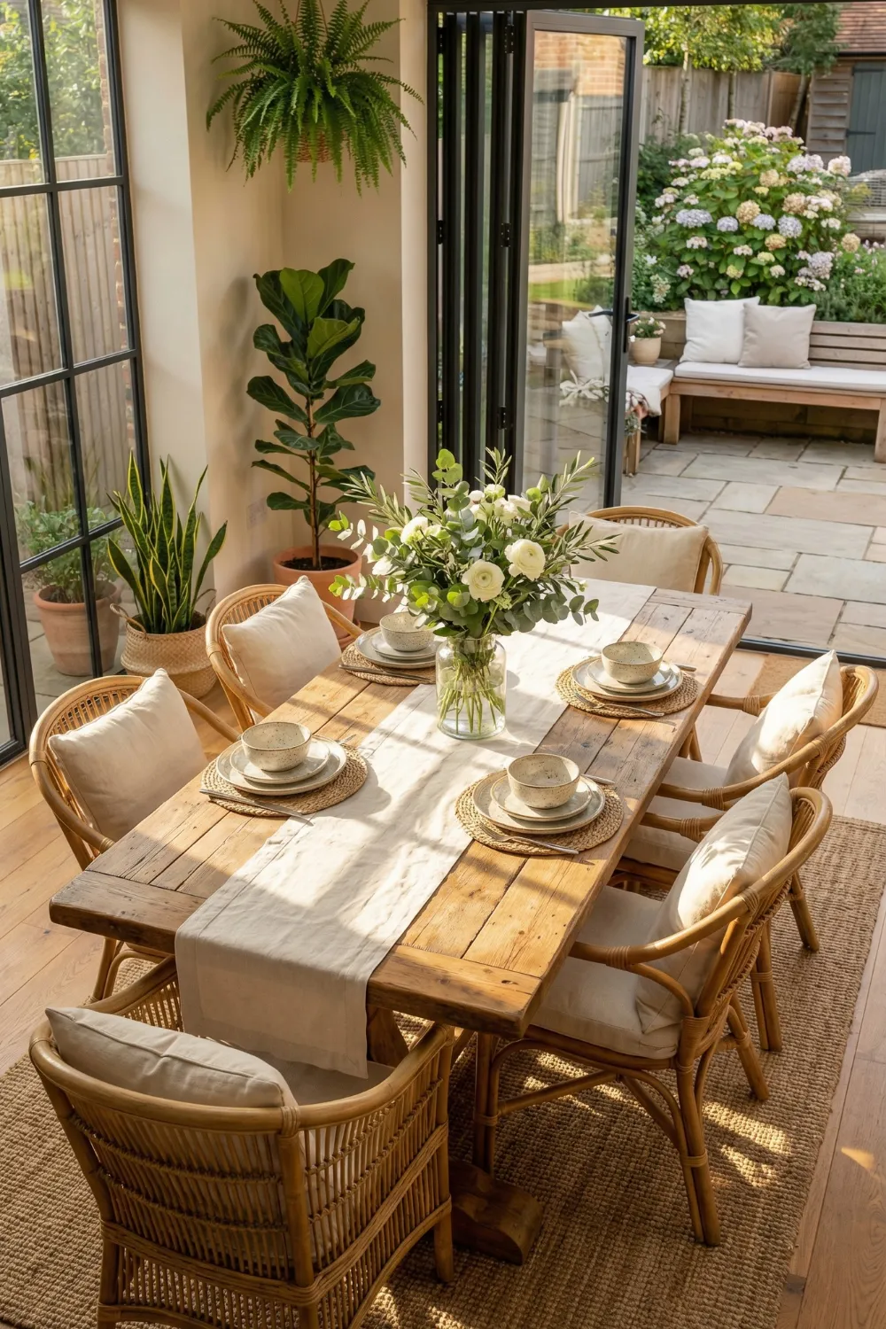
The best summer dining spaces do not feel like they are fully inside or outside; instead, they feel like they are somewhere in between. This is what makes them feel big and relaxed.
The design principle that does the most work here is visual continuity between the inside and outside. When the materials used for indoor furniture (like warm wood tones, natural fibers, and organic textures) are similar to what you can see outside (like plants in the garden, timber decking, and stone), the two spaces look like one big space. The room seems bigger, but its size does not change.
Table styling in summer dining areas should be simple. A linen runner, plain ceramic dishes, and one organic centerpiece, like wildflowers in a clay jug, a bowl of lemons, or a glass with a trailing vine cutting in it. Negative space on a dining table shows that you are relaxed and sure of yourself. Even if each piece is beautiful on its own, a table that is too full of things feels like work instead of inviting.
Vertical elements that open the room up:
- Hanging plants at varying heights draw the eye upward and replace the need for wall art in rooms with strong natural light
- Choose dining chairs that allow visual passage through them — open backs, woven seats, slim profiles — so sightlines remain uninterrupted and the room feels airy even when full of people
- Imperfect wood finishes, visible grain, and slightly mismatched pieces communicate ease; uniformly perfect furniture makes summer rooms feel formal in all the wrong ways
5. Relaxed Coastal Bedroom Balance — Softness Over Statement
When it tries too hard, the coastal bedroom look does not work. Rope accents, real starfish on every surface, and twelve shades of blue fighting for attention are what make a concept into a caricature. The one that works is a lot quieter.
This method is based on crisp white bedding. Pale blues and sandy neutrals can build on that clean base without being too much. The bed looks like it would be refreshing instead of too much of a theme. This soft contrast of clean white and two or three muted supporting tones gives off a summer vibe without forcing you to stick to a certain style.
The woven pendant light above is doing more than just lighting up the room. The bed frame below has straight horizontal lines, but this piece’s organic shape softens them. This creates a visual balance between geometry and nature that keeps the room from feeling too stiff or too casual.
Styling the bed itself:
- Work in a clear size hierarchy: large neutral Euro pillows at the back, standard pillows in front, two accent pillows in a complementary pattern at the front
- This layered structure looks intentional from across the room and takes less than two minutes to reset each morning
- Avoid too many patterns competing simultaneously — one patterned element per surface is a reliable rule that prevents visual fatigue
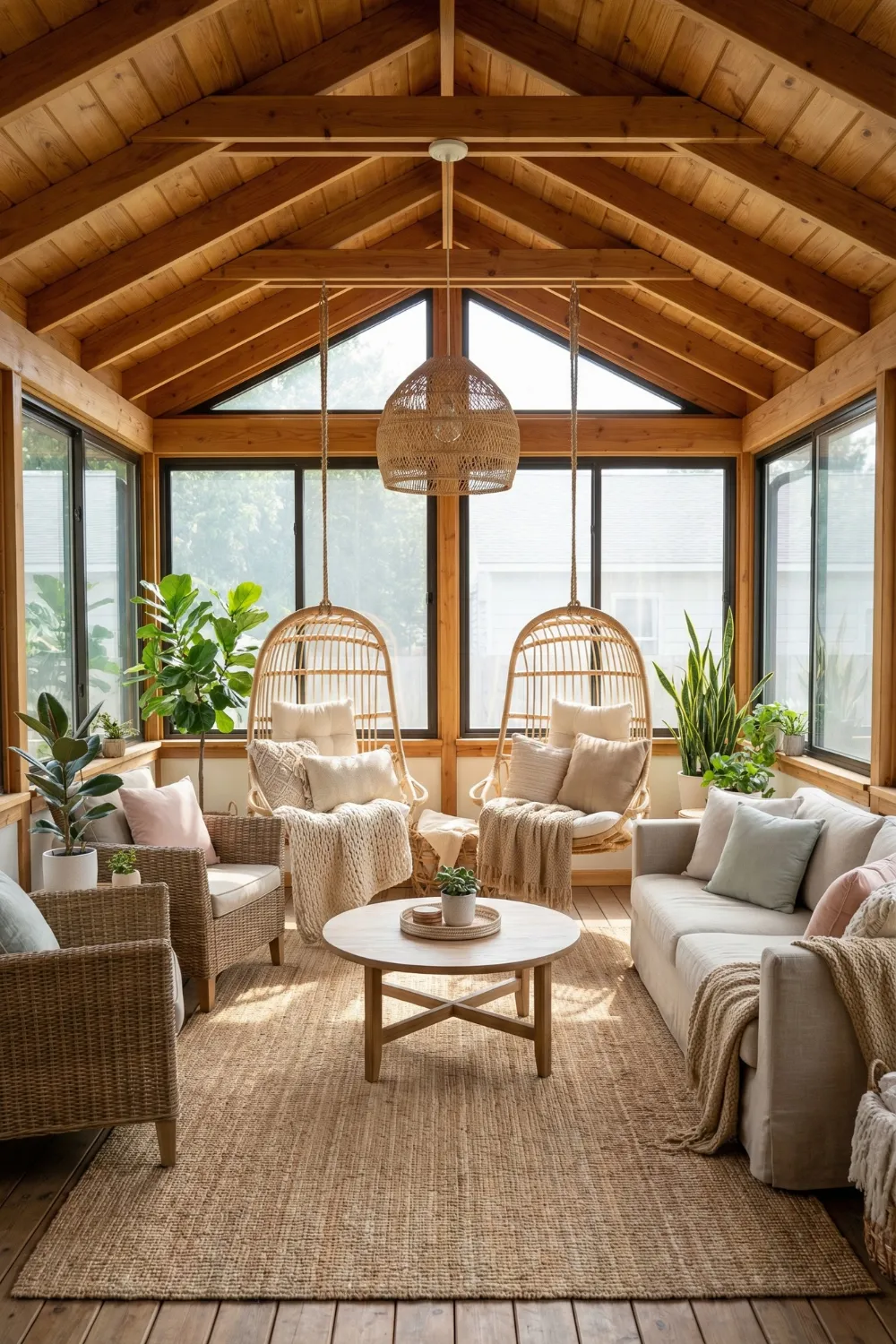
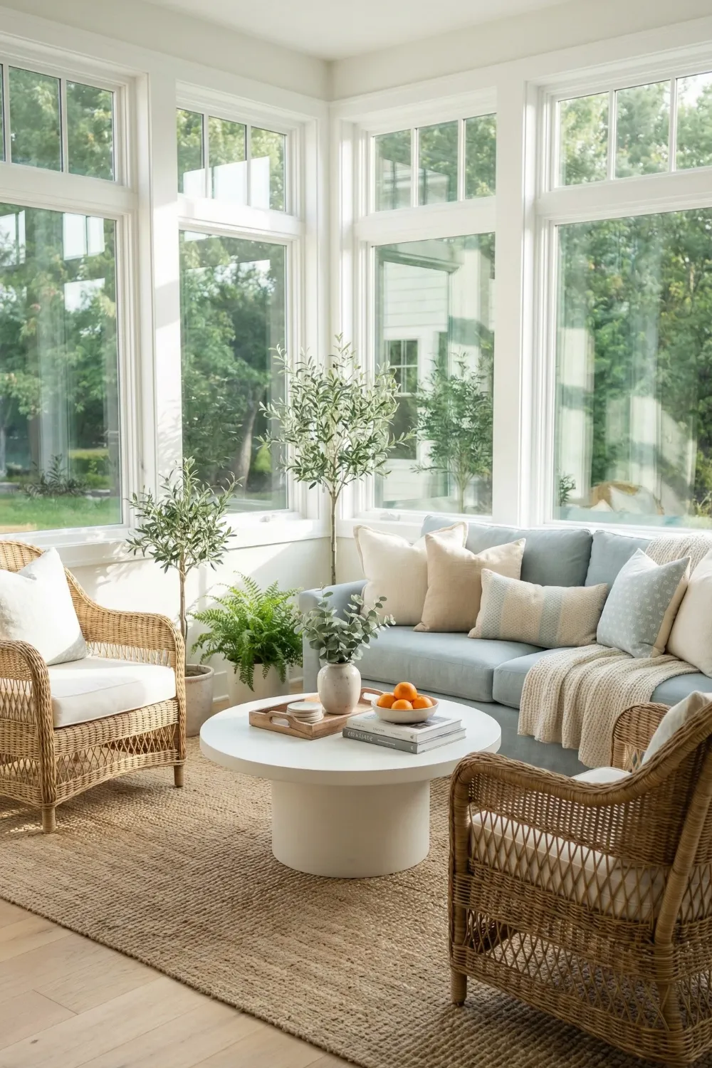
6. Sunroom Lounge With Natural Rhythm — When Architecture Does the Decorating
Some rooms need to be decorated to feel complete. Others need to step back and let the architecture breathe by adding decorations. This sunroom definitely fits into the second group.
An exposed wood ceiling is a great addition to a summer space. It adds warmth, texture, and character that no paint color or accessory can match. The design response is to support it instead of fight it. This is done with cream and blush upholstery, a jute rug, and woven pendant lights. Every material choice speaks the same relaxed, natural language, which makes the room feel like it all goes together without being formally decorated.
Hanging chairs are a smart choice here because they look good and serve a purpose. Even when someone is just changing positions, the way they move gently sends a message of lightness and relaxation. Static furniture, no matter how comfortable, looks heavier.
Layout principles for sunrooms:
- Keep furniture low and proportionally slim so it doesn’t interrupt the flow of natural light through the space
- Layer plants at three height levels: trailing plants at table height, mid-height potted plants on the floor, larger specimens or hanging plants overhead — this vertical distribution softens the architecture without adding visual clutter
- Choose pieces with open structures (woven sides, slim arms, visible legs) rather than fully upholstered or solid forms — negative space within the furniture itself contributes to the room’s overall airiness
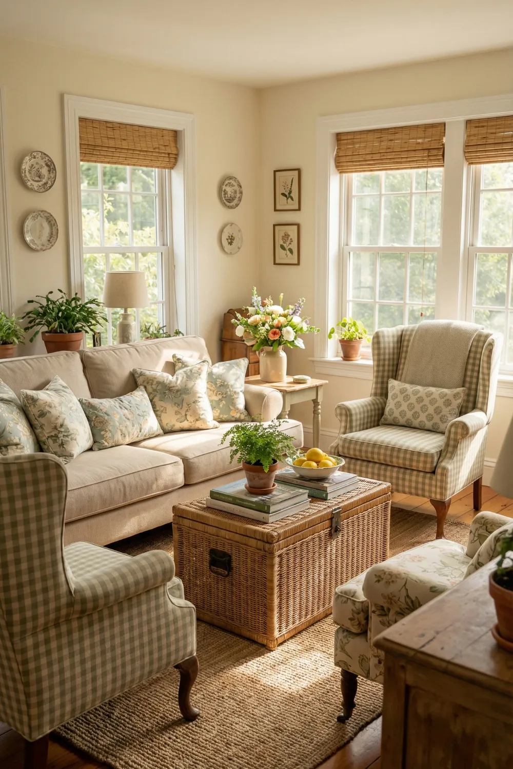
7. Botanical Cottage Living Room — Summer Without the Coast
There are many ways to design your home for summer, and coastal is just one of them. The botanical cottage style uses a completely different set of words to describe the same seasonal warmth. It focuses on plants, patterns, and the feeling of a garden that has moved inside.
The floral upholstery and leafy-print cushions work here because the colors underneath them are not too bright. These calm choices, like soft white walls, natural wood floors, and linen window shades that let light in but do not block it, give the more colorful botanical patterns room to breathe. It would be a mess if the walls were patterned, the upholstery was bright, and the accessories were fighting with each other. The discipline of the base is what makes the pattern’s personality seem charming.
The light filtering principle:
- Woven or natural-fiber window shades are one of the most underused tools in summer interior design — they transform harsh direct sunlight into the diffused, golden quality of light that actually feels like summer rather than glare
- Filtered light makes every material in the room look better: fabric colors deepen, textures become more visible, and the overall atmosphere softens considerably
- Position seating to face or be adjacent to filtered light sources rather than directly opposite them — this prevents harsh shadows on faces during social gatherings
Repeat one motif across scales: a floral print in a large sofa cushion, a smaller version in a decorative tray, a botanical illustration in a frame. This repetition across different sizes creates visual harmony without requiring everything to match.
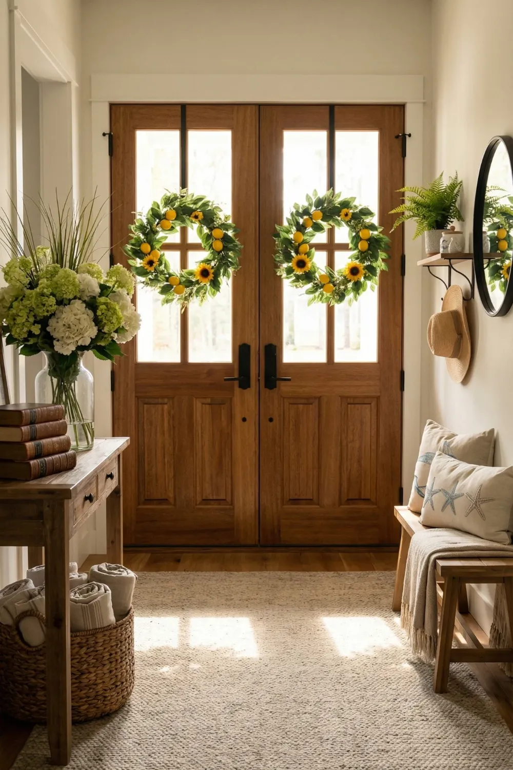
8. Cheerful Summer Entryway — The 8-Second First Impression
The entryway has about eight seconds to set the mood for the whole house. In the summer, that mood should be open, warm, and a little happy.
A new wreath with seasonal touches like citrus slices, wildflowers, and eucalyptus on the front door lets people know it is summer before they even step inside. Inside, the seasonal signaling is done through color and material instead of obvious themed objects. A light-colored natural fiber rug, warm wood tones, a simple wooden bench, and a couple of baskets for organization all come together to make a welcoming first impression that feels like summer without being too formal.
Controlled simplicity is the key to summer entryway style. This is a transitional space by nature, and it is easy to want to decorate it too much. Do not give in. One statement seasonal item, like a wreath, a bold arrangement of sunflowers in a crock, or a vintage mirror with a rope frame, looks much better when it is surrounded by neutral, useful things than six other decorative items.
Functional-meets-beautiful entryway logic:
- A basket, tray, or small bowl for daily essentials (keys, sunglasses, mail) prevents the entry from becoming a clutter accumulation zone that undermines the styling effort
- The rug should anchor the space visually without closing it in — natural fiber, light tone, and appropriately scaled to the entry’s width
- Greenery used sparingly and positioned deliberately (a single potted plant, one stem in a tall vase) feels intentional; greenery placed everywhere feels like a plant store
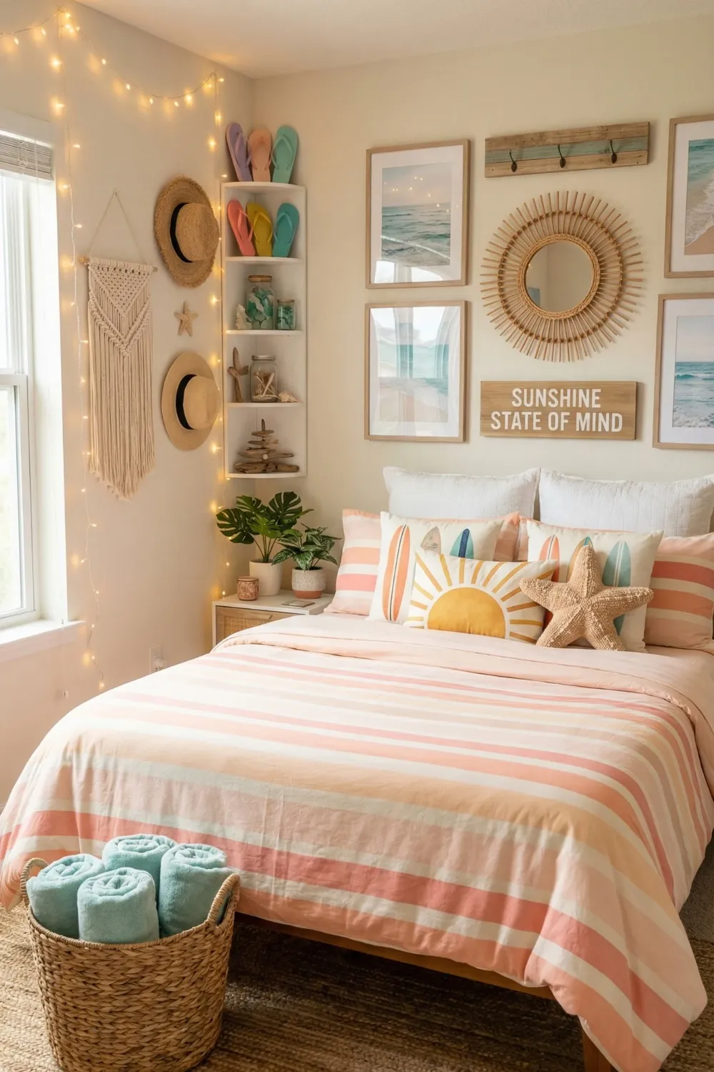
9. Playful Beach-Inspired Bedroom — Controlled Maximalism
The beach-inspired bedroom is one of the hardest summer aesthetics to execute well, because the distance between “playful and joyful” and “visually overwhelming” is surprisingly narrow.
Interior designers sometimes call the style that works “controlled maximalism.” It uses bright colors and strong patterns on top of a calm, neutral base that acts as a reset. White walls and white bedding are things you can not change. Peach, teal, and coral can come into the room through throw pillows, a statement rug, artwork, and decorative accessories without making the room too busy.
String lights in this room do the same thing they do in any summer bedroom: they replace harsh overhead light with a warm, ambient glow that makes the room feel like a long summer evening instead of a brightly lit room.
The vertical styling principle:
- Layering wall decor at multiple heights — a large piece at eye level, smaller pieces above, a shelf below — draws the eye upward and makes the room feel taller and airier than its actual ceiling height
- In small bedrooms especially, vertical visual interest is more effective than horizontal spread for creating a sense of spaciousness
- Choose one playful theme (ocean, tropical, vintage surf) and express it through two or three pieces at most — let the rest of the room provide contrast rather than reinforcement
The room should feel like a good mood, not a mood board.
10. Bright Eclectic Summer Living Space — Colour Without Chaos
To keep a colorful summer living room from feeling chaotic, you need a neutral canvas that is strong enough to hold anything you put on it.
The white walls and light natural flooring are what make everything else in this room possible. Because of this, turquoise, coral, and warm green can all be used together on pillows, a rug, artwork, and decorative plants without any one color being too strong. The colors come back, but not in a matching way. They come back like a musical theme does through variations. A little turquoise in a pillow, again in a ceramic pot, and again in a piece of framed art. That repetition makes things fit together without having to work together.
When arranging furniture, open sightlines are more important than symmetry. In summer rooms, layouts that let the eye move freely around the space are best. There should not be any big pieces blocking natural light or arrangements that make the room feel closed in.
Plants as connective tissue:
- In eclectic colour-forward rooms, plants perform a specific unifying role: their green tone appears in almost every colour palette, so they literally bridge the gap between different accent colours
- Position plants at the room’s edges and in corners to soften the architecture and tie the interior back to the outdoors visually
- Vary plant scale — one large-leafed statement plant plus several smaller ones — rather than using many identical small plants, which can read as repetitive rather than lush
The Design Principles Behind Every Summer Room That Works
Across ten different rooms and ten different aesthetic approaches, the same underlying principles appear consistently. These are worth understanding at the level of principle rather than specific styling choices — because principles travel across rooms, budgets, and aesthetics in ways that specific objects don’t.
Natural light leads; everything else follows.
The first question in any summer room is not “what should I add?” but “what is the light doing, and how do I work with it?” Maximizing natural light through reflective surfaces, sheer window treatments, and light-coloured walls creates the summer atmosphere that no amount of seasonal accessories can manufacture.
Breathable materials over heavy upholstery.
Rattan, linen, jute, unfinished wood, woven cotton — these materials communicate ease and warmth simultaneously. Dense, heavy upholstery in dark tones works against summer energy regardless of the colour palette surrounding it.
Restraint in colour, rhythm in texture.
Limit your active colour palette to three or four tones and repeat them across the room at different scales. Then use texture — woven, smooth, matte, soft — to add richness and variety without adding more colour. This combination creates rooms that feel layered and considered without feeling busy.
Design for behaviour, not aesthetics.
The best summer rooms are designed for how summer actually feels: slow, social, comfortable, and slightly unhurried. Furniture arranged for conversation. Lighting set for long evenings. Surfaces kept clear enough for spontaneous use. When the room supports summer behaviour, it naturally looks like a summer room.
Mood before objects.
Decide how the room should feel before deciding what to put in it. The feeling — breezy, tropical, coastal-calm, joyfully eclectic — is the brief. Every object, material, and colour choice that follows should pass the simple test: does this support that feeling, or does it work against it?


Pingback: 11 Cozy Cottagecore Living Room Ideas That Feel Warm & Lived-In (2026) - Decorly Nest | Modern Home Decor Ideas