
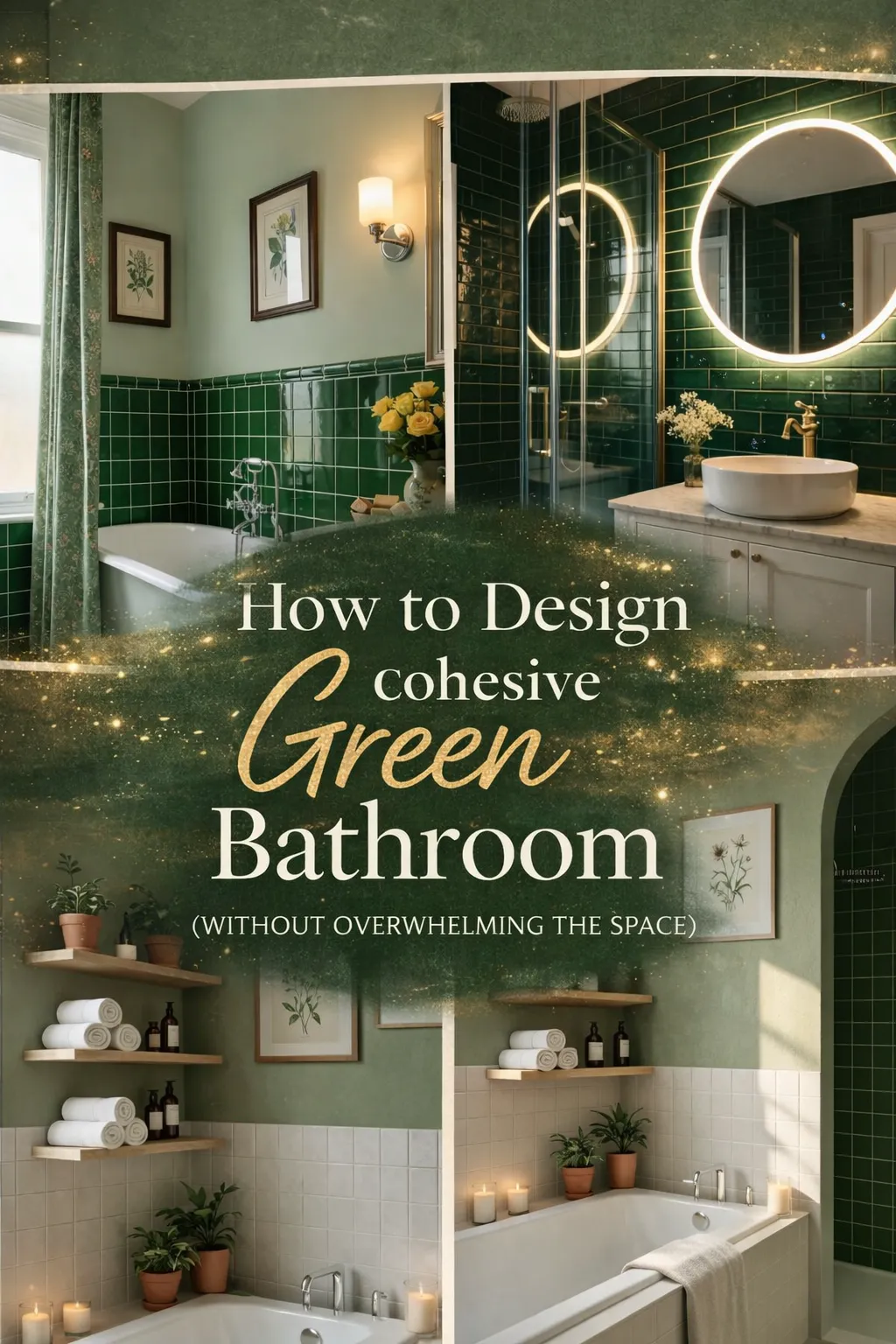
Green is having a moment in bathroom design — and unlike most trends, this one has staying power.
Designers keep reaching for it for a reason. Green is in the middle of calm and character. It connects indoor spaces to the outdoors in a way that almost no other color does, and it can make a bathroom feel like a destination instead of a utility room. Green goes well with any style of architecture and looks great with warm metals and natural wood. It also looks great with both bold and subtle colors, so you can choose the one that works best for you.
The problem is that green is one of the easiest colors to get wrong, which is why many green bathrooms do not work. A bathroom feels cramped when there is not enough contrast. There are too many colors that do not match, and it feels like it is not done. The wrong lighting can make the most beautiful tile look gray or cold. Choosing the right green is more than just picking a color.
This guide shows you ten real bathrooms, each one based on a different design principle that explains not only how the room looks but also why it works.
Table of Contents
- 1. Moody Botanical Shower With Textured Walls
- 2. Glam Green Tiles With Gold Accents
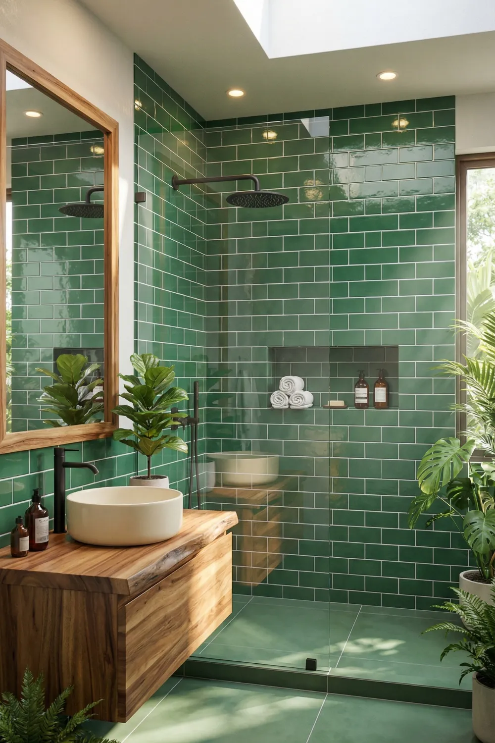
- 3. Minimalist Green Walk-In Shower With Skylight
- 4. Classic Green Paneling With Vintage Charm
- 5. Emerald Subway Tiles With Modern Gold Details
- 6. Rustic Green Vanity With Natural Textures
- 7. Soft Sage Shower With Spa-Like Freshness
- 8. Cottage-Style Green Bathroom With Retro Charm
- 9. Soft Green Walls With White Subway Tiles
- 10. Sunlit Green Tub Nook With Cozy Shelves
- 11. The Design Principles Behind Green Bathrooms That Work
- 12. FAQs
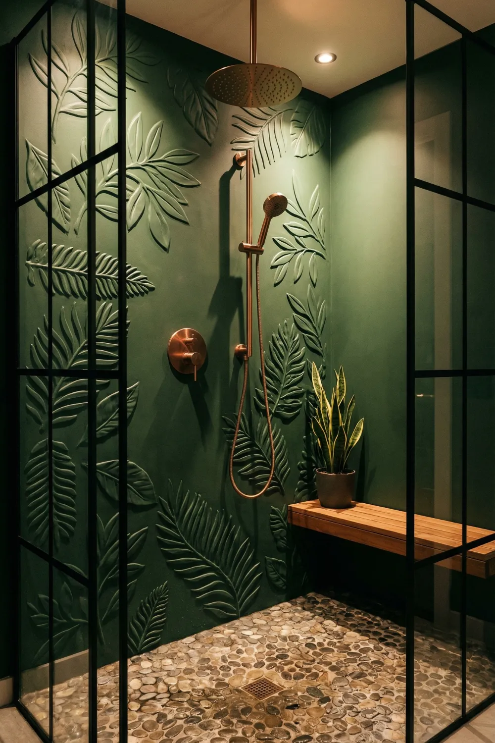
1. Moody Botanical Shower With Textured Walls — Depth as the Design Strategy
Texture is the only thing that matters for the most dramatic and deepest green bathrooms. If you have a small shower, flat deep-green paint can be too much. If you use the same depth of tone on a three-dimensional botanical wall, the room will absorb light in a way that feels rich and enveloping instead of heavy.
The 3D leaf texture makes little shadows on the wall. As the day goes on and the shadows move, the wall looks different. The fact that stone and brick walls have different surfaces instead of the same one is what makes them so interesting to look at. The green in the cracks gets darker, and the green on the raised relief gets lighter. This makes a range of tones from one tile.
What this works with:
- Textured matte green walls with smooth chrome or copper fixtures. The difference in surface quality makes both more visible and interesting.
- Pebble or natural stone flooring at the bottom keeps the botanical theme grounded without adding another pattern.
- With deep greens, warm-toned hardware like copper, rose gold, and brushed brass is a must. Cool chrome, on the other hand, looks clinical and takes the warmth out of the palette.
The last choice is the lighting. When you shine overhead spotlights on a textured wall, it has the same effect as gallery lighting on a sculpture: the shadows get deeper, the relief becomes more pronounced, and what might have looked like a simple tile surface becomes truly architectural.
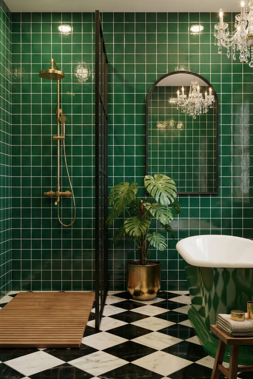
2. Glam Green Tiles With Gold Accents — The Logic of High Contrast
The emerald and gold bathroom is one of the most sure of itself design combinations. Confidence makes any room feel fancy, no matter how big or small it is or how much it costs.
The shiny emerald tiles are doing two things at once. The reflective surface bounces light around the room, which makes it seem bigger and brighter than it really is. The grid pattern gives the design a sense of rhythm and repetition, which is a design principle that makes things look neat and keeps a strong color from looking messy. Regular geometry makes colors look better.
The contrast works because of the gold fixtures. In the traditional color wheel, deep green and warm gold are next to each other in a way that makes both colors look richer. This is why emerald and gold have been a stylish pair in design for hundreds of years, from Georgian architecture to Art Deco interiors. It is not a fad; it is a real relationship.
Grounding a high-drama palette:
- A black-and-white patterned floor acts as a visual anchor that prevents the emerald walls from overwhelming the space — it introduces a neutral zone that gives the eye somewhere to rest
- A single plant in a metallic pot performs double duty: it softens the hard glossy surfaces and repeats the gold tone at a different height and scale
- Keep accessory finishes strictly consistent — mixing gold and chrome in a high-contrast room like this fragments the visual story immediately
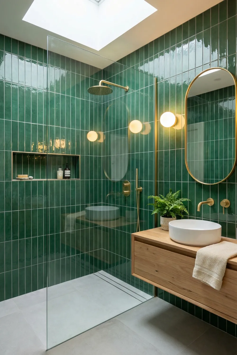
3. Minimalist Green Walk-In Shower With Skylight — Vertical Thinking
This bathroom knows something that a lot of green bathroom designs don’t: the way things are arranged is just as important as the color.
The green tiles on one wall of the shower make the ceiling look higher than it is by making it look like it is going up. This is not just a theory about how to decorate; it is the same optical principle that makes vertical stripes in fashion look taller. The eye follows tiles that go up, and the room looks bigger without any changes to the way it is built.
The white wall next to it makes the green feature wall stand out less and keeps it from taking over the whole room. This is a stylish and dependable pairing: one surface tells the color story and the other gives it a break. The room does not feel like one color; it feels balanced.
The natural light advantage:
- A skylight transforms green tiles more dramatically than any artificial light source — the way natural light shifts through the day means the tiles genuinely change character between morning and evening, which is one of the most underrated qualities of a well-lit green surface
- In the absence of a skylight, warm-toned LED sconces placed at eye level on either side of the vanity mirror replicate the quality of natural side-lighting more effectively than overhead fixtures
- A wood vanity introduces the organic warmth that prevents the combination of green and white from feeling clinical — even a single wooden element shifts the room from bathroom to retreat
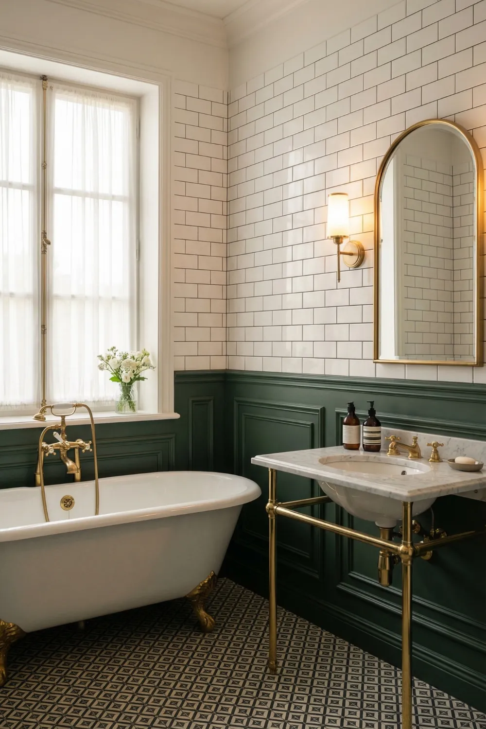
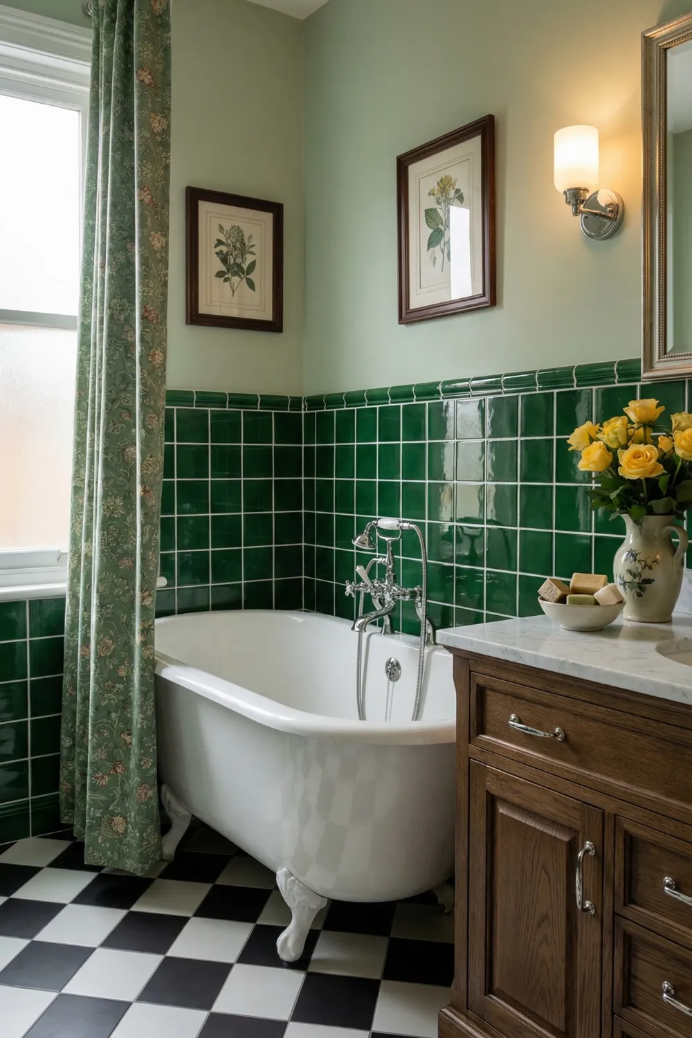
4. Classic Green Paneling With Vintage Charm — Architecture as Colour Delivery
Green does not have to live on tiles. When used on wall paneling, especially the lower-half wainscoting that has made bathrooms look classy for hundreds of years, it acts very differently. Paneling adds depth, shadow lines, and historical character to a room that flat painted or tiled walls can not match.
Structured contrast is the design principle at work here. The dark forest green on the lower panels gives the room a visual weight at the base, which makes the white upper walls and ceiling feel light by comparison. This top-light, bottom-grounded approach is similar to how well-designed rooms have always worked: heavy things should be on the floor and light things should be above.
In this case, a freestanding clawfoot tub is more than just a statement piece; it is a functional anchor that takes up the visual center and makes the drama of the surrounding colors make sense. A forest-green paneled bathroom could feel like a set without a lead character if it does not have a centerpiece this heavy.
Completing the palette:
- Forest green, crisp white, aged gold, and matte black is a colour combination with enough internal contrast to feel timeless — each element plays a distinct role and none compete
- A patterned encaustic floor introduces movement and prevents the room from feeling static; the busier the floor pattern, the simpler the walls need to be, and vice versa
- Framed botanical or vintage artwork on the white upper wall section ties the design narrative together without adding more colour
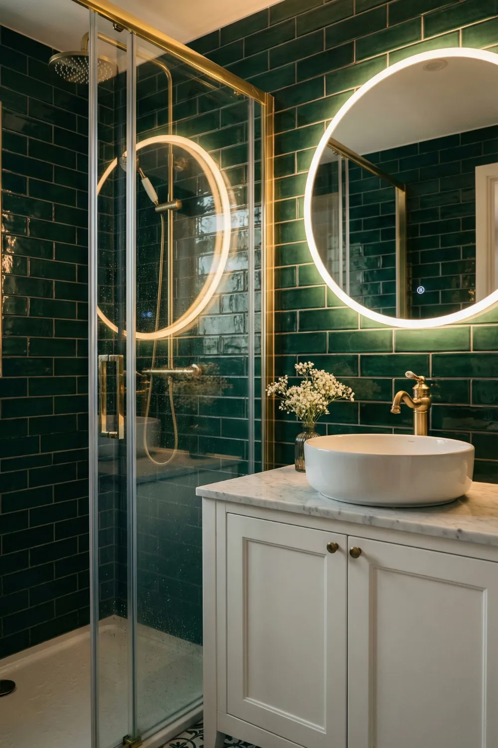
5. Emerald Subway Tiles With Modern Gold Details — Material Continuity as Polish
There is a certain quality that makes some bathrooms look like they were professionally designed and others look like they were put together. Material continuity is what designers call it. It is the intentional use of the same finish on several pieces so that the room looks like a whole instead of a bunch of separate purchases.
The shower enclosure frame, the wall-mounted taps, the mirror surround, and the light fixture all have gold in this bathroom. None of these things are the same size or shape, but they all have the same finish, which ties the room together in an invisible way. The effect is that the bathroom looks like it was designed from one point of view, which is what makes it look expensive.
The classic brick offset subway tile layout keeps the wall surface familiar enough to fade into the background and let the color and gold details take center stage. The backlit round mirror is the only thing that does something a little different. Its round shape adds a curve that softens all the straight tile grids and rectangular architectural lines, making the room feel less stiff.
The floor as the grounding moment:
- Patterned floor tiles in a room with strong wall colour perform an important visual function: they break up the saturation and give the eye a textural rest
- Choose a floor pattern that incorporates at least one tone from the wall colour — this creates a visual bridge between surfaces and prevents the floor from feeling disconnected
- Scale matters: smaller-scale floor patterns feel more traditional and detailed; larger-scale patterns feel more modern and architectural
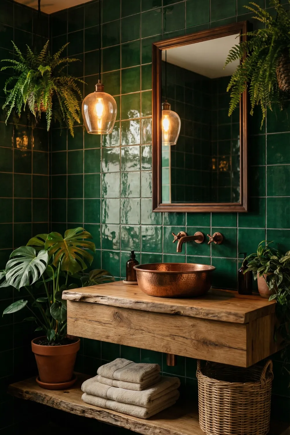
6. Rustic Green Vanity With Natural Textures — When Contrast Does the Heavy Lifting
The bathrooms that are most interesting to look at are rarely the ones that are the same. This example works because it puts materials in direct opposition to each other: the glossy depth of deep emerald tiles against the live-edge rawness of a natural wood vanity, and the industrial coolness of copper against the organic softness of cascading plants. What is next to each thing makes it more interesting.
This is how contrast theory works in real life. A raw-edge wooden vanity looks more interesting against smooth tile walls than it does against painted plasterboard. The deep emerald tiles look better next to unfinished wood than they do next to white cabinets. The difference makes both things stand out more and be more themselves.
The copper vessel sink as a pivot point:
- Copper reads warm against green in the same way that gold does — both add warmth that prevents the green from pulling cool or clinical
- A vessel sink positioned above the vanity surface (rather than undermount) adds height variation and gives the eye a vertical journey from counter level to eye level
- Multiple plant species layered together — large-leafed and small-leafed, upright and trailing — create botanical depth that a single plant cannot achieve; this is how you avoid the “one lonely plant” aesthetic
Globe pendant lights in warm amber glass are the right lighting choice for a room this richly textured — they diffuse light softly and warmly rather than directing it harshly, which allows the material textures to remain visible and attractive rather than being flattened by overhead glare.
7. Soft Sage Shower With Spa-Like Freshness — When Less Saturation Means More Versatility
Not every green bathroom needs to be dramatic. Soft sage is a warm, slightly desaturated color that sits somewhere between grey and green and warm cream. It may be the most versatile green for bathrooms because it works as a sophisticated neutral instead of a bold color.
The soft sage subway tile here does not make your bathroom look too clinical (because it leans warm instead of cool) or too busy (because its saturation is low enough to work with other things instead of overpowering them). It goes with almost every metal finish, wood tone, and color scheme that goes with it.
The Scandinavian spa formula:
- Matte black fixtures against soft sage provide crisp definition without the formality of gold — this is the more contemporary and slightly more casual approach to the same contrast principle
- Floating wooden ledges and a timber stool introduce warmth and the natural material layering that is central to Nordic bathroom design
- A ladder towel rack, positioned vertically against the wall, draws the eye upward — one of the simplest and least expensive tools for making a bathroom feel taller
- White mosaic floor tiles keep the base of the room light, preventing the sage walls from pulling the space downward visually
8. Cottage-Style Green Bathroom With Retro Charm — Tonal Contrast Within One Colour Family
One of the more sophisticated green bathroom techniques is using two different values of green — a deeper tone and a lighter tone from the same colour family — in the same room. When executed well, it creates layered depth and visual interest without introducing additional colours or competing palettes.
Here, deeper green tiles along the bathtub surround and a softer sage on the surrounding walls create a tonal contrast that feels harmonious because the colours are related, and interesting because they’re different. The eye registers variation without registering conflict. This is considerably more refined than a flat monochromatic application of a single green throughout.
Cottage bathroom elements that prevent monotony:
- A patterned shower curtain is an underrated tool for introducing visual movement into a bathroom that relies primarily on hard surfaces — the fabric softens the room and the pattern creates a focal point
- Diagonal floor tiling is a genuine spatial trick: the diagonal lines carry the eye outward toward the corners rather than straight across the short dimension, making narrow bathrooms feel measurably wider
- Mixing textures — glazed tile, painted wood, printed fabric, soft towelling — is fundamental to cottage style and what prevents the bathroom from feeling like a single material was repeated until the budget ran out
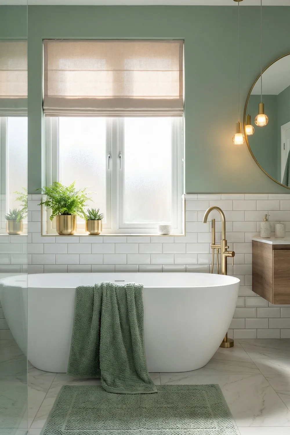
9. Soft Green Walls With White Subway Tiles — The Exhale Bathroom
There is a specific shade of sage — muted, warm, slightly grey — that reads less as a colour and more as a quality of light. It’s the shade that makes you feel like the room itself is relaxed. This is the bathroom equivalent of a deep breath.
The pairing with classic white subway tiles is one of the most reliable in bathroom design. White subway tiles provide structure, historical character, and contrast without competing. The result is a palette with clear foreground (the white tile) and clear background (the sage wall) — a distinction that gives the room visual order and makes it feel larger than it is.
The warm metal difference:
- Brushed brass or antique gold fixtures against sage green reads unmistakably warmer and friendlier than chrome would in the same space — the warmth in the metal activates the warmth in the green, while chrome would pull the sage toward grey
- A marble or stone floor that incorporates both white and soft grey veining echoes the bathroom’s full palette in a single surface and ties the room together through natural colour repetition
- Plants positioned at the top of the bathtub or on a high shelf provide upward visual movement that counterbalances the horizontal weight of the tile work below
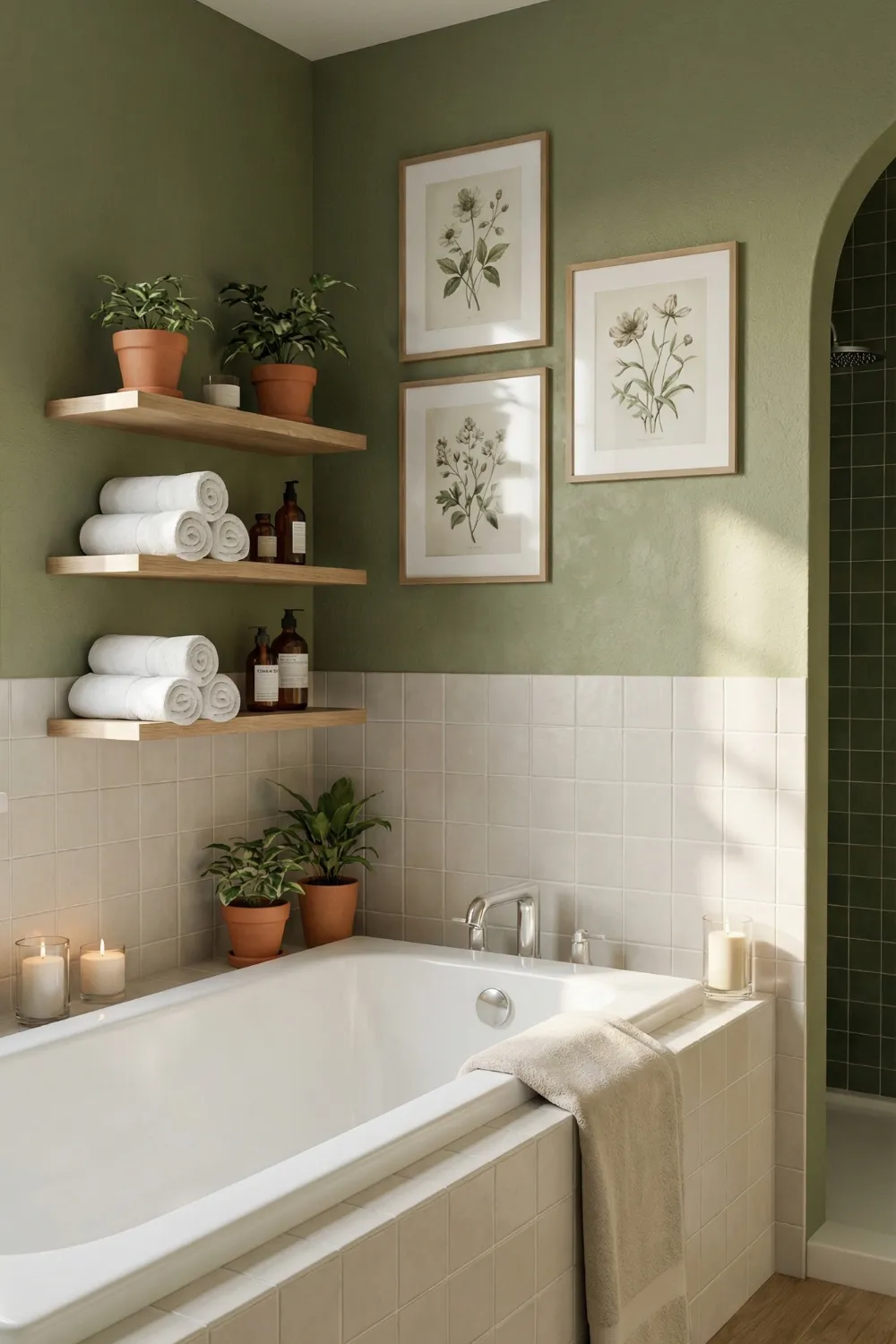
10. Sunlit Green Tub Nook With Cozy Shelves — Warmth as the Design Goal
This bathroom’s main goal is to make you feel good when you are in it. It is not how it looks in pictures or how many design rules it follows, but how good it feels to use the room. That priority is clear in every choice.
Soft, painterly green walls with subtle tonal variation—the kind that comes from paint that has visible brush or roller marks instead of being flat and uniform—give the impression of warmth and texture that solid color can’t. The flaw is intentional. It gives the room a hand-made, personal, and slightly worn-in look that formal perfection never does.
Cream square tiles around the bathtub add a warm neutral color that keeps the green from feeling too heavy. The tiles also give the bathroom a retro geometric look that has been popular for more than a century.
Shelf styling and the echo principle:
- Botanical artwork on the wall echoes the green palette through imagery rather than additional painted or tiled surface — this is how you reinforce a colour story without extending it further than the room can comfortably carry
- Symmetrically styled shelves (matching towel stacks, paired terracotta pots, centred artwork) create a composed quality that reads as intentional without feeling formal
- Candles, diffusers, and natural accessories at bath level complete the sensory environment — a well-designed bathroom engages more than just sight
The Design Principles Behind Green Bathrooms That Work
Across ten different rooms and approaches, a consistent set of principles distinguishes the bathrooms that feel genuinely resolved from those that feel like they’re still working things out.
Shade selection is a lighting decision, not just a colour decision.
Every green reads differently under different light conditions. A sage that feels warm and earthy under natural daylight can read grey and cold under cool LED lighting. Always test green samples under the actual lighting conditions of your bathroom — morning light, evening artificial light, and midday if applicable — before committing.
Every strong colour needs a visual resting place.
Deep emerald walls need a white tile, a neutral floor, or a pale ceiling to give the eye somewhere to recover. Without that contrast, the room feels saturated and tiring. The resting place doesn’t need to be large — it simply needs to exist.
Warm metals are green’s natural allies.
Brass, gold, copper, and bronze all activate the warmth in green tones in a way that chrome and nickel cannot. This is particularly important with deeper, cooler greens that risk feeling cold without a warming element nearby.
Natural materials are not optional decoration — they’re structural.
Wood, stone, terracotta, and plants don’t just add warmth to green bathrooms; they provide the organic counterpoint that makes green feel like nature brought inside rather than a painted box. Even one genuine natural material changes the character of a green bathroom significantly.
Texture multiplies depth.
A flat green surface delivers colour. A textured green surface delivers colour plus shadow, plus dimension, plus movement. In small bathrooms especially, surface texture does more spatial work than floor area or ceiling height.