
Budget Deck Skirting Ideas That Look High-End I have looked at a lot of decks. Not because I planned to become someone who thinks about deck skirting more than most people would consider healthy,
but because once you start noticing it, you genuinely cannot stop. The gap between a deck that looks finished and one that looks like someone gave up halfway through almost always comes down to what is happening below the platform — that strip of space between the frame and the ground that most home owners treat as an afterthought.
Here is what I have come to understand after years of following outdoor design and working on my own home: budget has almost nothing to do with how good deck skirting looks. Design choices do. Proportion, color, repetition, contrast — these are the things that make a $200 project look like a $2,000 one or vice versa.
This guide covers 14 of the most useful principles I have come across. Some are quick visual tricks. Others are about understanding why certain things work at all.
— Written from real experience renovating outdoor spaces and too many hours studying what makes some decks stop you mid-scroll 📌
1 • Why Deck Skirting Matters More Than Most House owners Realize
The deck boards get all the attention. The railings, the furniture, the stain color — people agonize over these decisions for weeks. And then the project is done, everyone steps back to admire the work, and something still feels slightly off. The deck looks good, but not finished. Not grounded.
That feeling almost always traces back to the skirting — or the complete absence of it. The space beneath a deck platform is where structural posts, pipes, wiring, and bare dirt live. Leaving it open is not a design choice. It is the absence of one, and the eye knows the difference even when the brain cannot quite name it.
Think about what base molding does in a room. It does not just cover the gap between wall and floor. It tells the eye that the wall belongs to the floor, that the two surfaces are part of the same intentional design. Deck skirting does the same thing outside. It roots the deck to the ground.
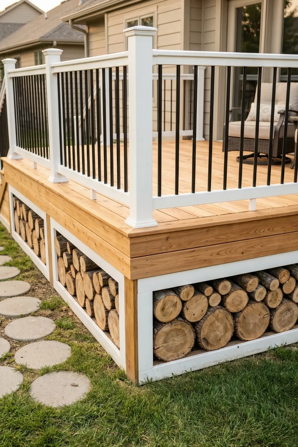
What Deck Skirting Actually Does
- Hides structural posts, pipes, wiring, and bare ground beneath the platform
- Grounds the deck visually — makes it read as a complete structure, not a floating surface
- Deters animals from nesting and reduces moisture buildup underneath
- Provides opportunity to add storage access through panels or doors
- Gives the whole outdoor space a more finished, architectural feel
2 • The Design Principle Most People Miss: Visual Intent
Here is the honest reason most budget deck skirting looks cheap: it was installed with a functional goal and no visual one. A panel goes up, the gap is covered, the project is finished. Nobody thought about what the eye would do when it landed on that surface.
Good skirting — regardless of what it costs — has a clear visual intention. Either it draws the eye to the base of the deck as a design feature in its own right, or it blends so seamlessly with the surrounding structure that the eye moves past it without pausing. Both outcomes are valid. What is not valid is skirting that sits in between: visible enough to notice, but not interesting enough to appreciate.
Understanding which category you are designing toward — high contrast or low contrast — is genuinely the first step. Everything else, including material choice and color, comes after that decision is made.
“Budget has almost nothing to do with how good deck skirting looks. Design choices do.”
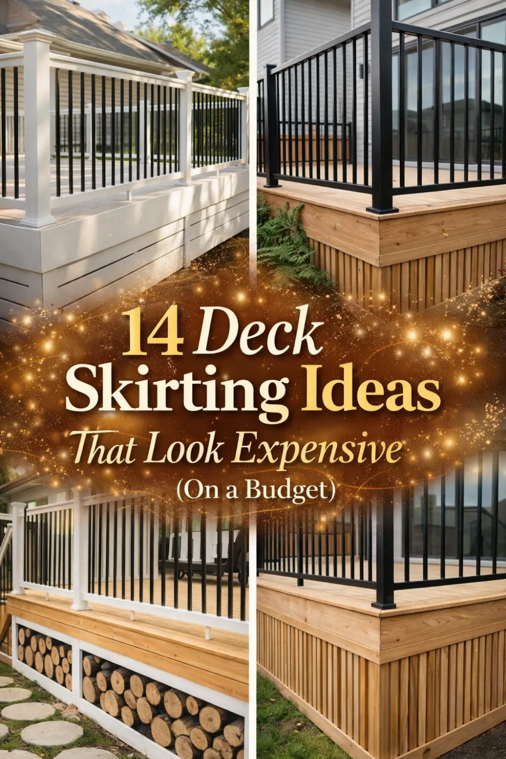
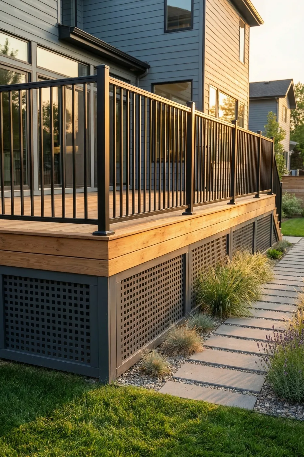
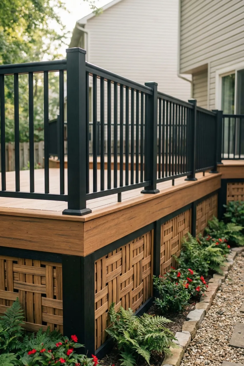
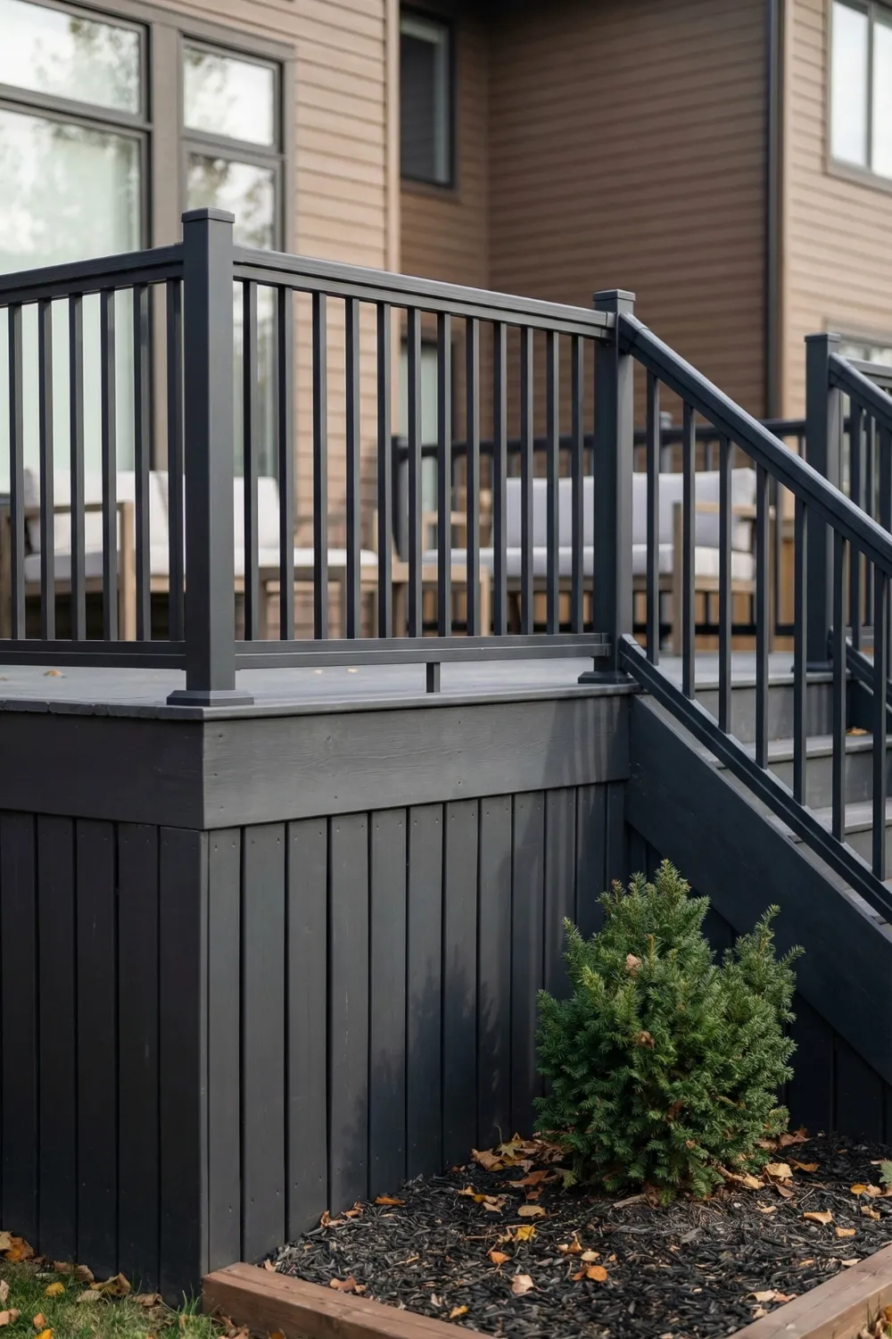
3 • High Contrast Skirting: Making the Base a Design Feature
High contrast skirting separates the base of the deck from the platform above it with a clear visual distinction. Done well, this makes the whole structure read more like a building — something with weight, intention, and layers — rather than a flat surface propped up on posts.
The most common version of this is painting the skirting darker than the deck boards. A deep charcoal, a rich forest green, a classic navy — any of these beneath lighter natural wood creates a strong horizontal line that gives the deck definition. The eye reads that line as architecture.
Contrast also makes pattern more visible, which is directly useful on a budget. A diagonal plank pattern or a geometric lattice that might disappear against a same-tone background suddenly becomes legible when framed in a darker color. The material does not need to be expensive. It needs to be visible.
High Contrast Done Right
- Paint skirting at least 2–3 shades darker than the deck boards above
- Use dark trim to outline any patterned panels — it makes shapes read clearly
- Repeat the darker tone on railings or stair accents so it looks intentional
- Keep the contrast consistent all the way around — partial contrast looks like a mistake
📌 Pinterest Save: Dark skirting under a light wood deck — high contrast design trick that makes budget builds look custom. Save this to your Deck Ideas board!
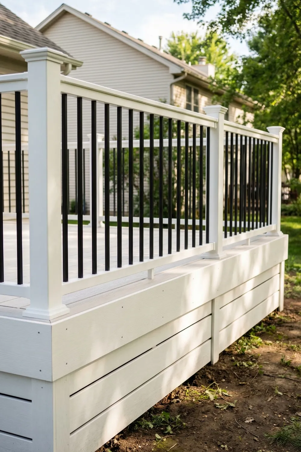
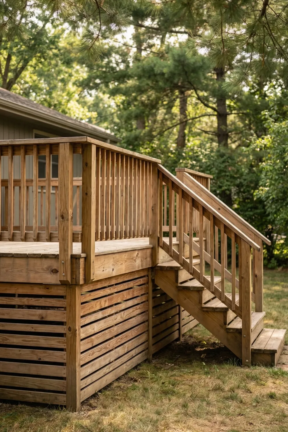
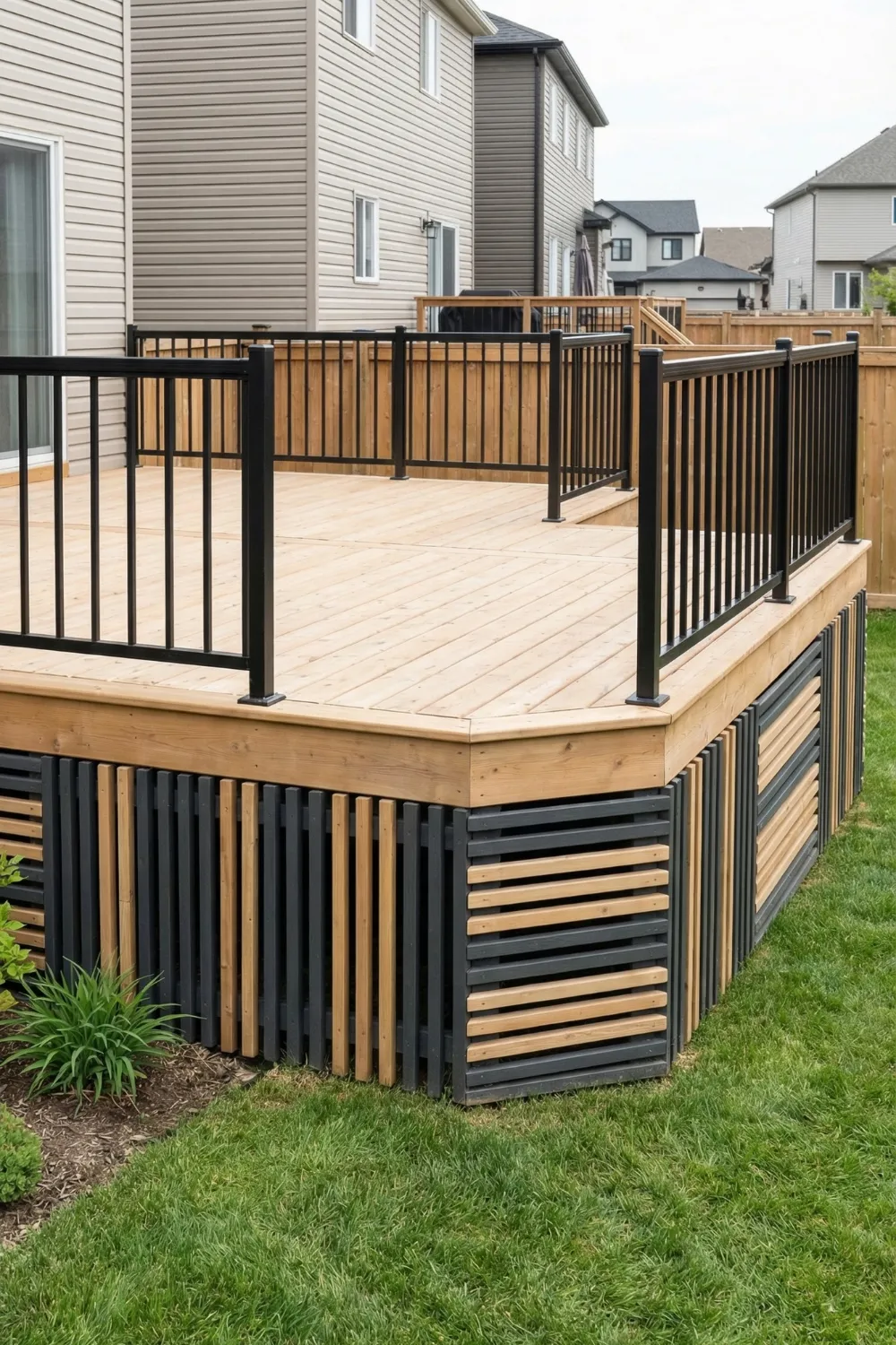
4 • Patterned Skirting: A Low-Cost Way to Add Real Personality
A flat, featureless panel does its job. It covers the gap. But it does not do anything for the design, and on a budget, you need materials to work harder than that. Pattern is how you get more out of inexpensive materials without spending more money.
Diagonal plank layouts are the most reliably beautiful option for budget builds. Standard dimensional lumber installed at 45 degrees suddenly reads as intentional and geometric. The pattern creates visual movement across a surface that would otherwise sit flat and uninteresting.
Lattice panels are another strong choice. On their own, they can look temporary. But add a frame of painted trim around each section and they immediately become a repeating architectural element. The frame is doing most of the work.
Pattern Ideas by Budget Level
- Diagonal planks: standard lumber installed at 45° — big impact, lowest cost
- Framed lattice: add painted trim borders to standard lattice panels for an instant upgrade
- Herringbone panels: alternating diagonal sections using the same boards
- Vertical slats with even spacing: simple, modern, works on any size deck
- Reclaimed wood stacked horizontally: free texture and character with a dark stain
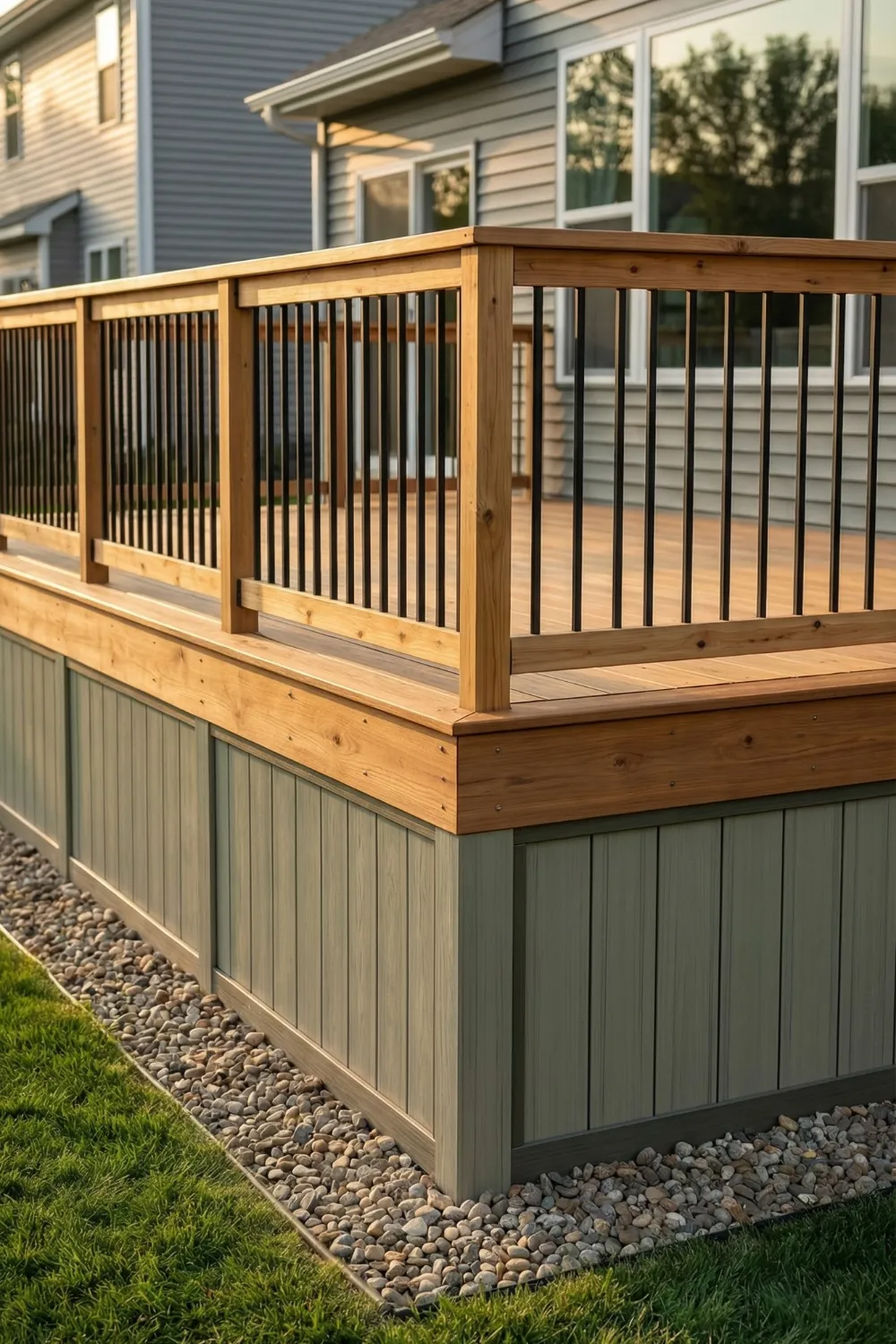
5 • Low Contrast: When Subtle Design Looks More Refined
Not every deck benefits from dramatic contrast. For smaller decks, cottage-style homes, or spaces where the goal is calm and cohesion, low contrast skirting often produces a more polished result than anything with sharp color separation.
Low contrast means keeping the skirting, deck boards, railing, and trim within the same tonal family. The deck reads as a single object rather than a collection of separate surfaces. This works particularly well for smaller decks because it eliminates visual breaks that would otherwise chop the structure into smaller perceived sections.
Warm neutrals — soft beige, weathered gray, warm sand, muted taupe — are the most forgiving palette for this method. They age gracefully outdoors and they read as sophisticated in a way that stark white or bright colors often do not.
How to Create a Seamless Low-Contrast Look
- Match skirting color to deck boards or go one shade lighter or darker at most
- Use the same or similar tone for trim, railing, and post wraps
- Stick to warm neutrals — beige, weathered gray, soft brown, muted taupe
- Avoid sharp color transitions anywhere on the structure
- Let texture rather than color carry the visual interest
📌 Pinterest Save: Low-contrast deck skirting in warm gray — seamless, cohesive, looks way more expensive than it is. Pin this to your Outdoor Living board!
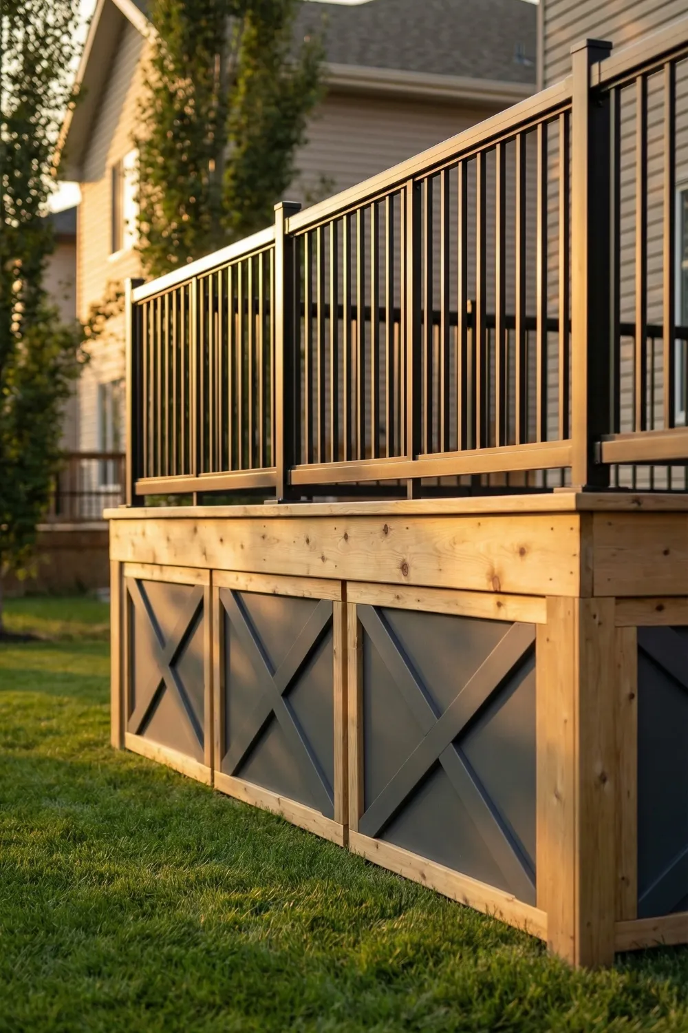
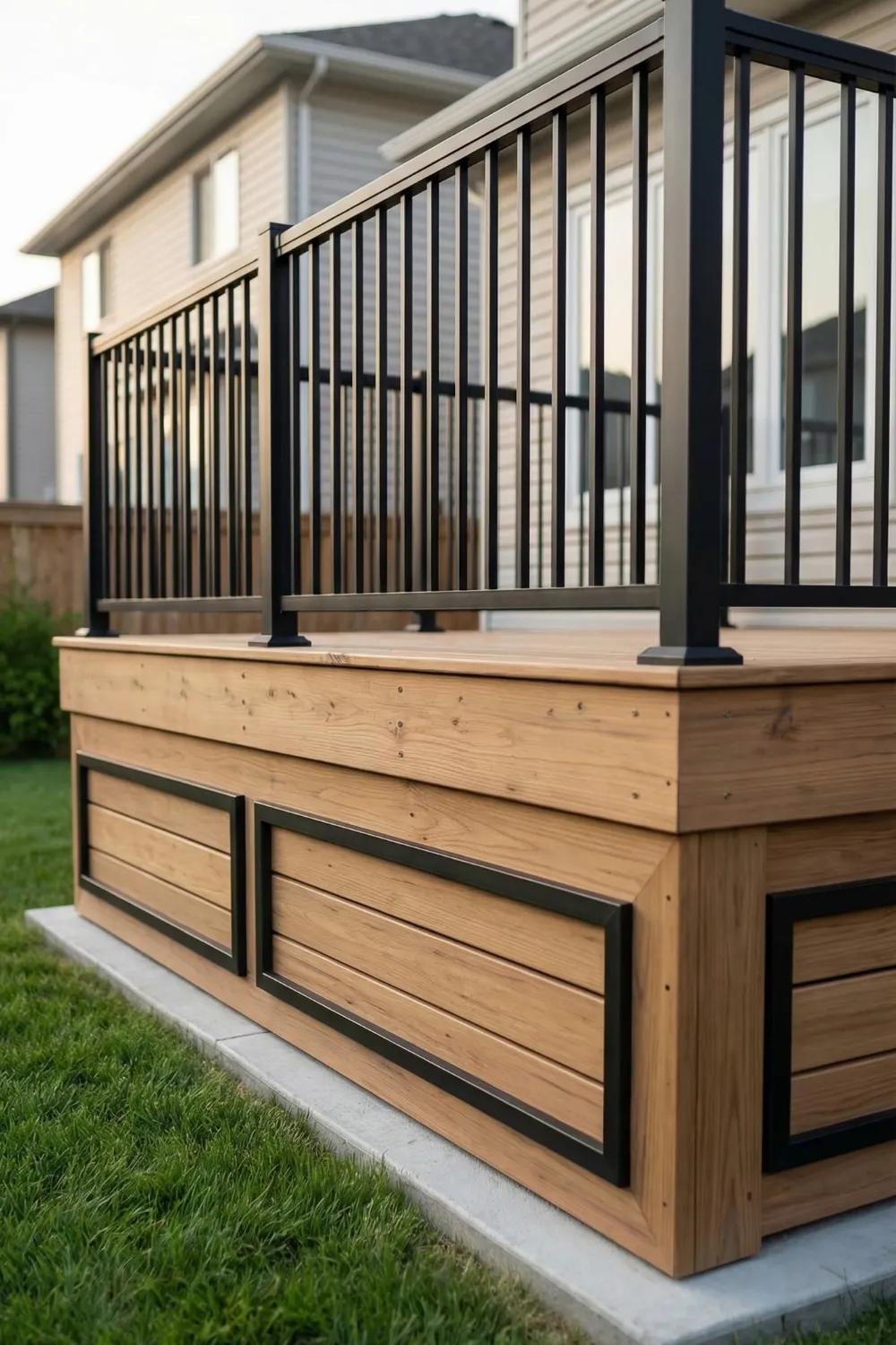
6 • Two-Tone Color Blocking: A Designer Trick That Costs Almost Nothing
Two-tone skirting is one of the fastest ways to make inexpensive panels look like they were designed by someone who knew what they were doing. A darker color on the outer frame, a lighter color or natural material filling the interior sections. The result looks layered and intentional even when the underlying materials are basic.
The darker frame acts as architectural trim. It defines the edge of each panel the same way a picture frame defines a painting — suddenly the thing inside looks chosen and considered rather than just placed. Even plywood starts to look structured when surrounded by a dark painted border.
The secret to making this look expensive rather than amateur is scale. The frame boards need to be wide enough to register visually from a normal viewing distance — usually at least two to three inches. Thin strips look tentative. Confident framing looks deliberate.
Applying the Two-Tone Method
- Paint outer frame boards 2–3 shades darker than the interior panels
- Keep interior sections light, natural, or textured — let the material breathe
- Use frame boards at least 2–3 inches wide so they read clearly from a distance
- Repeat the darker frame color on deck posts or stair railings
- Space panels consistently — uneven gaps undermine the whole effect
7 • Painted Frames with Natural Infill: Rustic Meets Refined
This method leans into texture rather than color blocking. The concept is to paint or stain the outer frame of each skirting panel while leaving the interior material in its natural state. The contrast between the structured frame and the organic interior creates an effect that feels deliberately designed.
What goes inside the frame matters. This method works best when the infill material has texture of its own. Rough-cut wood slats, woven reed panels, stacked split logs — all of these become interesting when contained within a painted border. The frame signals to the eye that the material inside was selected with thought.
The overall effect is relaxed but purposeful — exactly the tone most people want from outdoor spaces. It suggests that someone put care into the design without trying too hard.
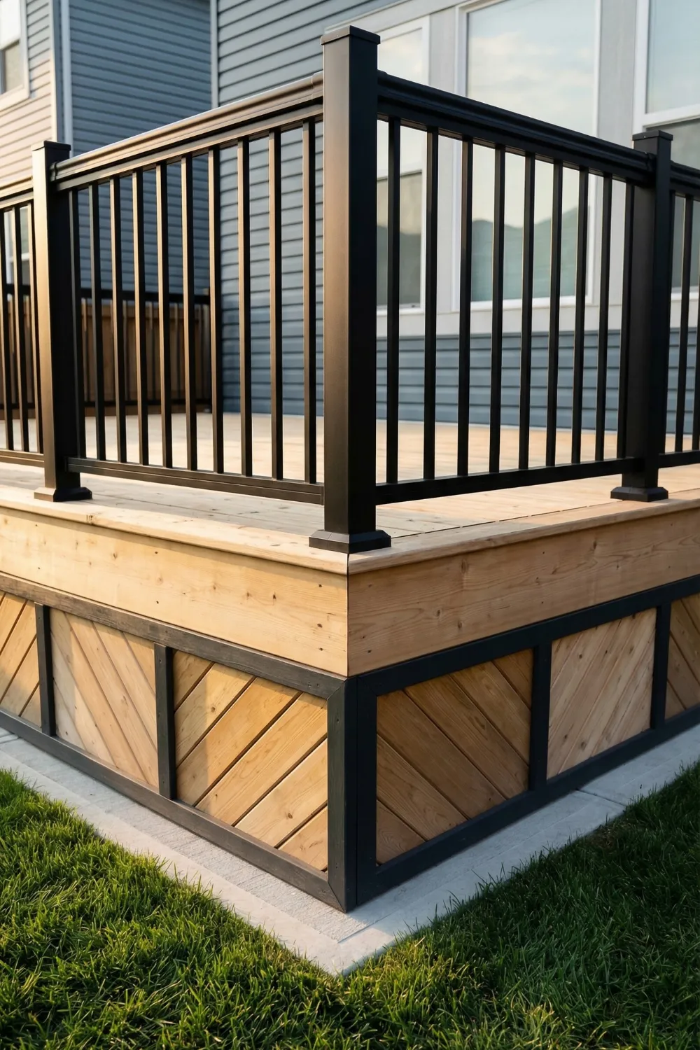
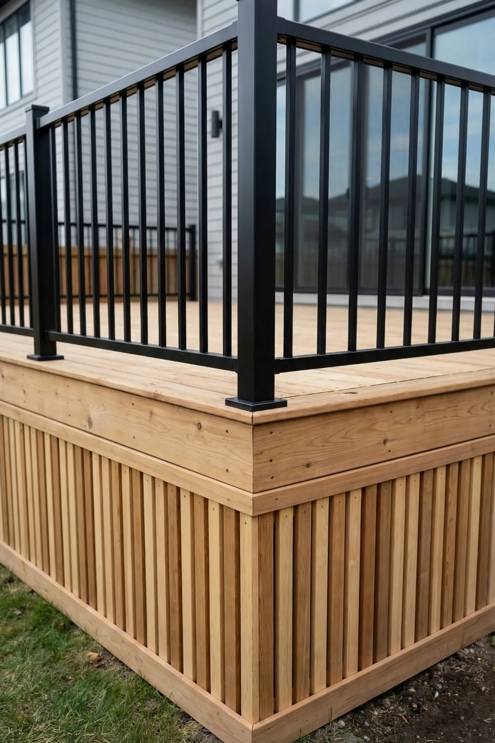
8 • Using Depth and Shadow Instead of Color
Most budget skirting conversations focus entirely on color and paint. But some of the most effective design moves in outdoor spaces have nothing to do with color at all — they are about structure, and specifically about how structure creates shadow.
When boards are layered, panels are recessed, or trim is raised above a flat surface, the sun does something useful with that geometry. Shadows form in the gaps and recesses, and those shadows shift throughout the day. What you end up with is a surface that appears to change depending on the light.
This kind of dimensional skirting mimics the panel detailing you might see on interior cabinetry. The principles are the same outdoors. Inset panels surrounded by raised trim read as sophisticated because the eye associates that level of construction with craftsmanship.
Simple Ways to Build In Depth
- Install vertical slats with deliberate spacing — even gaps between boards create shadow lines
- Add trim boards around inset panels — the raised edge catches light and casts a shadow
- Use layered framing boards of slightly different thicknesses for a stepped effect
- Recess the main panel behind the frame so the frame projects forward slightly
📌 Pinterest Save: Layered deck skirting that uses shadow instead of color — dimensional wood panels that look custom-built on a DIY budget. Save this!
9 • The Role of Repetition: Why Pattern Needs to Commit
Repetition is probably the least glamorous design principle to write about, and it is almost certainly the one that separates expensive-looking results from everything else. A pattern that appears on one section of skirting and then changes or disappears on the next section does not read as a design choice. It reads as an accident.
When the same spacing, the same panel size, the same trim profile, or the same color repeats all the way around the deck, something shifts. The viewer’s brain begins to sense rhythm. That rhythm communicates skill and planning in the same way that evenly spaced words on a page communicate editorial care.
The practical takeaway: before you start a skirting project, decide on three things — the pattern, the spacing, and the color. Then commit to those decisions all the way around the structure, even when it would be easier to make exceptions. The consistency is the work, and it shows.
10 • Choosing Materials That Actually Work With Your Budget
Budget skirting does not require compromise if you understand what each material does well. Most materials that work beautifully for deck skirting are genuinely inexpensive — they just need to be used with intention rather than as a default.
Pressure-treated pine is the workhorse option. It is rot-resistant, widely available, and takes paint or stain well. Lattice panels provide airflow while still covering the space visually. Reclaimed lumber adds instant character that new materials cannot fake. Plywood panels with applied trim framing are another underrated option.
Budget Material Comparison
- Pressure-treated pine boards: most affordable, durable, takes paint well — best all-rounder
- Wood lattice panels: allows airflow, adds pattern, needs regular painting to maintain
- Composite lattice: costs more upfront but lasts longer with minimal maintenance
- Plywood with trim framing: smooth base for painted designs, lightweight and easy to cut
- Reclaimed lumber: free or cheap, brings instant character — best for rustic styles
11 • How Lighting Turns Skirting Into a Nighttime Feature
Outdoor lighting often gets added to a deck for safety. But lighting placed specifically near the skirting can do something more interesting: it can make the skirting itself a design element after dark.
Low-mounted lights positioned at the base of the deck cast angled beams across textured surfaces. Those beams follow the contours of whatever is in front of them — the gaps between slats, the edges of trim boards, the depth of recessed panels. The same dimensional skirting that casts subtle daytime shadows becomes genuinely dramatic at night.
Solar-powered ground lights are now inexpensive enough that this is no longer a budget issue. A row of them placed along the base of the skirting costs very little and requires no wiring. The effect at night is disproportionate to what you spent to achieve it.
📌 Pinterest Save: Solar ground lights along deck skirting — a $30 upgrade that makes the whole deck look designed after dark. Pin this outdoor lighting idea!
12 • Common Deck Skirting Mistakes to Avoid
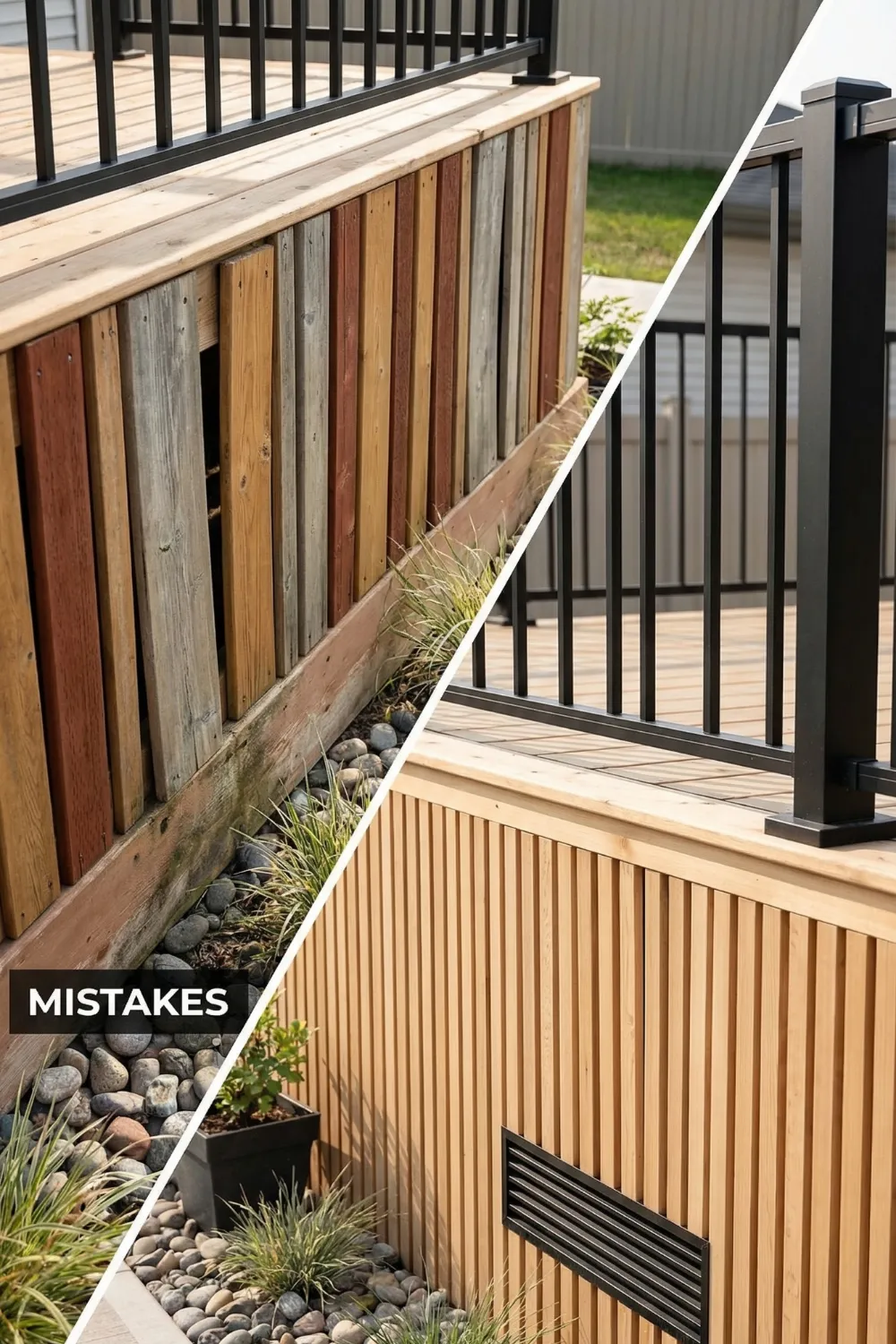
After paying attention to a lot of deck skirting projects, the mistakes tend to cluster around the same few problems. They are all avoidable, and naming them is probably more useful than any number of positive tips.
Inconsistent spacing is the fastest way to undermine an otherwise solid skirting job. Gaps that vary even slightly between panels register immediately as careless. Measure twice. Set a spacer. Use it every time.
Too many competing colors is the second most common issue. Strong contrast works when there are one or two tones in clear relationship. Three or four tones on a single skirting surface stop being design and start being noise.
Finally — skirting needs airflow. Completely sealing the space under a deck traps moisture, which accelerates rot in the framing above. Every skirting design should include ventilation, whether through lattice, spaced slats, or dedicated vents cut into solid panels.
13 • Why Budget Builds Can Look Just as Good as Expensive Ones
There is a persistent assumption in home improvement circles that better materials automatically produce better results. For skirting specifically, the assumption almost never holds.
Skirting is viewed from a distance. The grain of the wood, the quality of the composite, the exact finish of the surface — most of that detail is invisible from fifteen feet away. What is visible from fifteen feet away is color, proportion, pattern, and repetition. And none of those things cost money. They cost attention.
The eye does not evaluate materials. It evaluates organization. A surface that appears organized reads as crafted regardless of what it is made from. This is genuinely good news for anyone working with a tight budget: the most important variables are entirely within your control.
14 • Designing Smarter Instead of Spending More
The through-line across all fourteen of these ideas is the same: decisions matter more than dollars. Contrast creates definition without costing anything beyond a second can of paint. Repetition builds rhythm out of materials you already planned to buy. Texture comes from how boards are oriented and spaced, not from upgrading to a more expensive product. Shadow is free if you build dimensionally instead of flat.
The deck surface itself tends to dominate every renovation decision. But the base of the structure shapes how the whole thing reads. A beautiful deck surface on an unfinished base looks incomplete. A modest deck surface on well-designed skirting looks cohesive and intentional.
Before your next skirting project, spend some time with these principles. Decide on contrast first. Choose materials that support the pattern you want. Commit to consistency all the way around the structure. The result, done right, is a deck that looks like somebody thought about every part of it — which is exactly what you will have done.
Final Checklist Before You Start
- Decide: high contrast or low contrast — commit to one direction
- Choose one metal or hardware finish and use it throughout
- Select a pattern and decide on spacing before buying any materials
- Plan for airflow — lattice, spaced slats, or dedicated vents in solid panels
- Pick two paint tones maximum and repeat each at multiple points on the deck
- Measure spacing for every panel and use a physical spacer — never eyeball it
- Consider solar ground lights along the base after everything else is installed.