
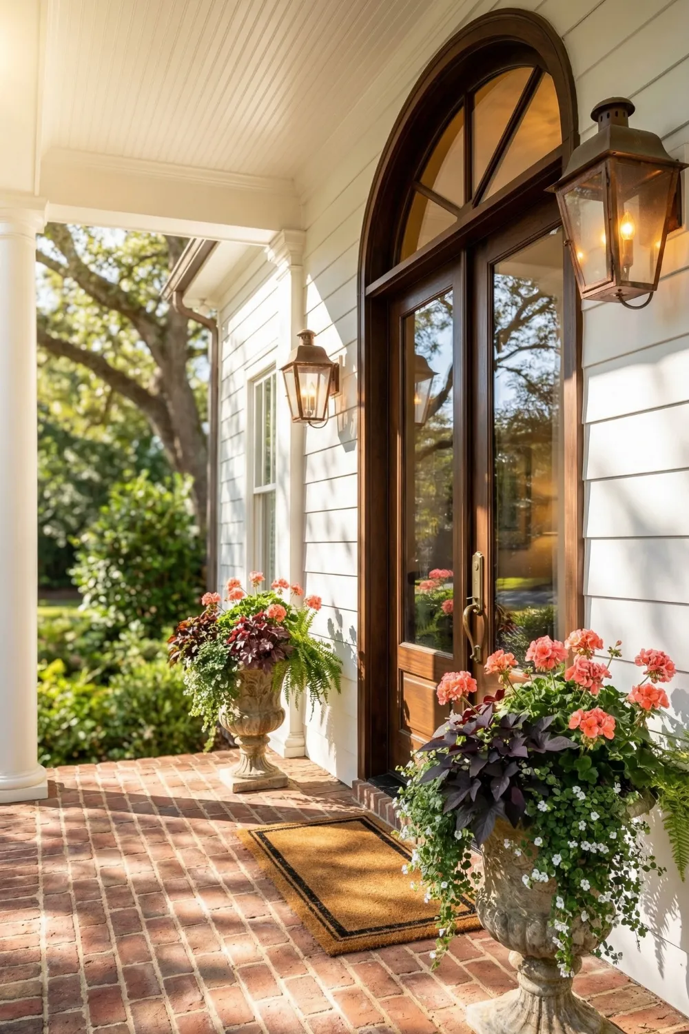
The space was there, technically functional, technically fine. I used to walk past my front porch without really seeing it. It had a door. It had a mat. It had nothing else. Then a neighbor two houses down spent one afternoon rearranging a few pots and planting some things, and the difference was immediate and slightly embarrassing to witness from my own bare entrance.
What struck me was not the flowers themselves — it was the way the porch suddenly looked like someone lived there. Like someone had thought about it. The planters were not expensive or elaborate. They were just placed with intention, filled with the right combination of plants, and sized to match the space they were occupying. That was it. That was the entire difference between a house and a home.
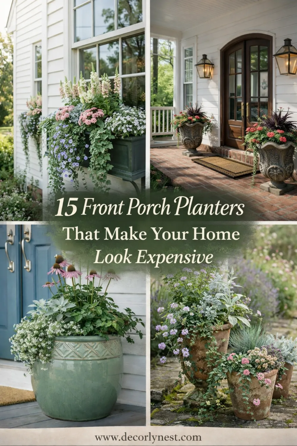
This guide covers fifteen approaches to front porch planters — from the simplest corner arrangement to full symmetrical entryway setups — with the kind of practical reasoning behind each choice that helps you make decisions for your own porch rather than just copying someone else’s.
a very bare front porch and learning what actually makes the difference 🌼
1 • Why Front Porch Planters Matter More Than They Seem
The front porch is doing a specific job in your home’s visual presentation. It is the transition zone — the space between public street and private interior — and how it looks determines whether your home feels welcoming or indifferent before anyone has knocked on the door. Most homeowners put significant thought into paint colors, door hardware, and exterior lighting, and then leave the porch itself structurally bare. Planters are the most efficient fix for that bare quality.
From a design perspective, planters solve multiple visual problems simultaneously. They break up the rigid geometry of architectural surfaces — all those straight lines of siding, steps, and railings. They fill vertical space that would otherwise read as emptiness. They introduce color, texture, and organic shape into what is typically a very hard, manufactured environment. And they do all of this while being entirely movable and seasonally adjustable, which no other exterior design element can claim.
The positioning is what determines whether planters contribute to the design or just occupy space. A pot placed in the corner of a porch because there was nowhere else to put it is not doing design work. A pot placed to soften the base of a column, frame one side of a door, or lead the eye along a path from the street to the entrance — that pot is working. The plant inside is almost secondary to the placement decision.
What Well-Placed Planters Actually Do
- Break up hard architectural lines — steps, railings, siding, columns
- Fill vertical space that reads as emptiness when left bare
- Guide the eye toward the front door naturally and without signage
- Add color and seasonal variation that paint and hardware cannot provide
- Signal that someone lives here and cares about how the entrance looks
2 • Thinking of Planters as Design Elements, Not Just Plant Holders
The shift from thinking of planters as containers for plants to thinking of them as structural design elements changes every decision that follows. Container shape, material, height, and placement are all spatial decisions before they are
horticultural ones. A tall container introduces vertical emphasis the same way a column does. A wide, low container at the base of stairs does the same visual work as a step nosing — it defines the edge and draws the eye along it. A medium container placed between two larger ones creates the middle layer of a hierarchy.
That hierarchy is what most successful porch arrangements have in common. Tall, medium, and small elements working together create visual movement — the eye enters the composition at the tallest point, travels through the middle elements, and arrives at the door. Without that graduated structure, a group of same-height pots just looks like a collection of objects. With it, the arrangement looks composed.
Container style matching the architectural style of the house is equally important and equally underappreciated. A sleek rectangular planter in a dark glaze looks appropriate on a modern house and jarring on a Victorian cottage. A weathered terracotta urn looks appropriate on a Mediterranean home and slightly confused on a contemporary one. The container is not a neutral backdrop for the plant. It is a design decision that either aligns with or contradicts the character of the home.
“A single well-placed planter does more for a porch than ten pots arranged without thought. Placement is the whole game.”
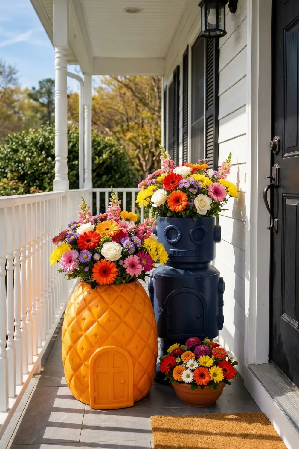
3 • Character Planters That Add Personality to the Entrance
Not every porch calls for formal or restrained design. Some homes have personalities that lean toward the playful, the eccentric, or the warmly informal, and the entrance design should reflect that rather than imposing a conventional symmetry that feels foreign to the rest of the house.
Sculptural planters — those shaped as animals, figures, fruits, or abstract forms — work as focal points rather than background elements. They are the first thing visitors notice, and they set an expectation for the personality of the home before anyone has met its owner. An animal-shaped planter on a cottage porch says something that a matched pair of ceramic urns on the same porch would not.
The planting inside a character container should support the mood rather than compete with it. When the container is already making a statement, the plants inside work best as soft, colorful companions rather than structural elements trying to assert their own character. Bright gerbera daisies, colorful annuals, or even a simple trailing plant that spills over the edges are all appropriate. The container leads, and the planting follows.
Creating Balance with Statement Planters
- Use one character planter as the primary focal point — avoid two competing for attention
- Add a medium container nearby to support the arrangement without duplicating it
- Keep plant selection simple inside character containers — the pot is the design
- Choose plants that reinforce the mood: bright and cheerful, or soft and trailing
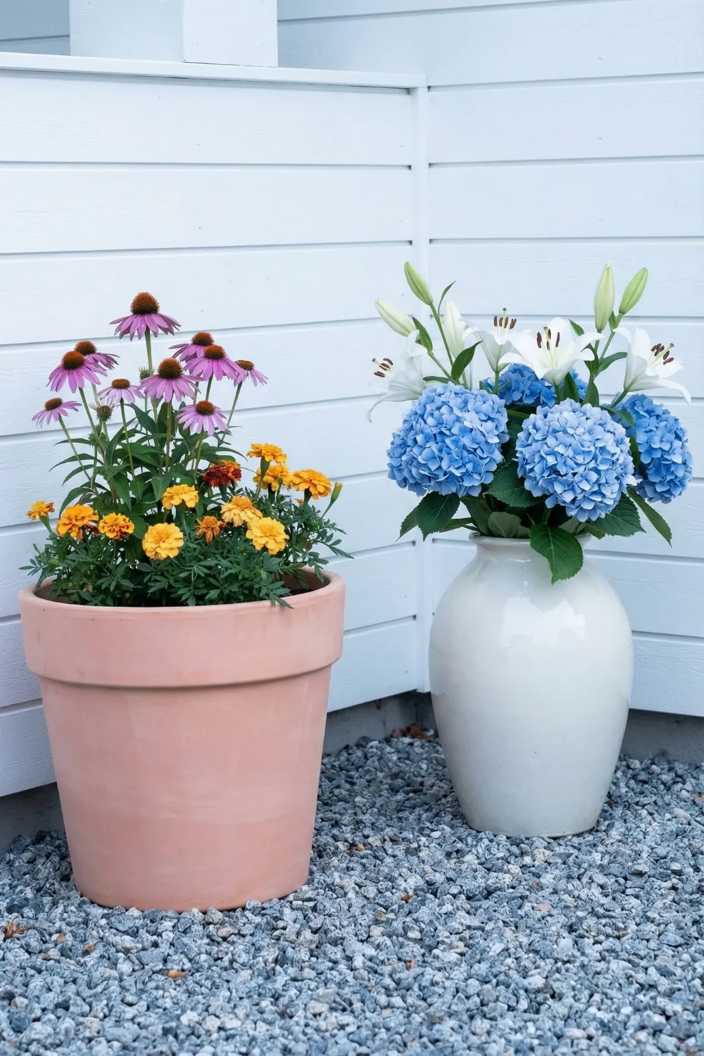
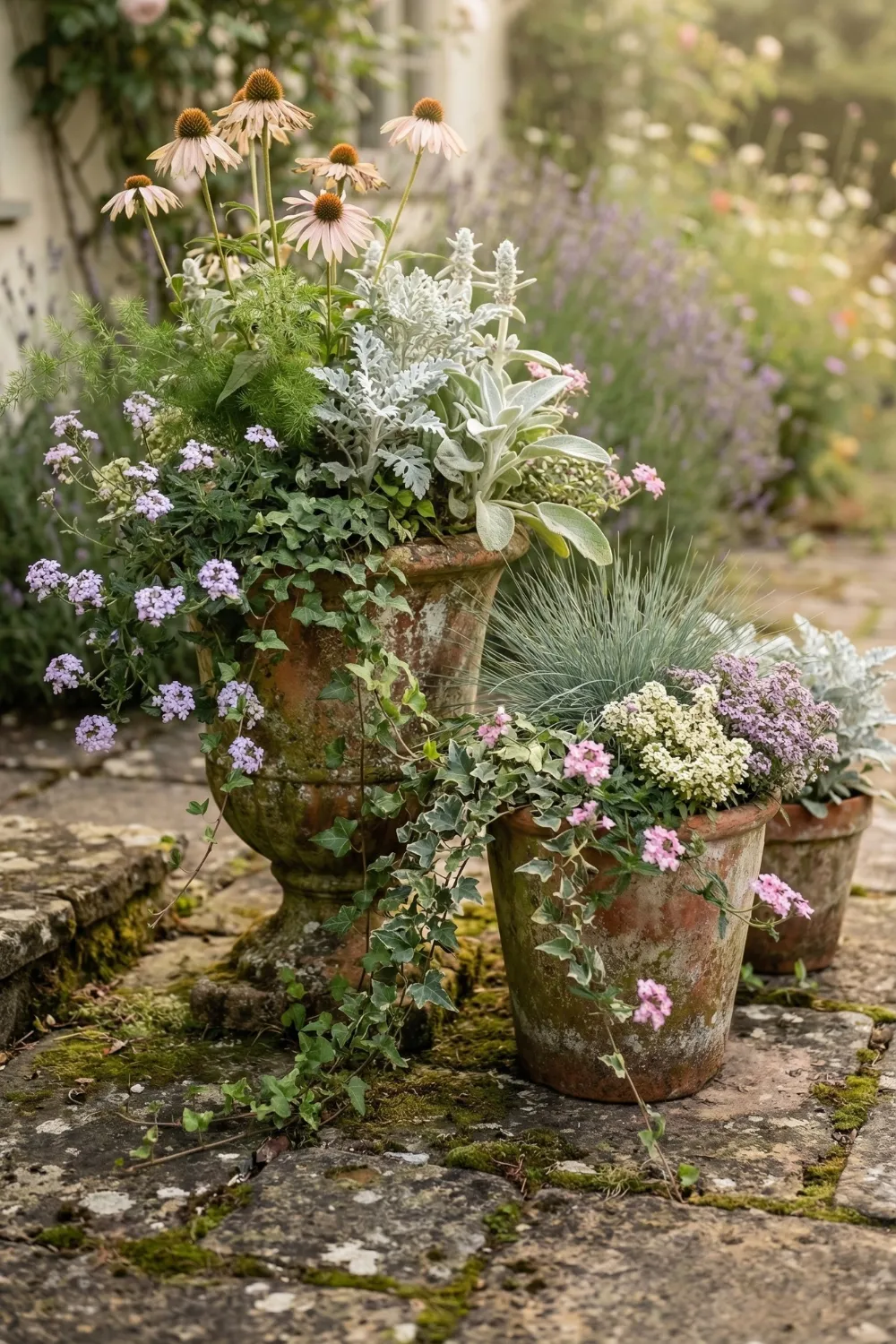
4 • Layered Terracotta Planters for an Informal Garden Look
There is a specific quality that grouped terracotta pots create that single containers almost never achieve: the feeling of a garden that has accumulated over time rather than been installed in an afternoon. That quality — of accumulation, of things growing together rather than being placed together — is exactly what makes a porch feel lived-in rather than staged.
The odd-number rule that most designers follow for grouped arrangements is not arbitrary. Three or five pots read as a cluster; two or four read as pairs, which creates a different and more symmetrical effect. With an odd number, the eye relaxes into the arrangement rather than counting it. The slight variation in size that naturally occurs within a collection of terracotta pots contributes to this relaxed quality — nothing is too matched, nothing is too uniform, but the warm clay color ties everything together.
Layered planting inside and across the group is what makes the arrangement feel rich rather than sparse. Taller plants at the back establish height. Flowering plants in the middle add color and fullness. Trailing plants at the front and edges blur the boundary between containers and surface. When pots are placed so that they slightly overlap each other visually, the collection begins to read as one composed arrangement rather than several separate ones.
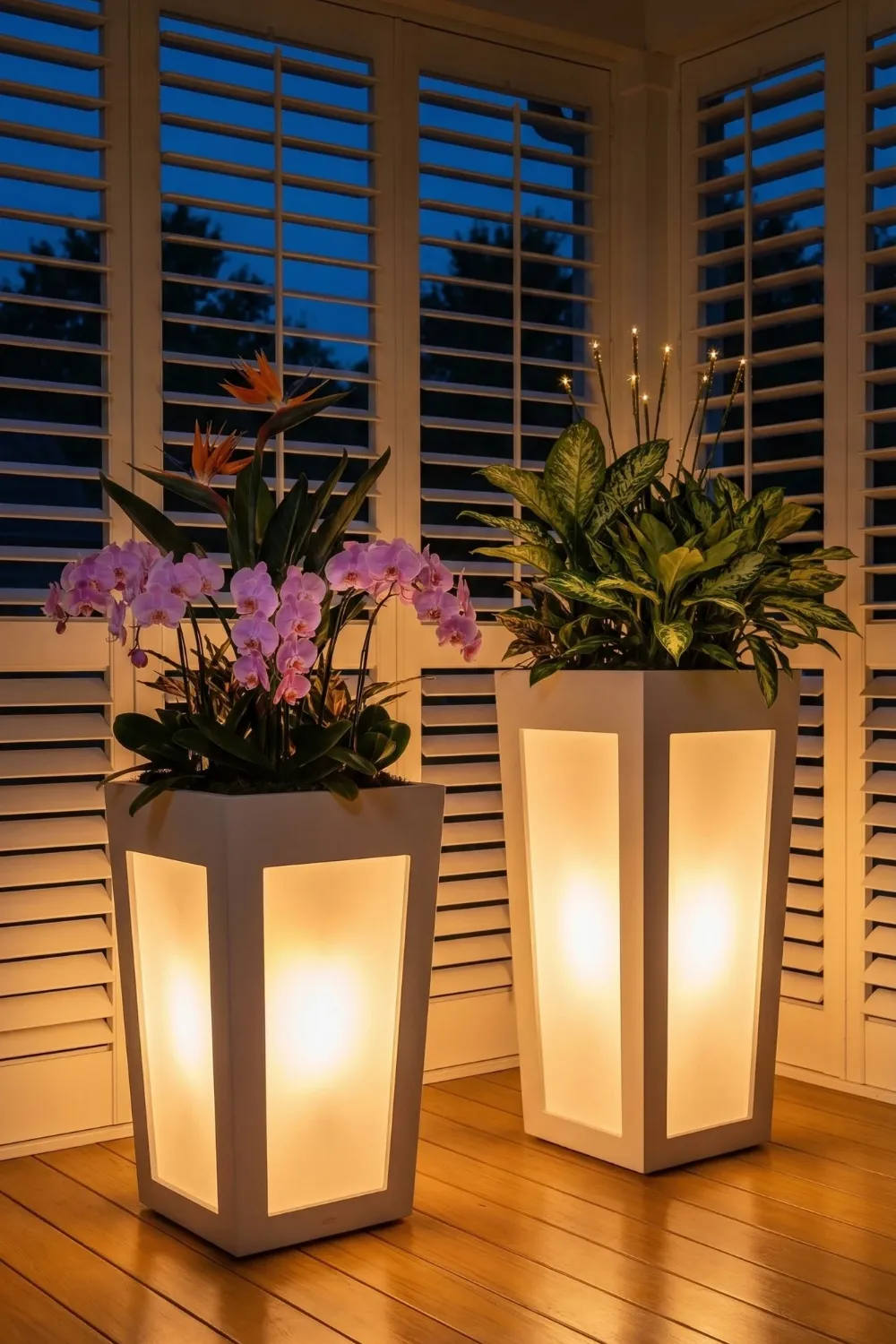
5 • Illuminated Planters That Work After Dark
Most porch lighting design stops at a single overhead fixture. It provides adequate illumination for finding the keyhole and not much else. Illuminated planters offer an entirely different approach: ground-level light sources that spread upward and outward across the architectural surfaces and plants around them, creating the layered lighting effect that interior designers routinely recommend and exterior designers routinely ignore.
The quality of light from an illuminated planter is fundamentally different from overhead lighting. Overhead light flattens surfaces and emphasizes the utilitarian function of the entrance. Ground-level light creates depth by illuminating surfaces from unexpected angles, producing shadows that add dimension to siding, steps, and plantings. After dark, a porch with illuminated planters looks genuinely atmospheric in a way that overhead lighting simply cannot produce.
Plant selection matters more in illuminated containers than in standard ones. Plants with strong architectural silhouettes — bird-of-paradise, structural tropical leaves, tall ornamental grasses — produce beautiful shadow patterns when backlit. Plants with fine or feathery foliage create a different but equally effective glow effect. Dense, rounded plants tend to block light rather than work with it, which produces a less interesting result.
Where to Place Lighted Planters
- Near entry doors for soft, welcoming illumination at face height
- In dark porch corners to add depth and eliminate the abandoned-corner effect
- Along steps to guide movement and improve safety without overhead fixtures
- Flanking a path to create a lit corridor that draws guests toward the entrance
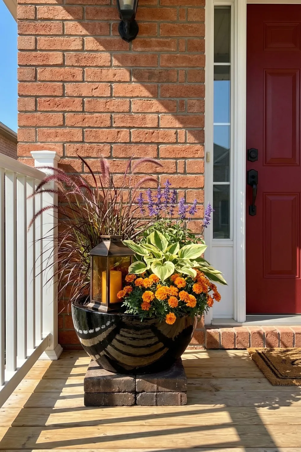
6 • Oversized Urn Planters for Dramatic Impact
There are porches where a single large container does more than several smaller ones ever could. This is usually the case when the architecture itself is large — when the door is tall, the columns are substantial, or the facade is wide enough that smaller pots simply get lost against it. Scale is not a preference in these situations; it is a requirement. A small pot in front of a large column looks like a decoration that got separated from something. A large urn at the base of the same column looks like it belongs there.
The thriller-filler-spiller planting formula works particularly well in oversized urns because the container provides enough room for all three layers to develop properly. The tallest plant establishes height and gives the arrangement its silhouette. Mid-height flowering plants fill the body and add color density. Trailing plants at the rim soften the container’s edge and create the visual connection between the planter and the surface below it — which is what prevents a large container from looking like it was just set down rather than placed.
Dark containers against brick or stone have a specific advantage worth noting: the contrast between the dark planter and the textured wall surface creates visual depth that lighter containers do not. The planter appears to advance toward the viewer while the wall recedes. This contrast also makes the planting inside the container more legible — the dark background acts as a frame, and the plants become the picture.
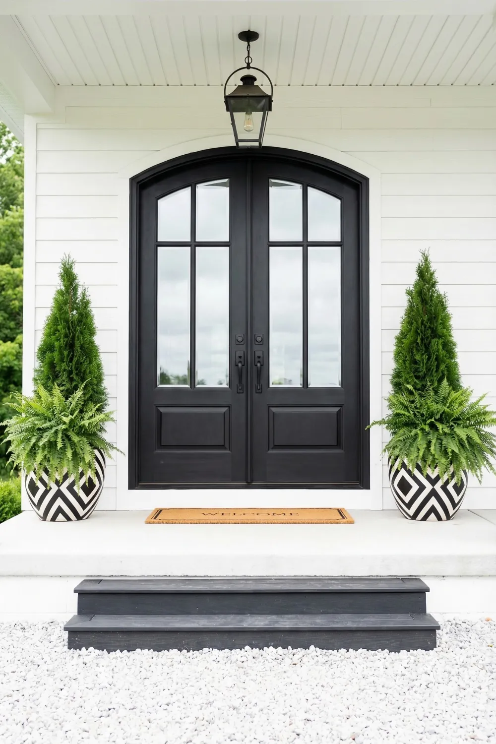
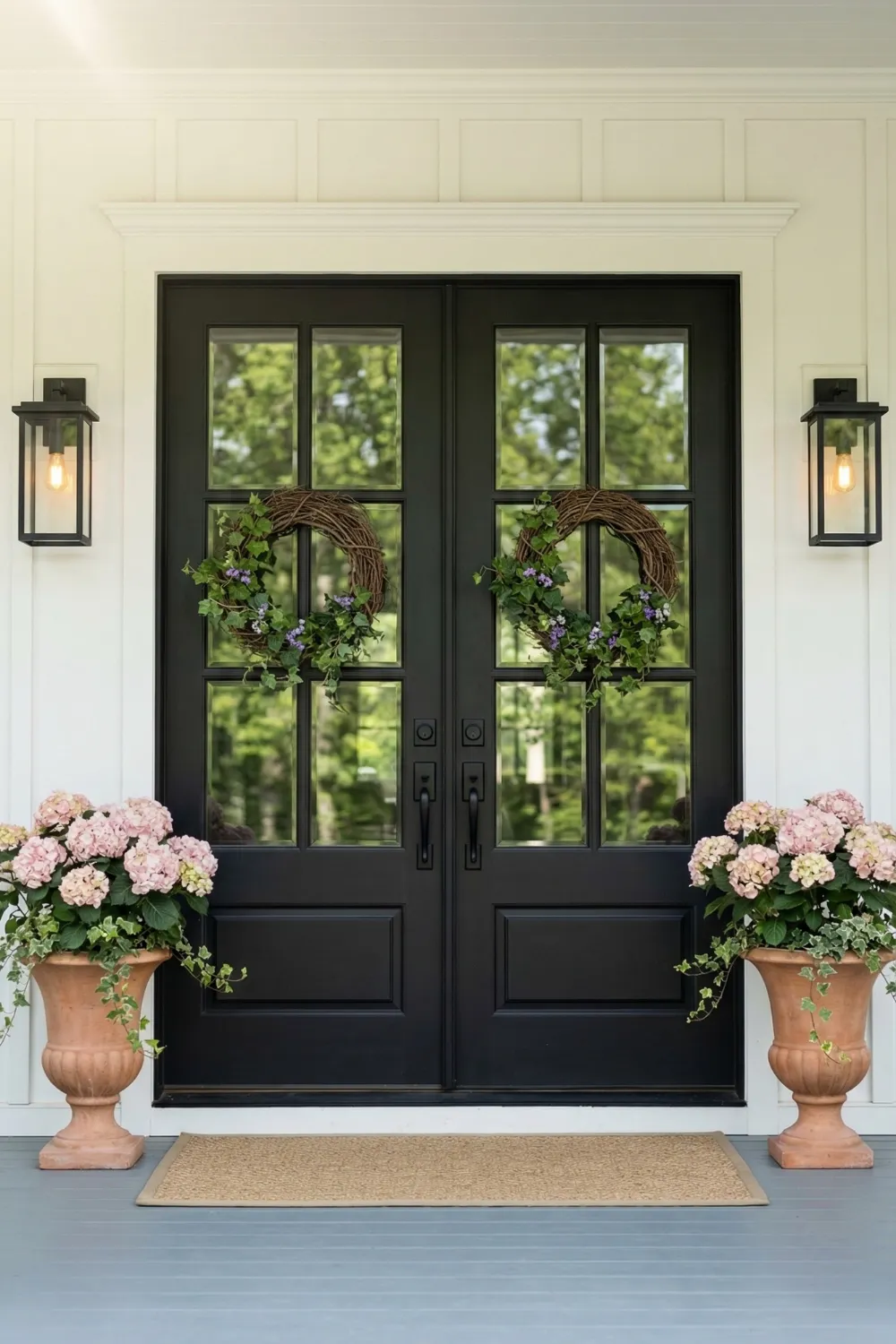
7 • Symmetrical Planters for Classic Entryways
Symmetry at the front entrance is one of the oldest and most reliable tools in residential design, and it persists for good reason: it works. Matching containers on either side of a front door create a visual frame that draws the eye to the entrance and signals that the home has been considered. This is not a flashy effect. It is a quiet one. But the absence of it is immediately noticeable, and the presence of it contributes to a sense of order and welcome that most homeowners want their entrance to project.
Evergreen plants are the most practical choice for symmetrical porch planters precisely because they maintain their structure and color year-round. The symmetry is only effective if both sides remain visually equivalent, and seasonal flowers introduce the risk of uneven flowering, different growth rates, or the bare-container problem that arrives every winter. Evergreens sidestep all of that. Boxwood, dwarf Alberta spruce, and ornamental conifers are all reliable options that provide structure regardless of season.
The spacing between each container and the door matters as much as the containers themselves. Both planters should be equidistant from the door centerline, and both should be the same distance from the edge of the step or porch surface. Even a slight asymmetry in placement undermines the effect more than most people expect. Measure it. The extra thirty seconds is worth it every time someone approaches the entrance.
Tips for Achieving Perfect Symmetry
- Position each planter the same measured distance from the door centerline
- Use identical containers and, ideally, identical plant combinations
- Choose evergreen plants for year-round structural consistency
- Repeat the container color in the door color, trim, or hardware for cohesion
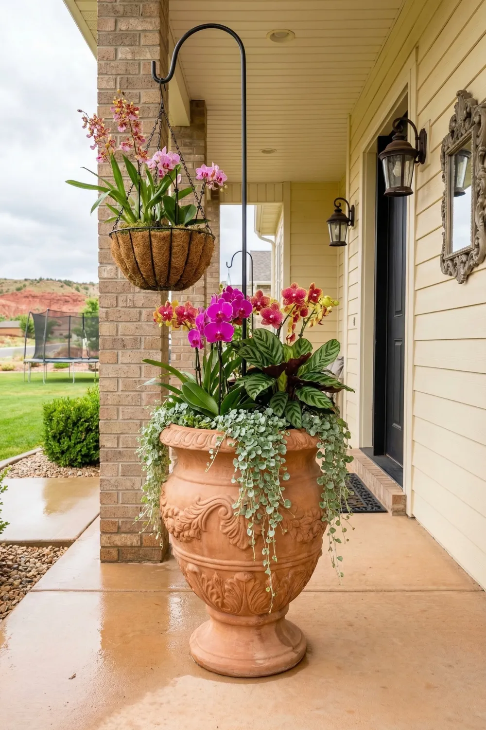
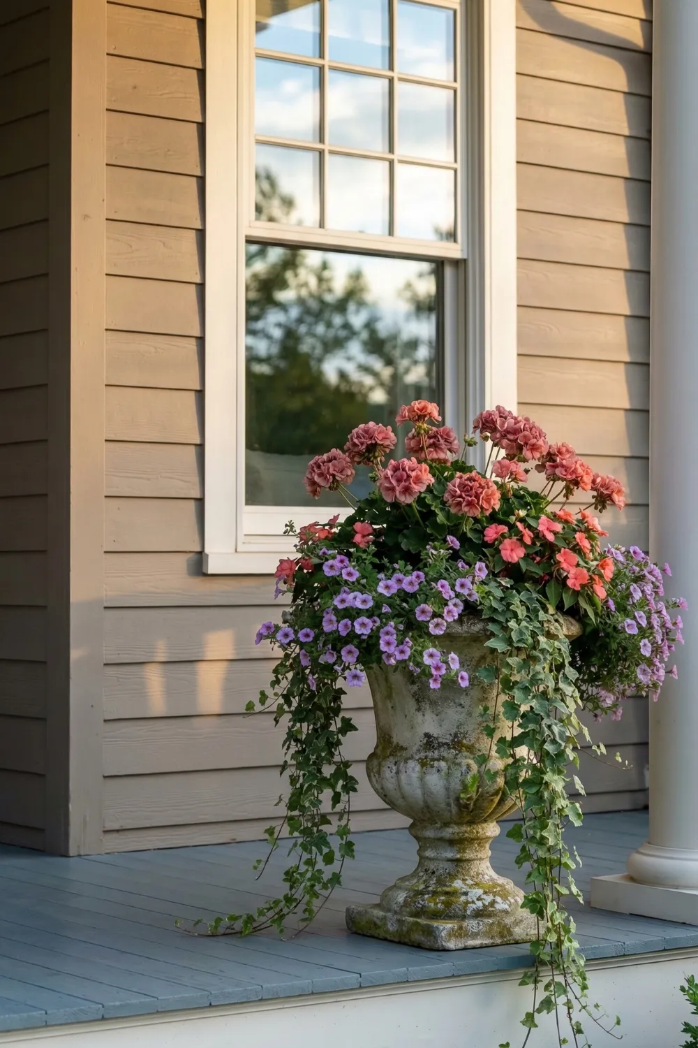
8 • Romantic Urn Planters with Cascading Greenery
Pedestal urns occupy a specific visual territory that standard pots do not: they raise the planting to eye level, which changes the relationship between the arrangement and the viewer. Instead of looking down at a plant, you look at it directly. The flowers and foliage become part of the same visual plane as windows, door frames, and architectural details, which is why tall pedestal urns read as more architectural than ground-level pots, even when they contain the same plants.
The cascading element is what makes pedestal urns particularly suited to porch applications. Trailing ivy, creeping Jenny, sweet potato vine, or bacopa spilling over the edges and down the pedestal creates a visual connection between the container and the surface below it. Without that connection, a pedestal urn can look slightly isolated — a beautiful object that is not quite sure where it belongs. The trailing plants resolve that uncertainty by literally linking the planter to its surroundings.
Soft color palettes — pale pink, lavender, white, soft peach — work especially well in romantic urn arrangements because they create the kind of gentle, layered composition that reads as effortlessly beautiful rather than intentionally styled. These colors also photograph well in the early morning and late afternoon light that typically illuminates front porches, which is relevant for anyone who wants their entrance to look as good in photos as it does in person.
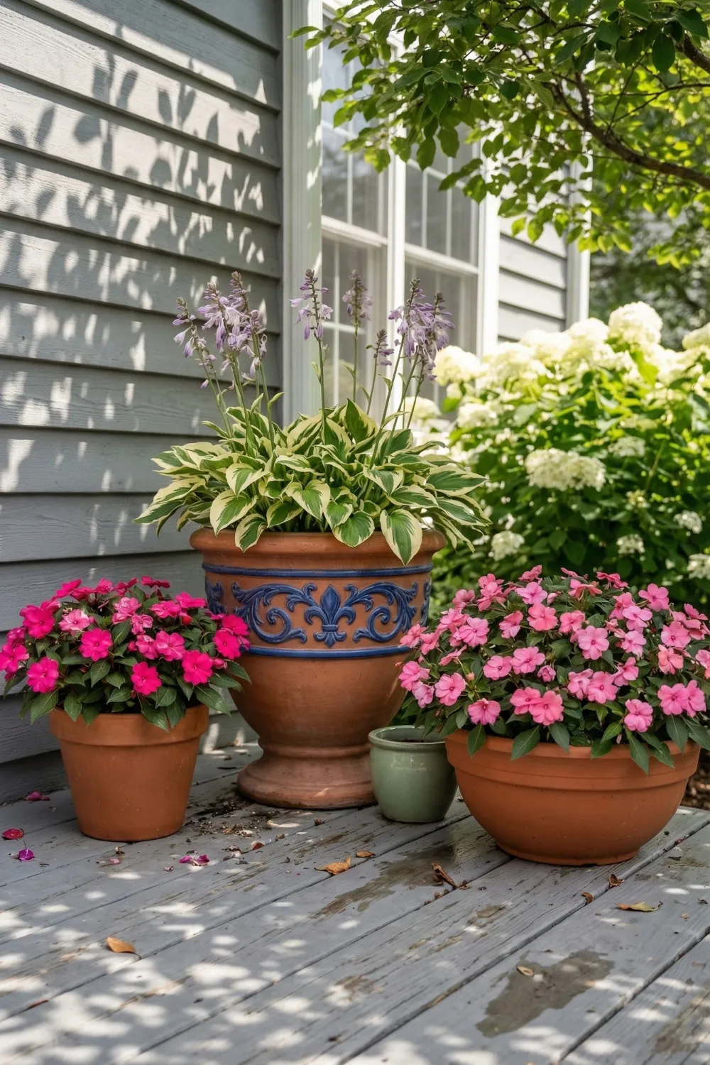
9 • Mixed Pots for Small Porch Corners
Small porches present a specific challenge: the instinct is to use small containers to match the small space, but small containers in small spaces often look tentative rather than considered. A more effective approach is to use fewer, slightly larger containers and allow negative space to do some of the work. Two pots of different sizes and materials in a small corner often create more visual interest than four small matching pots arranged along a railing.
Material contrast between containers is one of the most accessible ways to add interest to a small arrangement. A rough terracotta pot next to a glazed ceramic container creates textural contrast that the eye finds engaging without requiring elaborate planting. The same principle applies to height contrast: a taller container paired with a lower one creates the vertical variation that gives an arrangement depth.
Color contrast in the planting can follow the same logic. Warm-toned flowers — marigolds, coneflowers, zinnias in orange and yellow — placed next to cool-toned flowers — blue salvia, purple lavender, soft violet petunias — create a vibration between the two that makes both colors more vivid than either would be alone. This technique works in small spaces because it generates visual energy without requiring additional square footage.
10 • Oversized Entry Planters for Large Porches
Large porches have a problem that small porches do not: too much undifferentiated space. Without elements that define zones and establish scale relationships, a large porch reads as a flat, featureless area rather than a designed space. Oversized entry planters are the most effective tool for solving this problem because they introduce scale references that the eye can use to navigate the space.
The planting in large entry containers should be scaled to match. A spindly annual plant in a large urn looks lost. A tall architectural plant — a standard-trained topiary, a large ornamental grass, a structural tropical — fills the vertical space appropriately and reinforces the container’s presence. Trailing plants at the base do their usual work of connecting container to surface, and mid-height flowering plants fill the middle zone.
Repetition of shapes between the planters and other architectural elements strengthens the overall composition significantly. Round urns that echo round lanterns. Rectangular containers that mirror rectangular door panels. Dark containers that repeat the color of shutters or railings. These connections are what transform a large porch from a collection of elements into a designed environment where everything appears to have been considered in relation to everything else.
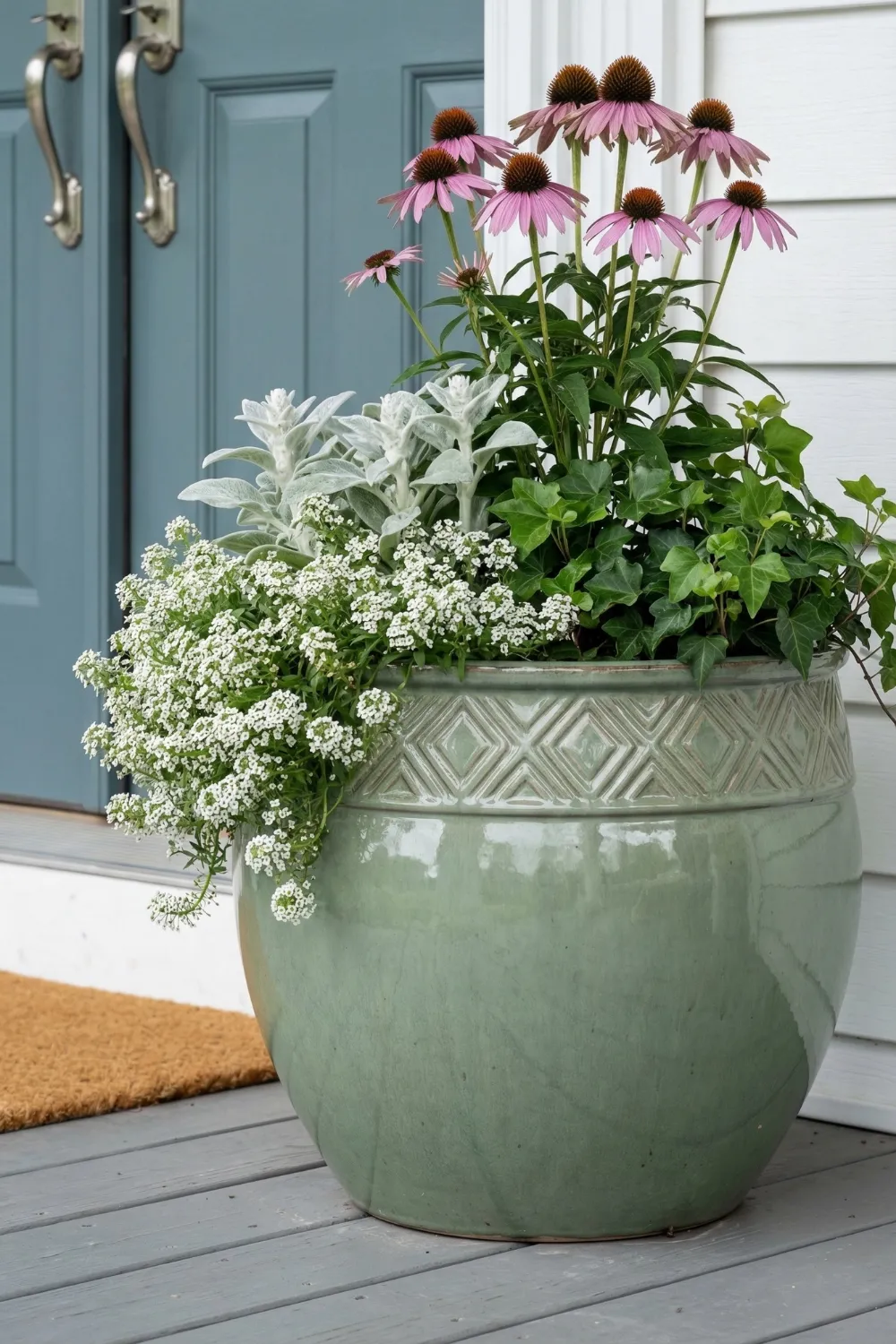
11 • Cottage-Style Planters with Soft Color Palettes
Cottage-style homes have a specific visual character that over-designed or over-structured planters can easily undermine. The appeal of a cottage aesthetic is its informality — the suggestion that things grew into their current arrangement rather than being placed there. Planters for this style should feel gathered rather than installed, and the color palette should read as gentle rather than bold.
Soft pink coneflowers, pale lavender, creamy white alyssum, dusty miller, and silver-leaved lamb’s ear are all plants that contribute to this relaxed, layered quality. The foliage textures are especially important in cottage arrangements — the soft, almost felted texture of lamb’s ear, the delicate ferny texture of asparagus fern, the loose and slightly wild quality of ornamental grasses all add visual richness that supports the cottage character without imposing structure on it.
Trailing plants are essential in cottage arrangements for the same reason they work in romantic urns: they soften boundaries. A planter with crisp, defined edges looks formal regardless of what is planted inside it. The same planter with ivy or trailing verbena spilling over the rim and down the sides begins to look like it has been there for seasons, which is the quality cottage style is always reaching for
12 • The Role of Containers in Porch Design
The container is not a neutral backdrop. It is half the design decision, and sometimes more than half. The material, finish, color, and form of a planter communicate before the plant inside it communicates, because the container is visible year-round while many plants are seasonal. Choosing a container only for its compatibility with a summer planting without considering how it will look in February is a planning failure that produces a lot of sad-looking winter porches.
Material choices carry specific associations. Dark glazed ceramic reads as sophisticated and slightly formal. Weathered terracotta reads as warm and informal. Cast stone reads as traditional and permanent. Metal reads as contemporary or industrial depending on the finish. Lightweight fiberglass that mimics stone or terracotta reads as whatever it is mimicking, which is often the most practical choice for large containers that need to be moved seasonally.
Material consistency across all containers on a porch creates cohesion without requiring identical pots. Three different-sized terracotta containers on a porch read as a collection. Three containers in terracotta, ceramic, and metal read as three separate decisions. The first creates unity; the second creates clutter, regardless of how attractive each individual container might be. This is one of those principles that feels obvious once stated and is violated constantly in practice.
13 • Seasonal Planting Strategies for Year-Round Porch Appeal
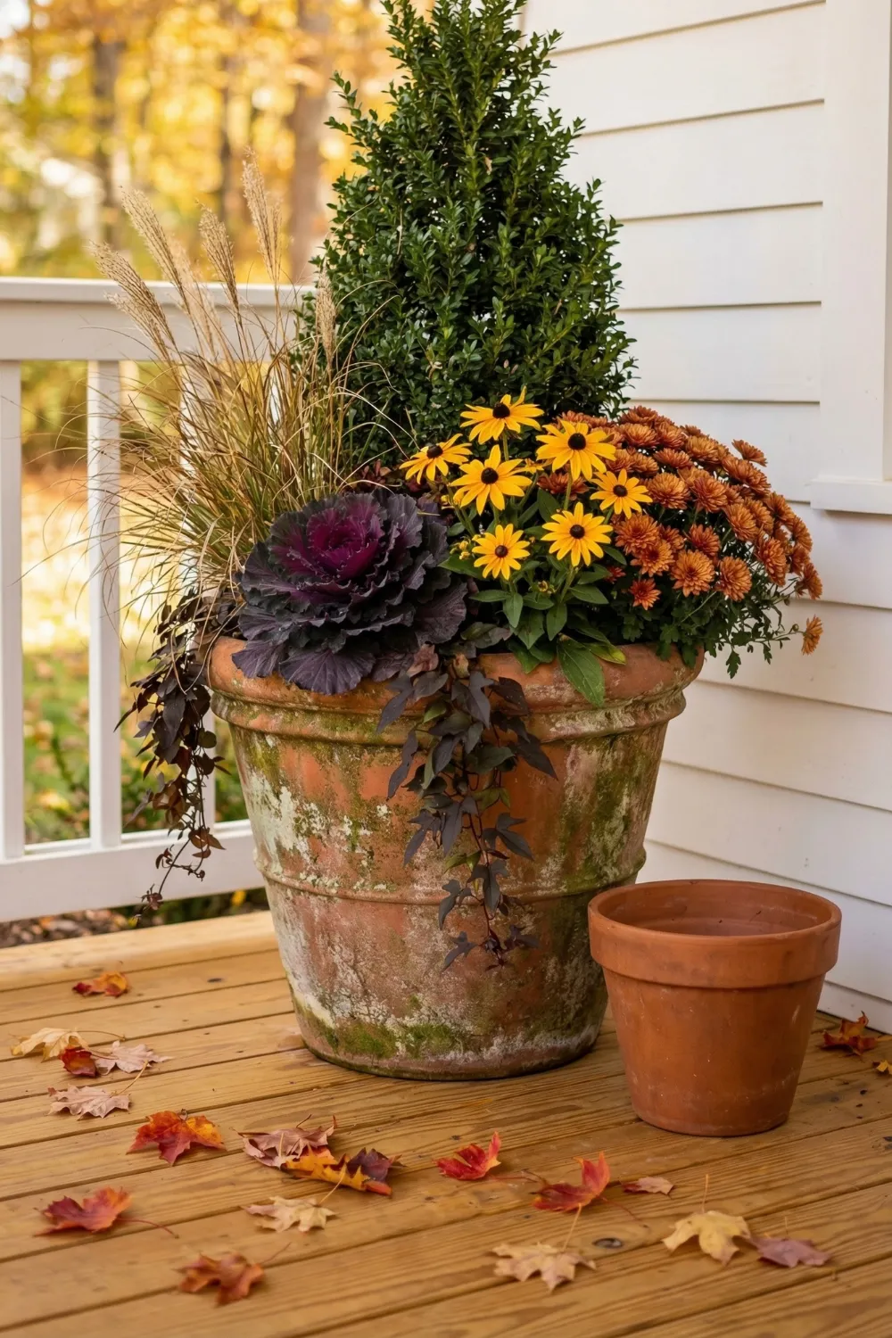
A porch that looks beautiful in July and abandoned in November is only half designed. Seasonal planting is not about changing everything four times a year — that approach is exhausting and expensive. It is about building a planting strategy that has a strong permanent structure and rotates only the seasonal performers within that structure.
The permanent layer is the foundation. Evergreen dwarf shrubs, ornamental grasses that hold their form through winter, and structural topiaries in classic containers provide the bones that keep a porch readable as a designed space even in the coldest months. These elements do not need to be replaced. They anchor the container and give it presence when everything seasonal has finished.
14 • Window Boxes — The Most Overlooked Opportunity in Porch Design
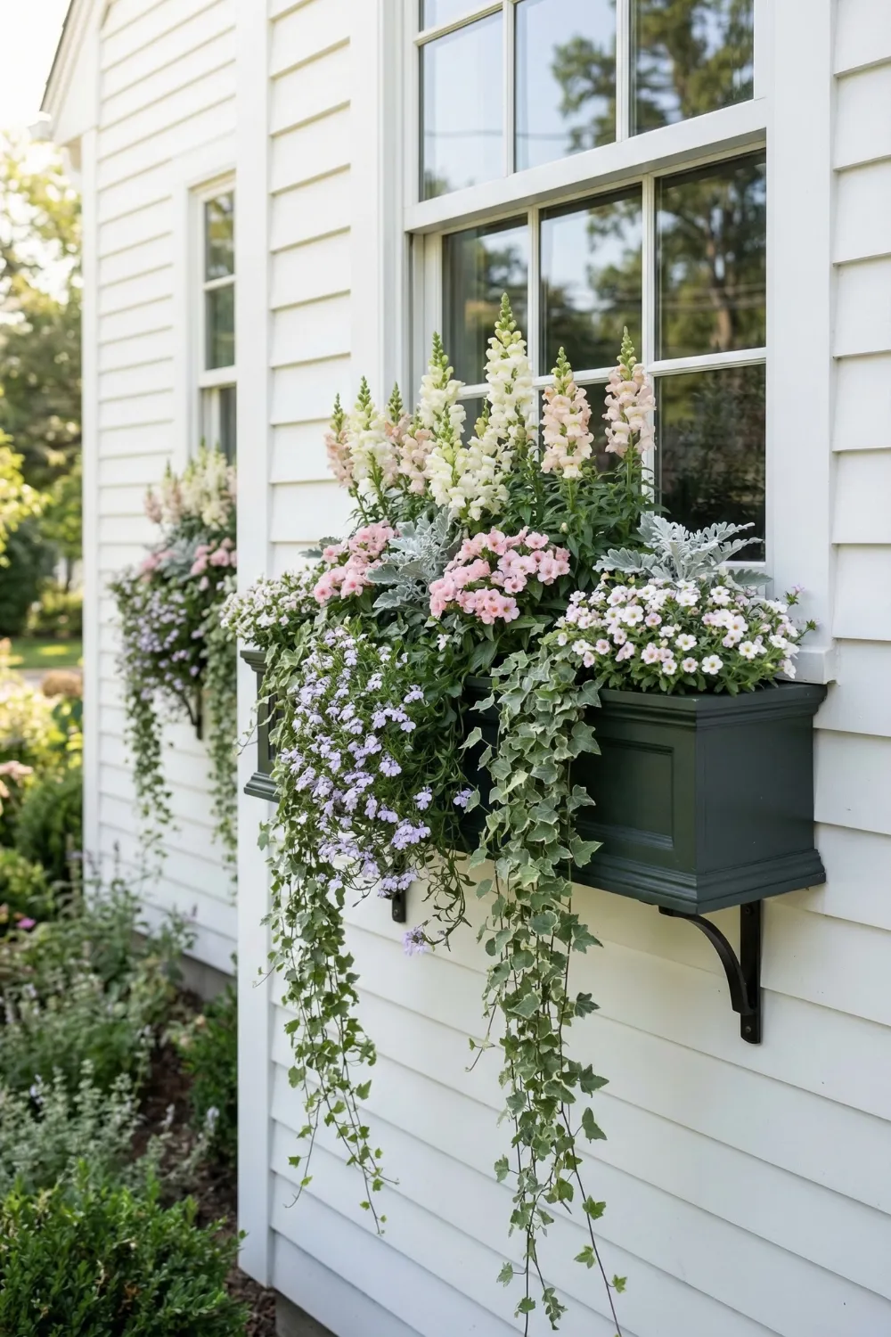
Window boxes occupy a unique position in exterior planting design because they are attached to the house itself rather than placed on a surface. This changes everything about how they function and what they communicate. A window box is not an accessory — it is an architectural element that either integrates with the facade or fights against it, and there is rarely a middle ground.
The first decision is material and finish compatibility. A window box in wrought iron belongs on a house with iron railings or dark metal hardware. A wooden window box with a painted finish belongs on a house with detailed millwork and painted trim. A terracotta or stone-look box belongs on a house with traditional masonry details. Choosing a box material that echoes something already present in the architecture is the difference between a window box that looks intended and one that looks attached.
The planting logic for window boxes follows the same thriller-filler-spiller structure that works in freestanding containers, but with one critical difference: the spiller is more important here than anywhere else. A window box seen from the street at any distance reads primarily as its trailing element. The cascade of ivy, trailing verbena, bacopa, or sweet potato vine is what gives the box its visual weight and softness from a distance. The thriller and filler provide color and vertical interest for close viewing, but the spiller is what makes the window box visible and beautiful from thirty feet away.
15 • How Flower Pots Transform an Ordinary Porch
What front porch planters ultimately do — when they are placed with intention, filled with layered planting, and sized to match the architecture they accompany — is give a house a face. Not the architectural face of windows and doors and siding, which every house has, but the living face that changes with seasons, requires care, and signals occupancy in a way that even the most beautiful static facade cannot.
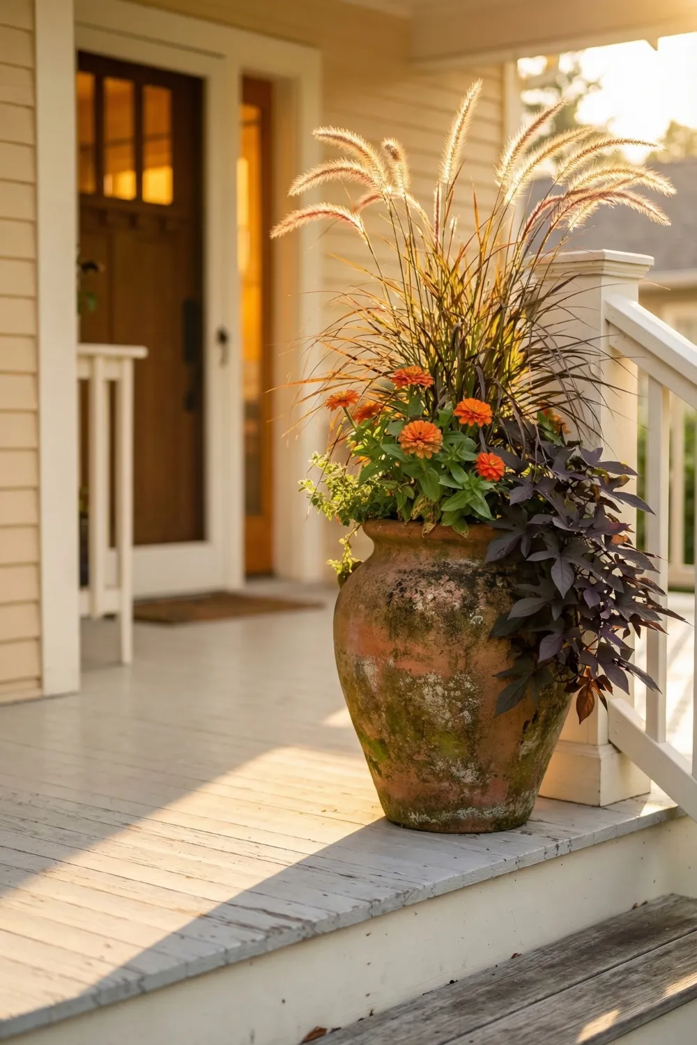
The single planter that stopped me at my neighbor’s porch two years ago was not doing anything complicated. It was a large terracotta urn with a tall grass in the center, some bright orange zinnias in the middle, and a trailing sweet potato vine spilling over the sides. It was placed at the corner of the top step, where it caught the afternoon light and softened the transition from the hard edge of the step to the open porch. It cost maybe thirty dollars to plant. It changed the entire character of the entrance.
That is what this is about. Not elaborate installations or expensive containers or rare plants. It is about understanding what a planter is doing in a space, choosing a container that matches the home it belongs to, placing it where it will do actual design work, and planting it with enough structure and softness to feel both composed and alive. Done right, it is one of the most effective things you can do for a home’s first impression, and it is entirely within reach.
Final Porch Planter Checklist
- Choose container material that matches your home’s architectural style
- Scale container size to the architecture — large columns need large pots
- Position planters to do spatial work, not just occupy available floor space
- Use the thriller-filler-spiller formula for any container over 12 inches
- Keep container material consistent across all pots on the porch
- Consider how containers will look in winter, not just during peak bloom
You Might Also Like
See more porch inspiration with Easter front porch ideas, or explore heuchera front yard design. Also check out backyard corner ideas for outdoor inspiration.
Related Home Decor Ideas
Keep your entry stylish with front porch flower pot ideas for curb appeal. Add vibrant plants like heuchera coral bells landscaping ideas, or explore unique vintage garden decor ideas for outdoor charm.


Pingback: 12 Easter Front Porch Ideas That Look Straight Out of Pinterest (2026) - Decorly Nest | Modern Home Decor Ideas