These Easter porch ideas are going viral on Pinterest right now
Your Front Porch Is Doing More Work Than You Think
During Easter weekend, you can tell in about three seconds whether someone has considered the porch or simply picked up whatever was left at the garden center if you walk up to any house. From the street, you can see that there is a difference.
Good Easter porch styling isn’t really about Easter. It’s about understanding how visual weight works, how color behaves in natural light, and how to make a small outdoor space feel considered rather than decorated. The holiday is just an occasion. The principles are the same ones interior designers use year-round.
The eleven actual porch setups that follow are honestly broken down, including what works, what’s doing the heavy lifting, and how to pull each one off without it looking like a craft store exploded next to your front door.
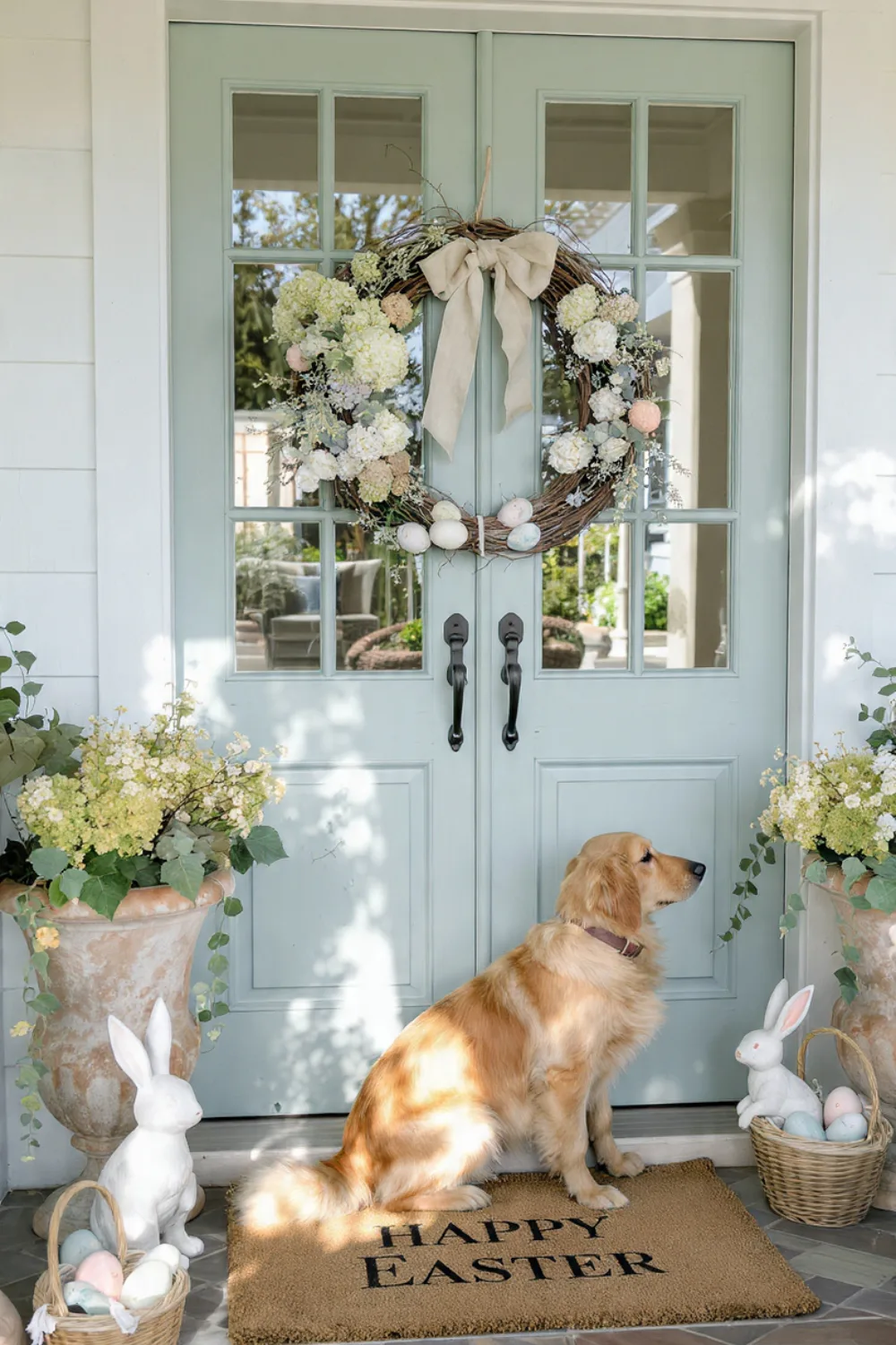
1. Whimsical Bunny Garden Porche
The symmetry is the first thing you notice, and it was done on purpose. Your eye naturally follows the triangle formed by the two tall planters with bunny topiaries on either side of the door, a wreath in the middle, and lower flowers at ground level. This is one of those configurations where the geometry plays a major role.
The color restraint is what gives it an opulent feel instead of a busy one. White, pale pinks, and soft yellows don’t compete for supremacy. The pastels have a clean surface to rest against thanks to the board-and-batten wall behind it all.
If you’re recreating this at home, start with the tall elements first. Get the topiaries or planters positioned and anchored before you touch anything else. It sounds obvious but most people do it backwards — they start small and try to build up, which almost always ends in something that looks improvised.
One real flower element, even just a small pot of daffodils, changes the whole thing. Faux-only arrangements tend to read as flat in photographs.
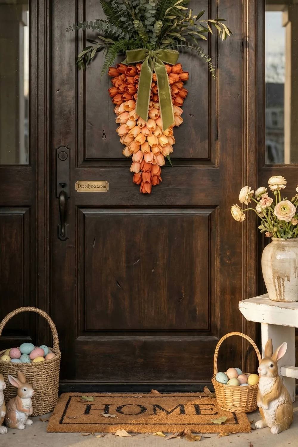
2. The Oversized Carrot Door Statement
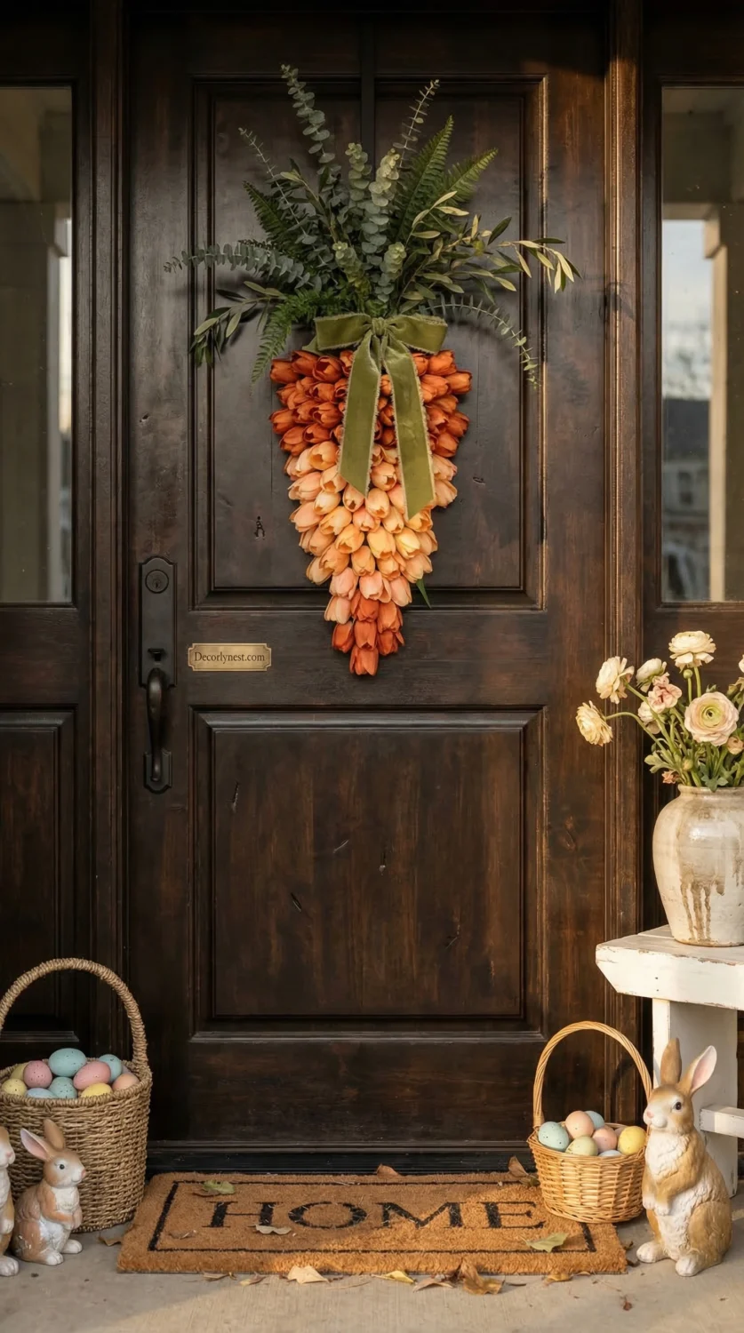
People stop when they see this. Greenery running vertically, orange tulips gathered at the base of a big carrot swag on a dark door. There’s only one thing vying for your attention, which is why it works so well even though it shouldn’t.
This porch’s real lesson is that. The outcome appears deliberate rather than overdone when you select one striking focal point and allow everything else to subtly support it. In this case, the dark door is crucial because it produces contrast that makes the orange stand out more than it would against a white or natural wood door.
The shape is worth paying attention to too. Greenery runs upward, the tulips cluster below it in a loose teardrop shape, and the eye moves down naturally to the ground-level bunnies and eggs. That’s a designed flow, not an accident.
If you try this one, make sure the surrounding palette is tight. White, green, and orange. Here, adding a different accent color would lessen the overall impact.
3. Pastel Egg Topiary Moment
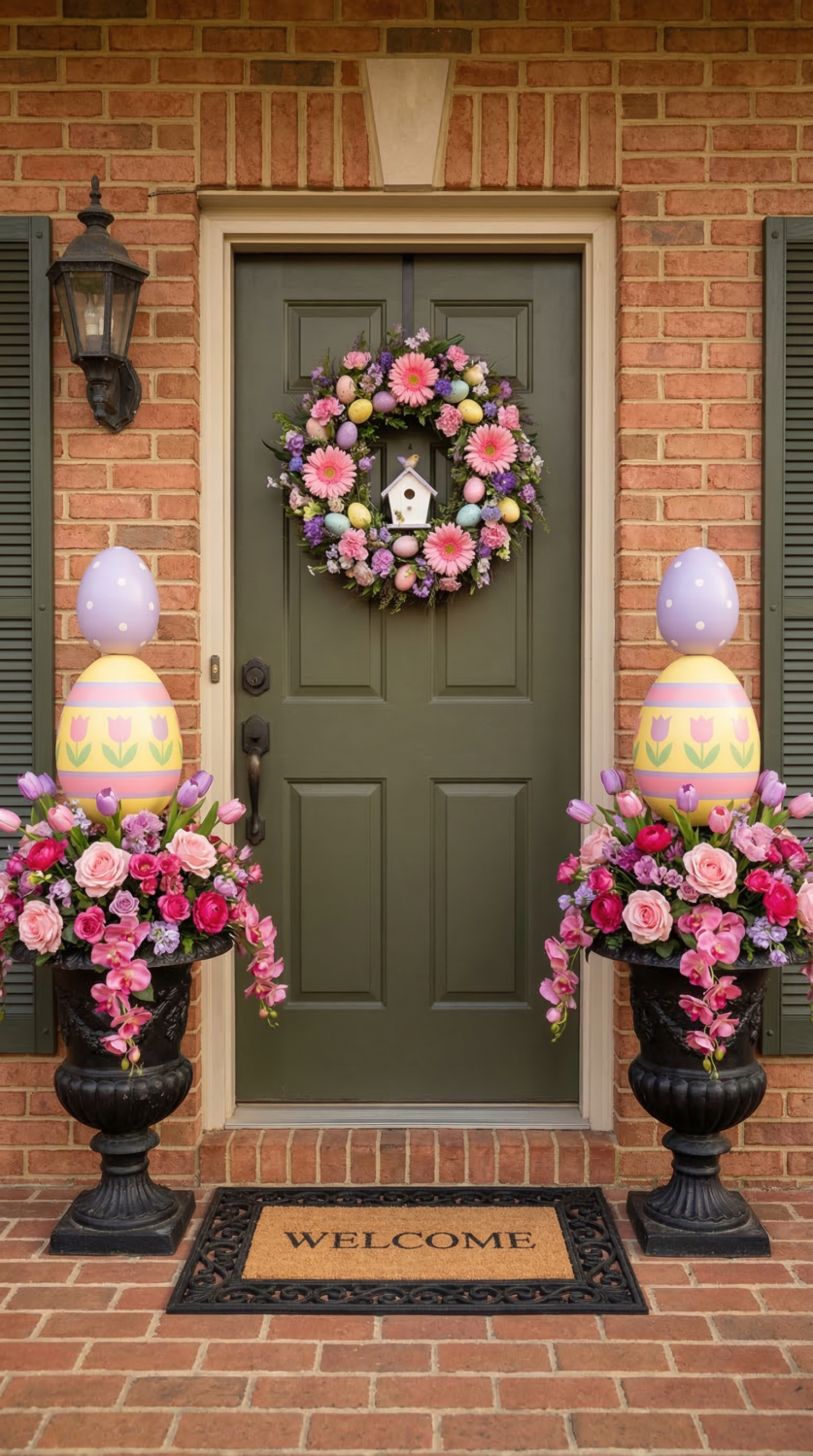
Maximalist Easter, done the right way. The dramatic egg topiaries stacked in matching urns are dramatic, and that’s the only word for it. They stay together because everything is perfectly mirrored. On both sides, the urns, egg stacks, and flower bases are the same.
Repetition is what keeps a bold arrangement from getting out of hand. The brick wall in the background also deserves some credit. The warm and textured look of the pastel colors keeps them from looking too sweet or precious.
You might need to add something neutral at ground level if your porch has a painted or stucco wall to get the same grounding effect. This style cares more about height than almost any other. The urns need to be high enough so that the egg topiaries are at eye level; otherwise, the effect is lost.
If the arrangement is too low, it looks like a table centerpiece that got lost outside. Three to four pastel colors at most. After that, the palette stops looking like it was put together on purpose and starts looking random.
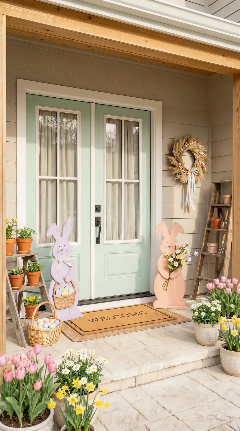
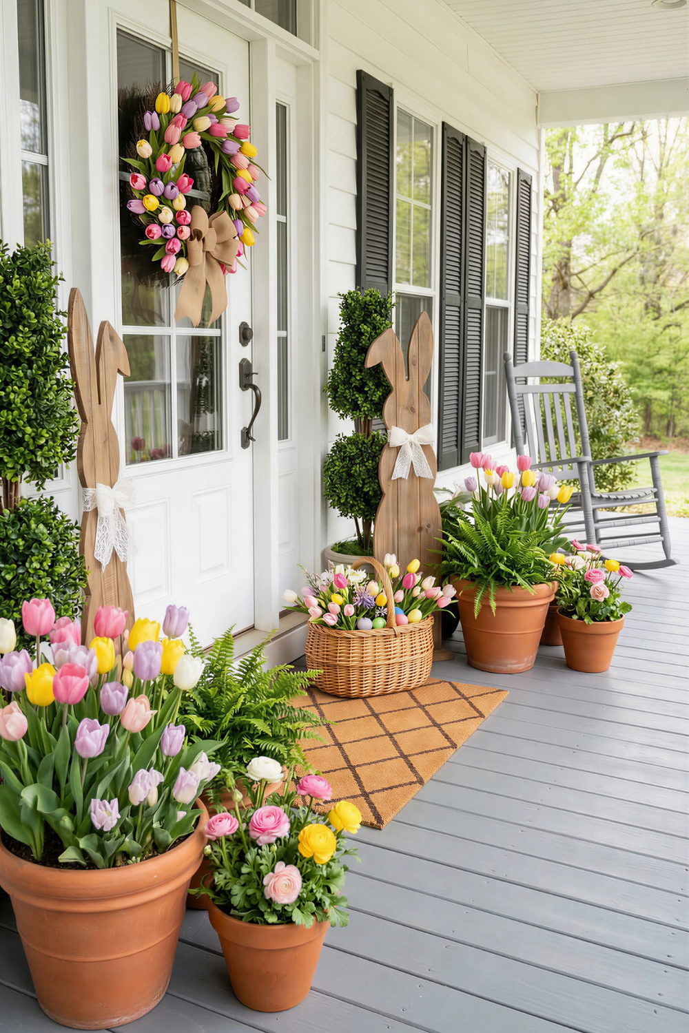
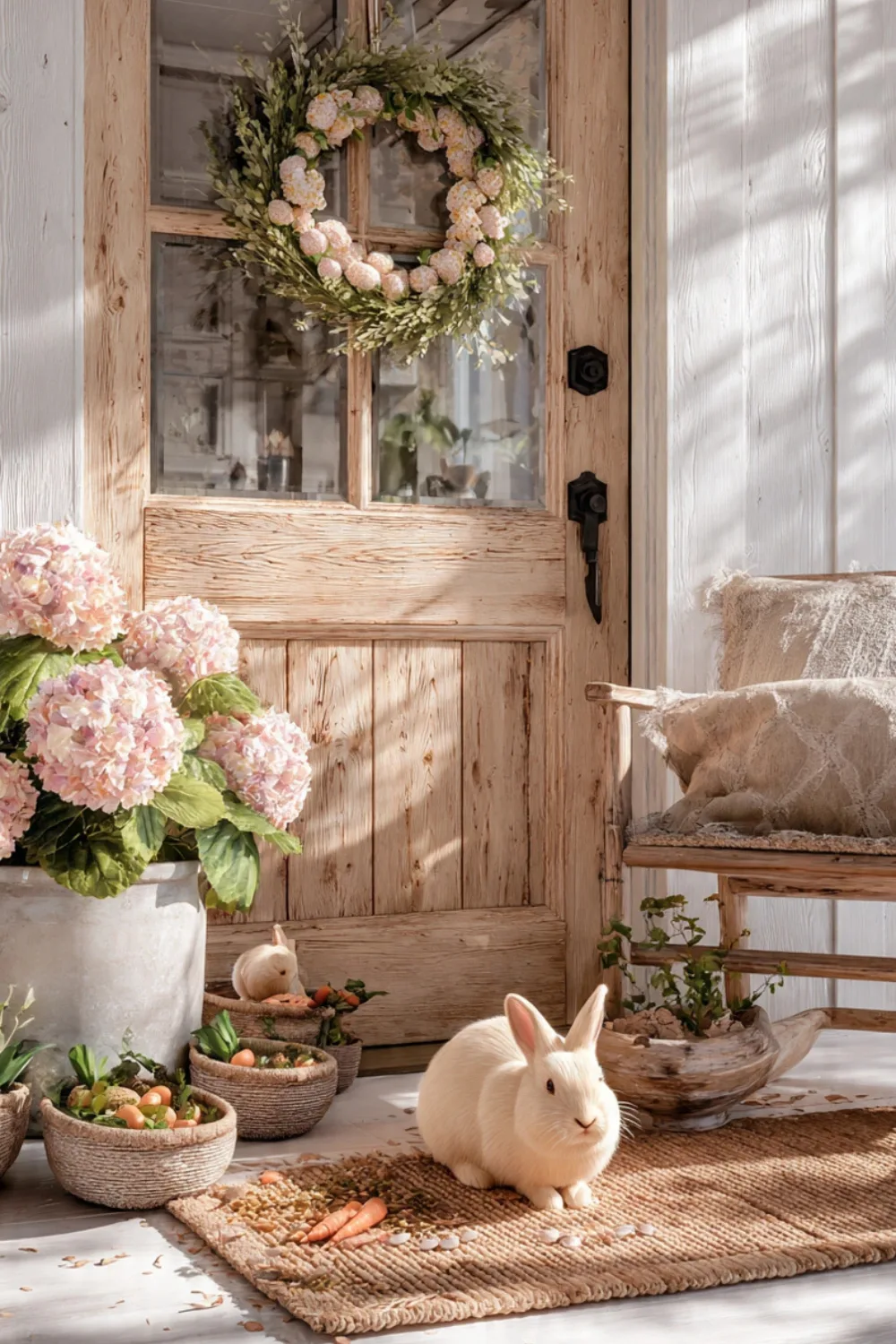
4. Rustic Farmhouse Bunny Porch

This one has a completely different energy than the last one, which is why it’s worth including. Wooden bunny cutouts, terracotta pots, woven baskets, and tulips in many containers make it warm, casual, and truly charming without trying to be fancy.
The mix of materials is doing a lot here. Wood, clay, wicker, and fresh greenery all have earthy tones, which is why they look good together even though they are all very different. When you mix materials, they only look good together if there is a thread that connects them. In this case, that thread is a natural, unfinished texture.
It would be interesting to study the difference in height. There are tall bunny silhouettes on the wall, medium planters on either side of the door, and low baskets at the bottom. There are three levels, and each one has something going on.
That staggered layering makes shapes that a single-height arrangement can’t make. One bloom of a hero, over and over. There are probably five different containers in this setup that hold tulips. That repetition is what makes it seem like a planned choice instead of just whatever was available.
5. Oversized Easter Step Display
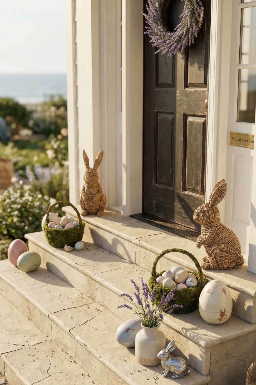
Here, the steps are the main focus, which is a technique that isn’t used very often. Big eggs, woven bunny figures, and moss nests grouped together in an odd number make a focal point that you see before you even get to the door. This style is all about scale.
The eggs are big enough that they don’t just look nice; they also serve a purpose. If the same arrangement were smaller, it would look strange.
If you decide to go with big Easter decorations, you really have to go all in. Half measures look worse than starting over with something simpler. The lavender in the vase is a nice touch. It gives things a vertical movement and something soft and airy that breaks up the heavier woven and ceramic shapes around it.
Without that kind of contrast, big arrangements can start to feel heavy and full. A neutral base, wall colors that aren’t too bright, and lots of space around the grouped pieces. Negative space is important for statement decor; if you crowd it, the effect goes away.
6. Enchanted Garden Entryway

This is the most complicated setup in the collection, and it works because each part tells the same story. There are a lot of things, like a floral arch garland, double wreaths on the doors, matching topiaries, and terracotta planters. But the soft pastel colors are consistent throughout, so even when it’s at its most dense, it doesn’t look messy.
You can use clustered color on a simpler porch, too. Instead of being spread out evenly, florals are grouped together in certain areas. The clustered color looks like it was meant to be there. Color that is all over the place looks like uncertainty. The birdhouses add a touch that makes everything fit into a garden story.
If the things you put on your porch all have a botanical, garden, or natural theme, it will start to feel like a real place instead of just a bunch of seasonal things. That’s what makes style and decoration different.
Build the structural base first if you attempt something at this scale. Greenery and garland go up before a single flower is added.
7. Focal Point Bunny Welcome
Simple and useful. The main focus is a big bunny statue, and everything else, like the wreath, doormat, lanterns, and flowers, is just there to support it. Choosing a hero element up front makes all the other choices much easier. Instead of trying to make an impact with a lot of competing pieces at once, you’re putting together a supporting cast. The color continuity here is quiet but steady.
The wreath, the flowers, and the doormat all have lavender, mint, and soft yellow in them. They are always there, but never too loud. The black lanterns are a very smart choice. They ground the pastels and keep the whole arrangement from floating in a soft blur of similar colors. It’s important to think carefully about how big the bunny should be in relation to the door. It gets lost if it’s too small. As a general rule, your main focal point should be at least a third of the height of your door for the proportions to look good in pictures.
8. Vertical Carrot Column Entrance
A different take on the carrot theme — this one is about vertical emphasis. Garlands running up both sides of the door act almost like decorative columns, pulling the eye upward and making the entry feel taller than it actually is. It’s a particularly useful trick for porches that feel a little squat or wide.
The carrot repetition along both garland sides creates rhythm in the design-school sense — a repeated element at consistent intervals that guides how your eye moves across the space. The centered bunny wreath becomes the visual pause in that rhythm. Without it, the two vertical garlands would just be competing columns.
Orange is the dominant accent here, and it stays dominant because nothing else is competing at the same intensity. Greenery and white bunnies support without challenging. One bold color, given full permission to lead, almost always looks more polished than two or three bold colors negotiating for space.
9. Soft Hydrangea Symmetry
“Save these ideas to your Pinterest board before they trend out”
This one reads differently from most Easter porches — quieter, more restrained, the kind of setup that photographs well in morning light. Muted mint door, matching urns with hydrangeas, mirrored bunny figures, evenly spaced lanterns. The symmetry is strict and it gives the whole arrangement a composed, almost formal quality.
The slight asymmetry in the wreath — florals cascading a little more heavily to one side — is what keeps it from feeling rigid. It’s a small thing but it matters. A perfectly symmetrical arrangement on a perfectly symmetrical structure can start to feel stiff. One deliberate deviation creates just enough visual tension to make it interesting.
Layered textiles at the base (stacked rugs under the doormat) add a styling layer that most people skip. Outdoors, this kind of textile layering signals care in a way that’s hard to define but immediately visible in photographs.
Tight palette: blue, blush, cream. Repeated in the florals, the eggs, the wreath. Nothing introduced that doesn’t already exist somewhere else in the arrangement.
10. European Arch Entrance
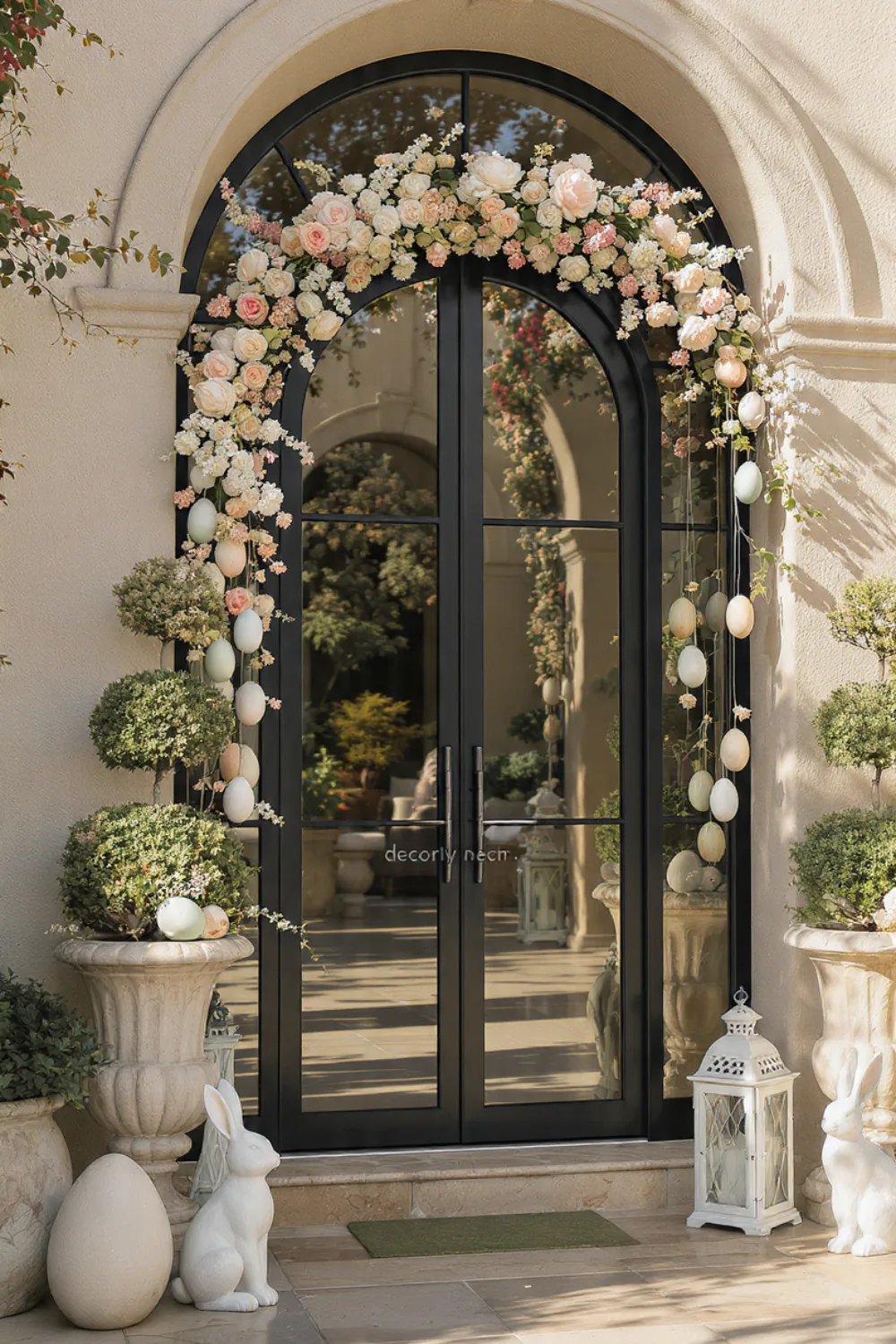
The architecture is doing significant work here — an arched doorway already has inherent drama, and the decorating approach respects that by staying refined rather than competing with it. Symmetrical topiary trees in pedestal urns, a classic rose and greenery wreath, pastel eggs tucked at the base as the only real Easter signal. That’s it.
The white lanterns echoing the pale stucco walls is a detail worth noting. When decorative elements match or near-match the architectural materials around them, the eye reads everything as a unified composition rather than decor sitting in front of a backdrop. It’s a subtle distinction that makes a visible difference.
Quality over quantity applies here more than in any other style. Two well-chosen, substantial pieces will consistently outperform seven smaller ones at this level of formality. Less is the strategy, not a compromise.
11. Calm Pastel Hydrangea Porch
Saving the most understated for last. This porch isn’t trying to impress anyone — and that restraint is precisely what makes it impressive. Pale florals, clean lines, a controlled palette that feels more like early spring than a specific holiday.
It photographs particularly well because there’s nothing fighting for attention. The eye moves around the frame calmly. In an era of maximalist Easter content, this kind of composed quietness actually stands out.
What Every Well-Styled Porch Has in Common
No matter the budget, size, or style of the eleven setups, there are some things that are always the same Repetition.
Something that shows up more than once is a color, a shape, or a material. Even a well-chosen group of things looks random without it. Different heights.
There are tall, medium, and short parts in the same arrangement. Single-level styling, no matter how carefully chosen, looks flat. One part of self-control.
This porch, even the most maximalist one, held back on something: a controlled color scheme, a neutral wall, and a simple doormat. The rest of the arrangement can work better when you hold back.
And one thing that is alive. A real flower, a plant that is growing, or even branches that have just been cut. It was something that couldn’t have come from a box.
It changes the quality of everything around it in a way that is hard to copy with fake materials alone. You don’t need a lot of money or design experience to do any of this.
It means seeing a porch as a whole instead of just a bunch of seasonal items and making choices based on that.
Related Home Decor Ideas
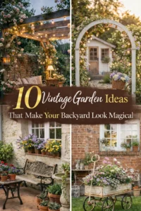
Keep your entry stylish with front porch flower pot ideas for curb appeal. Add vibrant plants like heuchera coral bells landscaping ideas, or explore unique vintage garden decor ideas for outdoor charm.

Pingback: 15 Front Porch Planters That Make Your Home Look Expensive - Decorly Nest | Modern Home Decor Ideas